Contents
Page Design
Monitor gamma settings
In computer imaging and display screens "gamma" refers to the degree of contrast between the mid-level gray values of an image. The technical explanations of gamma are irrelevant here
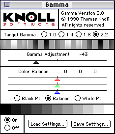
 the visual effect of changing gamma values is easy to see. If you have a copy of Adobe Photoshop, open an image with an average range of colors and contrasts and use the "Levels" control to change the gamma settings (see the Photoshop manual for details). Images will change noticeably with even minor changes in gamma settings. Gamma considerations are particularly important if you are displaying images with very long gray scales (like medical diagnostic images or fine black and white photography) or images with critical color values (like art history images or clinical medical photographs).The default gamma settings for Macintosh (1.8 target gamma) and Windows monitors (2.2 target gamma) are quite different, and this can lead to unpleasant surprises when you first see your images displayed on "the other" platform. Mac users will see their images get much darker and more contrasty on Windows displays; Windows users will see their images as flat and washed out on Mac displays. Most Web designers opt for a middle-ground solution, lightening images slightly if they work on the Macintosh; darkening slightly and adding a little more contrast if they work in Microsoft Windows.If you use Adobe Photoshop you can use the "Gamma" Control Panel that ships with Photoshop to experiment with your monitor gamma settings. To simulate the windows display on a Macintosh, set the target gamma to 2.2 and the gamma adjustment slider to "-43", then save those settings.
In the Windows version of Photoshop the gamma control only applies to images within Photoshop windows, not to the global display environment as it does on the Macintosh. The default gamma setting for the Windows version of Photoshop is 1.8 (same as the Mac). To see how your graphics may look once they are out of Photoshop and into your Windows Web browser, use the gamma control in Windows Photoshop to boost the Photoshop display gamma to 2.2 (to match the normal Windows operating system gamma).
Default text sizes
In general, screen type sizes in Windows (3.1, Win95, WinNT) appear about two sizes larger than the equivalent Macintosh versions. Thus a line of 12 point Times type on a Macintosh looks more like 14 points in Times New Roman on a windows machine. If you don't have ready access to a machine with "the other" operating system, use the "FONT SIZE" HTML tag at the top of your page to globally change the type size for a quick preview:
|
 |
Mac users should try <FONT SIZE="+2"> |
|
Windows users should try <FONT SIZE="-2"> |
Browser variations
Every Web browser interprets HTML tags a little differently. Tables, forms, graphic positioning and alignment tags will all work a bit differently in each brand or version of Web browser. Normally these subtleties might pass unnoticed, but in very precise or complex Web page layouts they can lead to some nasty surprises. At this writing the two main Web browsers are Netscape Navigator 3.0 and Microsoft Internet Explorer 3.0 (2.0 on Macs). Both now support HTML 3.0, the original 1995 "Netscape extensions" to HTML, plus Javascript, Java, and share a (mostly) compatible plug-in architecture. But never trust the implementation of any of these advanced features until you have seen your Web pages displayed and working reliably in each brand of browser.
Graphics offset variations
Beware of trying to get a graphic imbedded on your page to line up precisely with a page background image. Offset variations make it a losing cause. The offset is the built-in margin that Web browsers automatically create between the edge of the browser window and the graphics you place on your page:
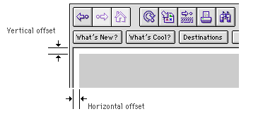
If the browser offset was fixed and consistent across browser brands and various hardware platforms the problem would be manageable, but unfortunately every browser seems to give a slightly different dimensions to the vertical and horizontal offsets. Thus even if you have perfectly lined up your foreground and background images in your particular brand and version of Web browser, you cannot count on the images lining up on someone else's screen. Even within one company the offset is inconsistent; the different platform versions of Netscape all give slightly different offsets.
Fortunately Microsoft recognized the problem and has added support for two new HTML tags to Microsoft Explorer 3.0. The "LEFTMARGIN" and "TOPMARGIN" tags allow direct control over margin offsets, and Netscape has apparently committed to support these tags in the 4.0 version of Netscape Navigator. See Siegel (1996) or Weinman (1996) for detailed discussions of these topics.References
|
Apple Computer, Inc. 1992. Macintosh human interface guidelines. Reading, MA: Addison-Wesley. Microsoft Corporation. 1992. The Windows interface: An application design guide. Redmond, WA: Microsoft Press. Siegel, D. 1996. Creating killer web sites. Indianapolis: Hayden Books. www.killersites.com Weinman, L. 1996. Designing Web graphics. Indianapolis: New Riders. www.lynda.com |