We know that the tail must wag the dog,
for the horse is drawn by the cart;
But the Devil whoops, as he whooped of old:
"It's clever, but is it Art?"
— Rudyard Kipling, "The Conundrum of the Workshops"
IN THIS CHAPTER we show you techniques to optimize the look and efficiency of your Web page graphics. Although electronic publishing frees you from the cost and limitations of color reproduction on paper, you will still need to make careful calculations (and a few compromises) if you wish to optimize your graphics and photographs for various display monitors and Internet access speeds.
The parameters that influence the display of Web graphics are the user's display monitor and bandwidth capacity. A good segment of the Web audience accesses the Internet via modem, and many view Web pages on monitors that display only 256 colors. This reality imposes limits on the size of files and number of colors that can be included in Web graphics.
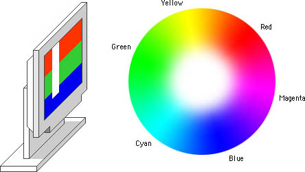
Color monitors for desktop microcomputers are based on cathode ray tubes (CRTs) or back-lighted flat-screen technologies. Because monitors transmit light, displays use the red-green-blue (RGB) additive color model. The RGB model is called "additive" because a combination of the three pure colors red, green, and blue "adds up" to white light:
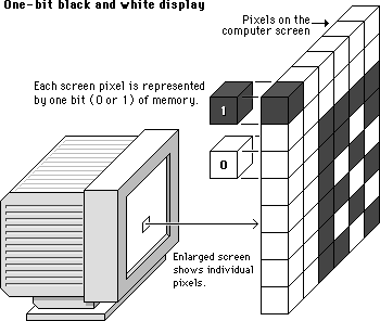
The computer's operating system organizes the display screen into a grid of x and y coordinates, like a checkerboard. Each little box on the screen is called a "pixel" (short for "picture element"). Current Macintosh and Windows displays are composed of these grids of pixels.
To control the color of each pixel on the screen, the operating system must dedicate a small amount of memory to each pixel. In aggregate this memory dedicated to the display screen is often referred to as "video RAM" or "VRAM" (Video Random Access Memory). In the simplest form of black-and-white computer displays, a single bit of memory is assigned to each pixel. Because each memory bit is either positive or negative (0 or 1), a 1-bit display system can manage only two colors (black or white) for each pixel on the screen:
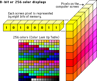
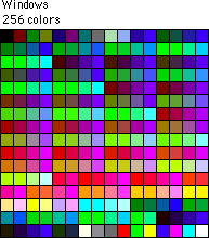
If more bits of memory are dedicated to each pixel in the display, more colors can be managed. When 8 bits of memory are dedicated to each pixel, each pixel could be one of 256 colors. (256 = 2 to the eighth power; in other words, 256 is the maximum number of unique combinations of zeros and ones you can make with 8 bits.) This kind of computer display is called an "8-bit" or "256-color" display, and is common on older laptop computers and desktop machines. Although the exact colors that an 8-bit screen can display are not fixed, there can never be more than 256 unique colors on the screen at once:
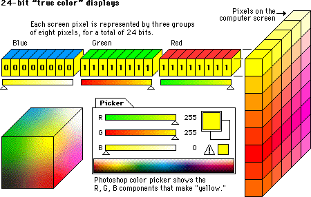
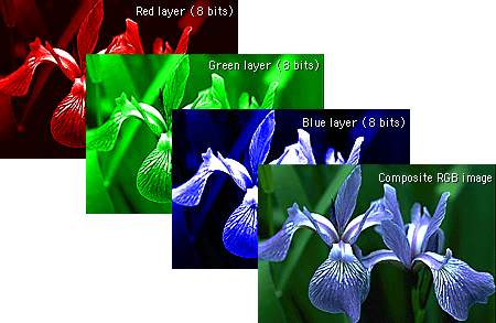
If still more memory is dedicated to each pixel, nearly photographic color is achievable on the computer screen. "True-color" or "24-bit" color displays can show millions of unique colors simultaneously on the computer screen. True-color images are composed by dedicating 24 bits of memory to each pixel; 8 each for the red, green, and blue components (8 + 8 + 8 = 24):
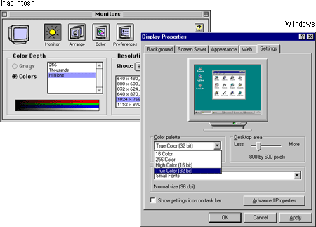
The amount of VRAM dedicated to each screen pixel in the display is commonly referred to as the "color depth" of the monitor. Most Macintosh and Windows microcomputers sold in recent years can easily display color depths in thousands (16-bit) or millions (24-bit) of simultaneous colors. To check your computer system for the range of color depths available to you, use the "Display" control panel (Windows) or the "Monitors" control panel (Macintosh):
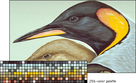
The terminology and memory schemes used in color displays are directly analogous to those used to describe color depth in graphics files. In their uncompressed states, 8-bit, or 256-color, image files dedicate 8 bits to each color pixel in the image. In 8-bit images the 256 colors that make up the image are stored in an array called a "palette" or an "index." The color palette may also be referred to as a "color lookup table" (CLUT). As mentioned above, 8-bit images can never contain more than 256 unique colors:
True-color, or 24-bit, images are typically much larger than 8-bit images in their uncompressed state, because 24 bits of memory are dedicated to each pixel, typically arranged in three monochrome layers — red, green, and blue:
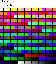
The color management system currently used by Web browser software is based on an 8-bit, 216-color (not 256) palette. The browser-safe color palette is a solution devised by Netscape to solve the problem of displaying color graphics in a similar way on many kinds of display screens, with browsers running under different operating systems (such as Macintosh, Windows, and UNIX). Because a majority of the Web audience years ago had 8-bit display screens, 256 colors was the upper limit for the color palette. But the various versions of the Windows operating system (which currently represent about 95 percent of the microcomputer market) reserve 40 colors for displaying such graphic interface elements as windows, menus, screen wallpaper, icons, and buttons, which leaves just 216 colors to display everything else. The 216 colors chosen by Netscape are identical in both the Macintosh and Windows system palettes. Although the browser-safe color scheme originated at Netscape, at present both of the dominant Web browsers (Netscape Navigator and Microsoft Internet Explorer) use the same color management system.
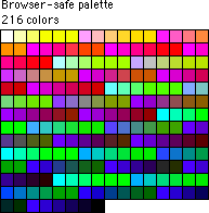
Most Web users have computers and monitors set to "thousands" or "millions" of colors, so the importance of the so-called Web-safe palette has sharply diminished in the past few years. When the user has a monitor set to thousands or millions of colors all colors display properly, so there is no longer any need to restrict your color choices to the 216 Web-safe colors.
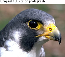
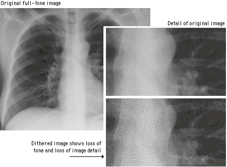
Full-color photographs may contain an almost infinite range of color values. Dithering is the most common means of reducing the color range of images down to the 256 (or fewer) colors seen in 8-bit GIF images.
Dithering is the process of juxtaposing pixels of two colors to create the illusion that a third color is present. A simple example is an image with only black and white in the color palette. By combining black and white pixels in complex patterns a graphics program like Adobe Photoshop can create the illusion of gray values:
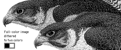
The same process softens the effect of reducing the number of colors in full-color images:
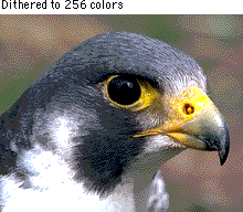
Most images are dithered in a diffusion or randomized pattern to diminish the harsh transition from one color to another. But dithering also reduces the overall sharpness of an image, and it often introduces a noticeable grainy pattern in the image. This loss of image detail is especially apparent when full-color photos are dithered down to the 216-color browser-safe palette:
If a reader of your Web site has his or her display monitor set to 256 colors (an increasingly rare occurrence these days), then the Web browser will display images using the 216-color browser-safe color palette. In this situation there is no way to force the browser to display a color outside the browser-safe palette. If any of your photographs, graphic design elements, or background colors use hues outside the browser-safe palette, the Web browser will automatically dither the displayed images into the browser-safe colors. The effect of using "unsafe" colors for your major graphic elements is that readers with 256-color displays will see a lot of heavily dithered images. This may be acceptable for some visual elements on the page, but if your basic navigation buttons and background graphics are dithered, parts of the page will be hard to read and the overall effect will be amateurish:
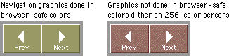
Now that the vast majority of Web users have more sophisticated display screens most designers choose to use GIF graphics with custom colors or full-color JPEG graphics and just accept that they will dither on some small percentage of display screens that are still set to 256 colors. One compromise is to mix navigation graphics done in browser-safe colors with full-color JPEG graphics. The full-color images will be dithered on 256-color screens, but the navigation buttons will look the same on all screens.

Screen resolution refers to the number of pixels a screen can display within a given area. Screen resolution is usually expressed in pixels per linear inch of screen. Most personal computer displays have resolutions that vary from 72 to 96 pixels per inch (ppi). The resolution of the display screen is dependent on how the monitor and display card are configured, but it's safe to assume that most users fall into the lower end of the range, or about 72 to 80 ppi.
Images destined for print can be created at various resolutions, but images for Web pages are always limited by the resolution of the computer screen. Thus a square GIF graphic of 72 by 72 pixels will be approximately one inch square on a 72-ppi display monitor. When you are creating graphics for Web pages you should always use the 1:1 display ratio (one pixel in the image equals one pixel on the screen), because this is how big the image will display on the Web page. Images that are too large should be reduced in size with a sophisticated image editor like Adobe's Photoshop to display at proper size at a resolution of 72 ppi.
In computer imaging and display screens "gamma" refers to the degree of contrast between the midlevel gray values of an image. The technical explanations of gamma are irrelevant here — the visual effect of changing gamma values is easy to see. If you own a copy of Adobe ImageReady, open an image with an average range of colors and contrasts and use the "Image: Adjust: Gamma" control to change the gamma settings (see the ImageReady manual for details). Images will change noticeably with even minor changes in gamma settings. Gamma considerations are particularly important if you are displaying images with very long gray scales (such as medical diagnostic images and fine black-and-white photography) or images in which the exact color values are critical (such as works of art and clinical medical photographs):
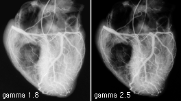
The default gamma settings for Macintosh (1.8 target gamma) and Windows (2.2 target gamma) monitors are quite different, and this can lead to unpleasant surprises when you first see your images displayed on "the other" platform. Mac users will see darker and more contrasting images on Windows displays; Windows users will see flat and washed-out images on Mac displays. Most Web designers opt for a middle-ground solution, lightening images slightly if they work on the Macintosh; darkening slightly and adding a little contrast if they work in Windows.
Many Web users currently access their Internet service providers via 56 kilobits per second (KBps) modems from their homes, offices, or remote work sites. At 56 KBps the actual download rate is only about 7 kilobytes (KB) per second (8 bits make a byte). This means that a modest 36 KB graphic on your Web page could take five seconds or longer to load into the reader's Web browser. Actual data transmission rates will vary depending on the user's modem, Web server speed, Internet connection, and other factors, but the overall point is clear: the more graphics you incorporate, the longer the reader will have to wait to see your page. A full-screen graphic menu on your home page plus background graphics could leave your modem-based readers twiddling their thumbs for a full minute or more, even if they have a state-of-the-art modem and a good Internet connection. Look at your watch (better yet, hold your breath) for a full minute, then decide whether you're willing to ask your users to wait this long when they visit your Web site.
A better strategy is to increase the graphics loading of your pages gradually, drawing users into your site with reasonable download times. As readers become more engaged with your content, they will be more willing to endure longer delays, especially if you give them notes about the size of graphics or warnings that particular pages are full of graphics and will take longer to download. At today's average modem speeds most pages designed for users dialing in from home should contain no more than 50 to 75 kilobytes of graphics.
Luckily for graphic designers, many Web sites are created primarily for educational, organizational, and commercial users who access their local intranets and the larger World Wide Web from the school or office at Ethernet speeds or greater. Also, increasing numbers of home users now have access to higher-speed connections like DSL and cable modems. Graphics and page performance are also an issue for these users, but it makes little sense to restrict Web page graphics arbitrarily in the cause of "saving network bandwidth." The bandwidth gearheads always miss the point: graphics are what drew most people to the Web in the first place. If you've got the access speed, indulge!
Because of the bandwidth issues surrounding networked delivery of information and because image files contain so much information, Web graphics are by necessity compressed. Different graphic file formats employ varying compression schemes, and some are designed to work better than others for certain types of graphics. The two primary Web file formats are GIF and JPEG. A third format, PNG, has been available since 1995 but has been little used because of poor browser support.
The CompuServe Information Service popularized the Graphic Interchange Format in the 1980s as an efficient means to transmit images across data networks. In the early 1990s the original designers of the World Wide Web adopted GIF for its efficiency and widespread familiarity. The overwhelming majority of images on the Web are now in GIF format, and virtually all Web browsers that support graphics can display GIF files. GIF files incorporate a compression scheme to keep file sizes at a minimum, and they are limited to 8-bit (256 or fewer colors) color palettes. Several slight variants of the basic GIF format add support for transparent color and for the interlaced GIF graphics popularized by Netscape Navigator.
The GIF file format uses a relatively basic form of file compression (Lempel Zev Welch, or LZW) that squeezes out inefficiencies in the data storage without losing data or distorting the image. The LZW compression scheme is best at compressing images with large fields of homogeneous color. It is less efficient at compressing complicated pictures with many colors and complex textures:
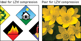
You can take advantage of the characteristics of LZW compression to improve its efficiency and thereby reduce the size of your GIF graphics. The strategy is to reduce the number of colors in your GIF image to the minimum number necessary and to remove stray colors that are not required to represent the image. A GIF graphic cannot have more than 256 colors but it can have fewer colors, down to the minimum of two (black and white). Images with fewer colors will compress more efficiently under LZW compression.
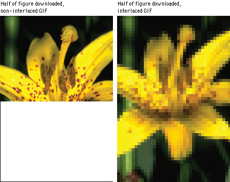
The conventional (non-interlaced) GIF graphic downloads one line of pixels at a time from top to bottom, and browsers display each line of the image as it gradually builds on the screen. In interlaced GIF files the image data is stored in a format that allows browsers that support interlaced GIFs to begin to build a low-resolution version of the full-sized GIF picture on the screen while the file is downloading. Many people find the "fuzzy-to-sharp" animated effect of interlacing visually appealing, but the most important benefit of interlacing is that it gives the reader a preview of the full area of the picture while the picture downloads into the browser.
Interlacing is best for larger GIF images such as illustrations and photographs. Interlacing is a poor choice for small GIF graphics such as navigation bars, buttons, and icons. These small graphics will load onto the screen much faster if you keep them in conventional (non-interlaced) GIF format. In general, interlacing has no significant effect on the file size of GIF graphics.
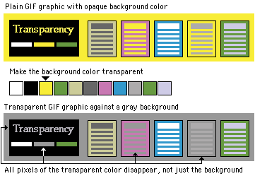
The GIF format allows you to pick colors from the color lookup table of the GIF to be transparent. You can use image-editing software like Photoshop (and many shareware utility programs) to select colors in a GIF graphic's color palette to become transparent. Usually the color selected for transparency is the background color in the graphic.
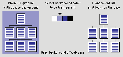
Unfortunately, the transparent property is not selective; if you make a color transparent, every pixel in the graphic that shares that particular color will become also transparent. This can cause unexpected results:
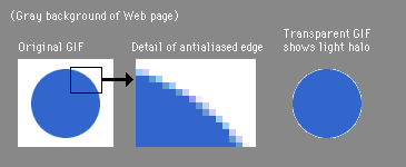
Adding transparency to a GIF graphic can produce disappointing results when the image contains antialiasing (see Typography, Antialiased type). If you use an image-editing program like Photoshop to create a shape set against a background color, Photoshop will smooth the shape by inserting pixels of intermediate colors along the shape's boundary edges. This smoothing, or antialiasing, improves the look of screen images by softening jagged edges. Trouble starts when you set the background color to transparent and then use the image on a Web page against a different background color. The antialiased pixels in the image will still correspond to the original background color. In the example below, when we change the background color from white to transparent (letting the gray Web page background show through), an ugly white halo appears around the graphic:
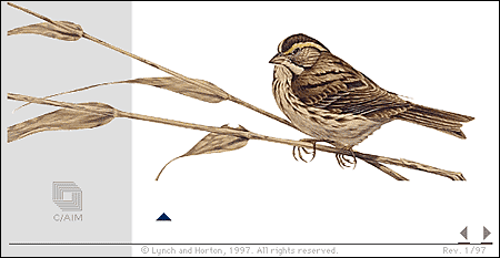
Transparency works best with simple diagrammatic graphics, but it can also work with complex shapes. The GIF graphic of the watercolor painting below (from the second edition of the online version of this guide) can run across the scan column and into the white background because we made the white background of the sparrow painting transparent. We avoided potential problems with a light halo around the leaves in the gray scan column area by retouching the painting to remove the white antialiased "halo" from the leaf edges:
The GIF file format allows you to combine multiple GIF images into a single file to create animation. There are a number of drawbacks to this functionality, however. The GIF format applies no compression between frames, so if you are combining four 30-kilobyte images into a single animation, you will end up with a 120 KB GIF file to push through the wire. The load is lightened somewhat by the fact that animated GIF files stream to the user, so the frames load and play even before the entire file is downloaded. Another drawback of GIF animations is that they are an imposition and a potential distraction. Because there are no interface controls for this file format, GIF animations play whether you want them to or not. And if looping is enabled, the animations play again and again and again. GIF animations are rarely used in a meaningful way, and generally distract readers from the main content of the page. If you are using GIF animation as content — to illustrate a concept or technique where animation is really required — use the technique sparingly.
The other graphic file format commonly used on the Web to minimize graphics file sizes is the Joint Photographic Experts Group (JPEG) compression scheme. Unlike GIF graphics, JPEG images are full-color images (24 bit, or "true color"). JPEG images have generated tremendous interest among photographers, artists, graphic designers, medical imaging specialists, art historians, and other groups for whom image quality is paramount and where color fidelity cannot be compromised by dithering a graphic to 8-bit color. A newer form of JPEG file called "progressive JPEG" gives JPEG graphics the same gradually built display seen in interlaced GIFs . Like interlaced GIFs , progressive JPEG images often take longer to load onto the page than standard JPEGs, but they do offer the reader a quicker preview.
JPEG compression uses a sophisticated mathematical technique called a discrete cosine transformation to produce a sliding scale of graphics compression. You can choose the degree of compression you wish to apply to an image in JPEG format, but in doing so you also determine the image's quality. The more you squeeze a picture with JPEG compression, the more you degrade its quality. JPEG can achieve incredible compression ratios, squeezing graphics down to as much as one hundred times smaller than the original file. This is possible because the JPEG algorithm discards "unnecessary" data as it compresses the image, and it is thus called a "lossy" compression technique. Notice in the example below how increasing the JPEG compression progressively degrades the details of the image:
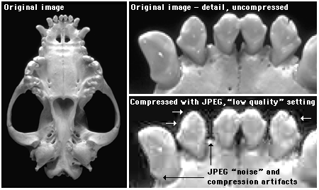
The checkered pattern and the dark "noise" pixels in the compressed image are classic JPEG compression artifacts.
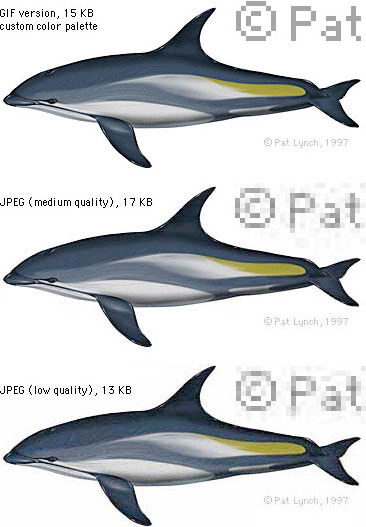
Another example of JPEG compression is shown below. Note the extensive compression noise and distortion present in the bottom dolphin — the download time saved is not worth the degrading of the images.
Once an image is compressed using JPEG compression, data is lost and you cannot recover it from that image file. Always save an uncompressed original file of your graphics or photographs as backup.
The JPEG algorithm was optimized for compressing conventional pictorial photographs and is also good at handling complex illustrations. Photos and artwork with smooth color and tonal transitions and with few areas of harsh contrast or sharp edges are ideal for JPEG compression. Yet most page design elements, diagrams, typography within images, and many illustrations are composed of hard-edged graphics and bright color boundaries that are seldom encountered in photographs. The illustration below shows what happens when you compress an interface graphic (shown in a) in GIF format (b, no compression artifacts) and JPEG compression (c, with JPEG compression "noise" around the text and borders):
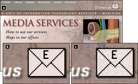
When compressed with JPEG, diagrammatic images such as interface graphics show a noise pattern of compression artifacts around the edges of shapes and text (c, above). The JPEG algorithm is best at compressing smooth tonal transitions and cannot properly reproduce the harsh transitions at the edges of diagrammatic graphics.
Portable Network Graphic (PNG, pronounced "ping") is an image format developed by a consortium of graphic software developers as a nonproprietary alternative to the GIF image format. As mentioned earlier, CompuServe developed the GIF format, and GIF uses the proprietary LZW compression scheme owned by Unisys Corporation. Any graphics tool developer who makes software that saves in GIF format must pay a royalty to Unisys and CompuServe.
PNG graphics were designed specifically for use on Web pages, and they offer a range of attractive features that should eventually make PNG the most common graphic format. These features include a full range of color depths, support for sophisticated image transparency, better interlacing, and automatic corrections for display monitor gamma. PNG images can also hold a short text description of the image's content, which allows Internet search engines to search for images based on these embedded text descriptions. Unfortunately, the PNG graphic format is not yet widely supported, and the current implementation of PNG graphics in the major Web browsers does not fully support all of PNG's features. This should change over the next few years, but do not make a commitment to PNG graphics until you are sure that most of your audience is using browsers that support PNG.
Small page navigation graphics, buttons, and graphic design elements should be handled as non-interlaced GIF graphics. The most conservative approach would be to use colors from the 216-color browser ("Web safe") palette so that they never dither, even on 8-bit display screens. Or, if you choose to use a color scheme for your interface that is not restricted to the Web palette, check to see that the colors you choose default to acceptable alternatives on 8-bit displays.
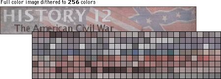
When you convert a full-color image into an 8-bit (256-color) GIF file you could allow Photoshop to choose the 256 colors that best fit that particular image. This results in the optimal GIF image quality — often these images look almost as good as their full-color originals — but the creation of a custom color palette does have drawbacks. If the reader of your page has their monitor set to show only 256 colors at one time then the colors in your GIF images will appear distorted as the browser forces them to display using the 216-color browser palette. Forcing a GIF made from custom palette colors to display within the limited system palette colors can result in ugly distortions of the image. A Web browser running on an 8-bit display has no way to optimize your particular custom GIF colors — it forces the picture to display in the nearest equivalent colors in the browser palette. The result is often color banding, or harsh distortions of the original colors, as seen in the example below:
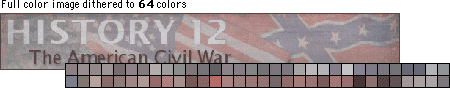
To get around this problem you could convert all your color graphics to GIF files that use only the browser palette of 216 colors. This would ensure that your images look exactly the same — in most cases, poor — no matter how the user's display screen is set up. A better approach is to apply custom palettes to your images and accept that those readers using 8-bit display monitors (a growing minority) will see distorted images. Or you could use the JPEG file format instead.
The image compression in the GIF file format is less efficient than JPEG compression. However, the compression advantages of JPEG don't apply to small to medium-size images (say, up to 200 x 200 pixels). At these sizes GIF images may be only slightly larger than JPEG files. With images larger than 200 x 200 the compression advantages of the JPEG format become more obvious.
JPEG files are inherently full-color (24-bit) images, so preserving the correct colors in the files themselves is not an issue. However, there is no way to prevent JPEG images from dithering when they are displayed on 8-bit screens — any photographic image displayed on a 256-color display will dither. The dithering seen in JPEG images does not compromise image quality any more than if you dithered the images to 256-color GIFs yourself. If you standardize on JPEG images, the majority of your audience will see full-color photographs and illustrations. Standardize on the JPEG format for any photographic or other full-color or grayscale image suitable for JPEG compression.
Most Web page graphics are raster images — often called "bitmap" or "paint" images — composed of a grid of colored pixels. Complex diagrams or illustrations, however, should be created as vector graphics and then converted to raster formats like GIF or JPEG for the Web. Vector graphics (also known as "draw" or "PostScript" graphics) are composed of mathematical descriptions of lines and shapes. Although these graphics cannot (yet) be used directly to illustrate Web pages without requiring users to have a special browser plug-in, there are three major reasons for producing complex diagrams in vector graphics programs:
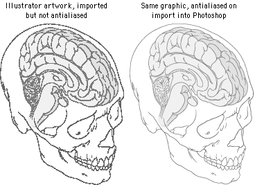
1. Vector graphic illustrations are automatically antialiased when imported into Photoshop or other raster imaging programs and converted to raster graphics:
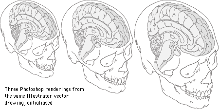
2. Vector graphics can be easily resized as they are imported:
3. Complex artwork created in such vector-based programs as Adobe Illustrator and Macromedia FreeHand is a better investment of your illustration budget, because vector graphics also produce high-resolution images suitable for print, as shown below. The illustrations below and immediately above were produced from the same Illustrator file:
Always save a copy of your original graphics files, and make it a standard practice to create separate new files every time you make significant changes to an image, such as resizing it or changing the file format. After the close of a project all photos and artwork should be kept and stored at their full original resolution and in a format that does not compromise the image quality of the files through "lossy" image compression, as in JPEG. We prefer to archive every image generated in a project. Many small 8-bit GIF or JPEG illustrations on the finished Web page, for example, start out as much larger high-resolution files in Photoshop format. We save all the intermediate pieces, not just the original and final files. This will save you a lot of time if you later change your mind about the best file format for a graphic or need to modify it. If you have archived the full-color Photoshop version of the graphic, you can easily create a new version in a different format. If you save only the final GIFs , you will have lost your full-color version. If you save only the final JPEGs, you will no longer have images without compression artifacts, and recompressing an image that already has JPEG compression noise usually yields poor results.
Netscape Navigator, Microsoft Internet Explorer, and most other browsers support both GIF and JPEG graphics (as of this writing, PNG graphics are not adequately supported). In theory, you could use either graphic format for the visual elements of your Web pages. In practice, however, most Web developers will continue to favor the GIF format for most page design elements, diagrams, and images that must not dither on 8-bit display screens. Designers choose the JPEG format mostly for photographs, complex "photographic" illustrations, medical images, and other types of images in which the compression artifacts of the JPEG process do not severely compromise image quality.
The primary challenge in creating images for Web pages is the relatively low resolution of the computer screen. But today's computer screens can display thousands or millions of colors, and this wealth of color minimizes the limitations of screen resolution. Complex graphics or color photographs often look surprisingly good on Web pages for two reasons:
Digital publishing is color publishing: on the Web there is no economic penalty for publishing in color. Web pages may in fact be the best current means of distributing color photography — it's a lot cheaper than color printing, and it's also more consistent and reliable than all but the most expert (and costly) color printing.
Relative to printed pages the computer screen is a low-resolution medium. When you look at illustrations, photographs, and other sophisticated imagery, however, the differences in quality between conventional four-color printing and the computer screen are not as great as you might expect.
In terms of resolution, the computer screen is limited to about 72 to 92 dots per inch of resolution (see Screen resolution). But most four-color magazine printing is done at 150 dpi, or only about four times the resolution of the computer screen (150 dpi is four times the resolution of 75 dpi because resolution is measured over area, 150 x 150 per square inch):
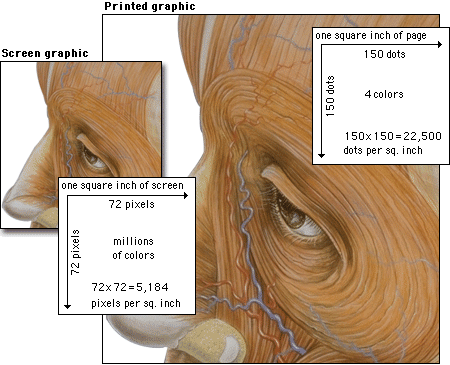
Regarding color reproduction, four-color printed images are separated into four subtractive printing colors (cyan, magenta, yellow, and black). These four inks combined produce the illusion of a full range of colors on the printed page, but ultimately the typical magazine or textbook image is composed of only four colors. By comparison, as mentioned, current computer monitors can display millions of colors, producing a richness of color that easily rivals the best quality color printing. Also, computer screens display transilluminated images — the colored light shines out from the screen. Transilluminated images deliver a much greater range of contrast and color intensity than images printed on opaque paper, which depend on reflected light. Finally, computer displays show color images using the additive RGB (red-green-blue) color system, which can display a much broader and subtler range of colors than conventional four-color printing.
Bottom line: the computer screen is lower in resolution, but because of the other advantages of computer displays, images on Web pages can easily rival color images printed on paper.
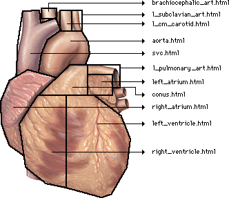
The anatomic graphic below was originally painted at much higher resolution in Adobe Photoshop (1000 x 2000 pixels, 24-bit RGB file). We then reduced a copy to the size above and used Photoshop's "Unsharp Mask" filter (at 60 percent) to restore sharpness. Although this small version of the painting has lost some resolution and color detail, it still shows all the major anatomic landmarks. The extra detail and subtle nuances of high-resolution artwork are not entirely lost when the graphic is reduced to Web page size.
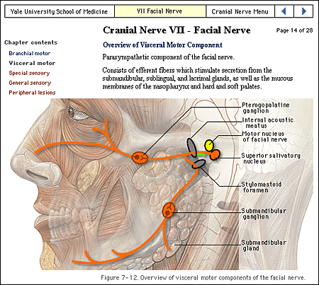
We chose the JPEG file format for the anatomic painting because the artwork is relatively large for a Web page graphic. JPEG compression can be used for paintings or photographs with text labels if you choose the right compression setting. The painting above was compressed in Photoshop at "good" quality, which is the medium-quality setting ("excellent, good, poor"). If you choose the "good" or "excellent" JPEG compression settings, text labels should look acceptable, at least on 16-bit or 24-bit displays. Note that in the anatomic illustration example shown above the text labels are clear and legible, even though close inspection would certainly turn up JPEG noise around the characters.
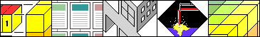
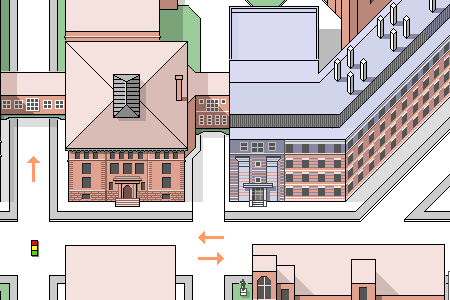
Basic diagrams also work well on the computer screen if they are carefully designed to match the grid of pixels on the screen. Graphics built with orthogonal lines (straight horizontal or vertical lines) or diagonal lines at 45-degree angles work best for the screen, as this enlarged view illustrates:
Complex icons are hard to interpret, and they look mushy and confusing on the screen. Keep icons and navigation graphics as simple as possible:
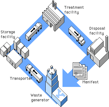
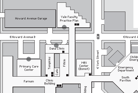
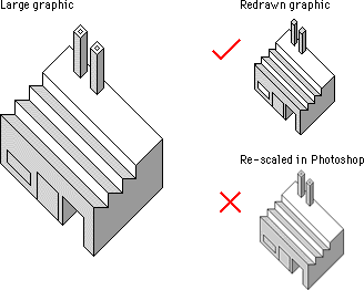
Simple isometric perspective graphics also work well because they depend on straight lines and 45-degree diagonals. Although the restrictions of working within fixed line angles make the technique unsuitable for many diagrammatic graphics, it is possible to build complex illustrations using this technique. The regularity of the isometric line work and the absence of the complexities of perspective bring order to graphics that might otherwise be too complex for Web page presentation:
Another benefit of keeping diagrammatic art and maps simple is that graphic simplicity is ideally suited to the LZW encoding compression algorithm used in GIF graphics (see GIF files). This 450 x 306-pixel GIF graphic is large for a Web page, but it compresses to a mere 8 KB because the contents are well suited to LZW compression:
Be careful about choosing the proper sizes for this type of illustration. Graphics carefully built to match the pixel grid cannot be resized automatically in Photoshop — they must be redrawn by hand to larger or smaller sizes to avoid a mushy, fuzzy look that destroys their effectiveness:
The low resolution of the computer screen is insufficient for displaying diagrams that incorporate many curves or angles; lines that do not follow the pixel grid appear jagged. To optimize these kinds of diagrams for Web pages you'll need to use antialiasing to smooth the boundaries and make the jagged edges less apparent:
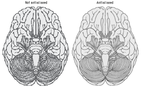
At great magnification antialiased graphics may have fuzzy boundaries, but at normal magnification antialiasing produces smooth, natural-looking line work.
All your page graphics source tags (even small button or icon graphics) should include HEIGHT and WIDTH tags. These tags tell the browser how much space to devote to a graphic on a page, and they instruct the browser to lay out your Web page even before the graphics files have begun to download. Although this does not speed up downloading (only a faster data connection can do that), it does allow the user to see the page layout more quickly. The text blocks will fill out first and then the graphics files will "pour" into the allotted spaces. This means that the user can start to read your page while the graphics are downloading.
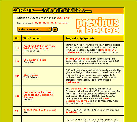
Web background colors offer a "zero-bandwidth" means to change the look of your pages without adding graphics. They also allow you to increase the legibility of your pages, tune the background color to complement foreground art, and signal a broad change in context from one part of your site to another. A List Apart uses background colors as an easy way to enliven the visual impact of their otherwise low-bandwidth pages:
Picking the background color is easy in WYSIWYG (what you see is what you get) graphic Web page layout programs. Unfortunately, picking a color without one of these Web page editors is a procedure only a propellerhead could enjoy. The color is specified in the tag in hexadecimal code, in which the six elements give the red, green, and blue values that blend to make the color. In the tag, the hex code is always preceded by a "#" sign: (#RRGGBB). Because this whole business is now handled visually by the new generation of WYSIWYG page editors and image editors like Adobe Photoshop, we will not delve further into the arcana of hexadecimal RGB color selection.
The Web is rife with pages whose legibility is marginal due to poorly chosen background color – text color combinations. Text that is hard to read is a hindrance for a fully sighted reader, and certain color combinations make pages unreadable for colorblind users (10 percent of males are partially colorblind). The legibility of type on the computer screen is already compromised by low screen resolution. The typical Macintosh or Windows computer screen displays text at 72 to 80 dots per inch (about 5,200 dots per square inch), or almost 300 times lower resolution than a typical magazine page (1,440,000 dots per square inch). Black text on a white (or very slightly tinted) background yields the best overall type contrast and legibility. Black backgrounds are significantly less legible than white backgrounds, even when white type is used for maximum contrast. Colored backgrounds can work as an alternative to plain browser-default gray if the colors are kept in very muted tones, and low in overall color saturation (pastels, light grays, and light earth tones work best).
Early in 1995 Netscape Navigator version 1.1 gave Web page authors the ability to use small tiled GIF or JPEG graphics (or a single large graphic) to form a background pattern behind the Web page. The feature is controversial in Web design discussions, because pages that use large background images take longer to download and because the background patterns tend to make pages harder to read unless they are carefully designed.
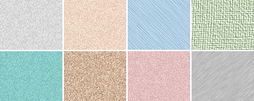
To be suitable for use as a background texture, the graphic should be a small GIF or JPEG, ideally no more than about 100 x 100 pixels in size. In our experience, JPEG background patterns load slightly faster than equivalent GIF graphics. Typical graphics used for background patterns are homogeneous textures:
The image will repeat both horizontally and vertically to fill the browser window.
How you might use background graphics depends entirely on your goals for your Web site, the access speeds that are typical for your target audience, and whether a graphic background matches the aesthetic goals of your Web site. It is foolish to use large or visually complex background textures on any page that is heavily accessed by busy people looking for work-related information — the long download times, amateurish aesthetics, and poor legibility will simply annoy your users. That said, in the hands of a skilled graphic designer who is creating Web pages designed for graphic impact, the option to use background textures opens up many interesting visual design possibilities. This is particularly true in universities and commercial organizations where fast network access is commonplace and bandwidth is not the obstacle it is to many modem-based users.
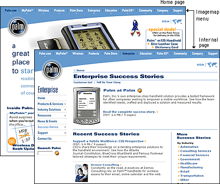
Imagemaps offer a way to define multiple "live" link areas within a graphic on a Web page. Imagemaps have become a standard feature of most professionally designed Web sites because they offer an effective combination of visual appeal and, when used properly, space-efficient functionality. Imagemaps are particularly effective when incorporated into moderately sized "splash" graphics at the top of home pages or into the "signature" graphics or logos that define your pages. For example, Palm uses a space-efficient imagemap menu on its home page. The graphic is more than a menu; it helps define the signature "look" of pages within the Palm Web site:
Imagemaps are the only way to incorporate multiple links into a graphic illustration, as in this anatomic example:
Imagemaps are also the ultimate way to overcome the vertical, list-oriented, graphically inflexible norms of conventional Web pages built with standard HTML tags. With imagemaps you can abandon HTML page layout and build links into large graphics, just as you might in CD-ROM authoring programs. Keep in mind, however, that such designs are suitable only for audiences with high bandwidth access to the Web or the local intranet.
Whenever you introduce nontext elements to your Web design you reduce the accessibility of your pages. For the purposes of universal access, text is the ultimate content type: it can be most widely adapted for use with different devices and assistive technologies. But the Web is a visual medium, and access to images and other nontext materials is one of the reasons why people turn to the Web over other information sources. As a Web page designer, you should keep this restriction in mind and take measures to ensure that your design decisions do not exclude disabled users from your Web page content.
Your site navigation can be supplied using graphics such as buttons, imagemaps, or animations, but it is critical that you design your navigation system for all users. If your site's navigation interface uses graphic menus, always provide an alternate navigation route using basic text links. Users without graphics capabilities, such as those using text-only browsers or visually impaired users, will not be able to use your site if you provide only graphic menus.
HTML has several built-in fallbacks designed to allow your content to degrade gracefully under different viewing conditions. One of these is ALT, an attribute of the IMG tag. The ALT attribute allows you to supply an alternate text description with any images you place on your page. Users who cannot see your images for whatever reason will see or hear the text you supply using the ALT attribute:
<IMG SRC="banner.gif" HEIGHT="30" WIDTH="535" ALT="Web Style Guide">
In the above example, users accessing the Web Style Guide page with graphic loading turned off will see the alternate text "Web Style Guide" in place of the banner graphic. Visually impaired users using assistive technology to access Web pages will hear the text "Web Style Guide" read aloud. This way you can use a graphic banner to establish site identity, but users who do not see images will still know what site they are visiting.
Writing good ALT-text is an epigrammatic art, challenging your ability to describe the content and function of an image in just a few words. Browsers do not currently wrap ALT-text, so users reading ALT-text from the screen will normally see only a few words, though users who are read ALT-text by software will hear the entire description. Think not only about what the image is but also how it functions on the page. What does the image say? What is its purpose? Is it there to identify your organization? If so, write ALT-text that identifies your organization. Does it provide navigation options? Write ALT-text that describes where the user will go after clicking on the image. Think about the primary purpose of the graphic and attempt to convey it in ten words or fewer.
<IMG SRC="up.gif" HEIGHT="10" WIDTH="10" ALT="Go to top of page">
Also include ALT-text describing link destinations for imagemap menus so that users who cannot see the graphic menu will know where they will go if they select an imagemap link.
At times ALT-text is not useful — for example, for interface images like custom bullets or for invisible spacer graphics — and in those cases you should include an empty ALT attribute (ALT="") in your IMG tag. An empty ALT attribute hides the graphic from text-only browsers and assistive technologies like screen readers. If you leave out the ALT-text, users could hear the words "image, image, image, image" because most software is designed to let the user know when there is an undescribed image on the page. If instead you include an empty ALT attribute, the software knows to skip the image.
Brewer, Judy, ed. 2001. How people with disabilities use the Web. http://www.w3c.org/wai/eo/Drafts/pwd-Use-Web (31 March 2001)
Chisholm, Wendy, Gregg Vanderheiden, and Ian Jacobs, eds. 1999. Web content accessibility guidelines 1.0. http://www.w3c.org/tr/wai-webcontent/wai-pageauth.html (17 January 2001).
Niederst, Jennifer. 1999. Web design in a nutshell: A desktop quick reference. Sebastopol, Calif.: O'Reilly.
Nielsen, Jakob. 1995. The alertbox: Current issues in Web usability. http://www.useit.com/alertbox.
———. 1999. Designing Web usability: The practice of simplicity. Indianapolis, Ind.: New Riders.
Pring, Robert. 2000. www.color: Effective use of color in designing Web pages. New York: Watson-Guptill.
Siegel, David. 1997. Creating killer Web sites, 2d ed. Indianapolis, Ind.: Hayden Books.
Webster, Timothy, Paul Atzberger, and Andrew Zolli. 1997. Web designer's guide to graphics: PNG, GIF , and JPEG. Indianapolis, Ind.: Hayden Books.
Weinman, Lynda. 1999. Designing Web graphics: How to prepare images and media for the Web, 3d ed. Indianapolis, Ind.: New Riders.