If you ask why something works and you push back far enough, eventually everything seems to be based on contrast: the ability to distinguish one thing from another. Composition, sequencing, even legibility all rely on devices that affect the contrast between things.
— Chris Pulman, The Education of a Graphic Designer
We seek clarity, order, and trustworthiness in information sources, whether traditional paper documents or Web pages. Effective page design can provide this confidence. The spatial organization of graphics and text on the Web page can engage readers with graphic impact, direct their attention, prioritize the information they see, and make their interactions with your Web site more enjoyable and efficient.
Graphic design creates visual logic and seeks an optimal balance between visual sensation and graphic information. Without the visual impact of shape, color, and contrast, pages are graphically uninteresting and will not motivate the viewer. Dense text documents without contrast and visual relief are also harder to read, particularly on the relatively low-resolution screens of personal computers. But without the depth and complexity of text, highly graphical pages risk disappointing the user by offering a poor balance of visual sensation, text information, and interactive hypermedia links. In seeking this ideal balance, the primary design constraints are the restrictions of HTML and the bandwidth limitations on user access ranging from slow modems to high-speed connections such as Ethernet or DSL.
Visual and functional continuity in your Web site organization, graphic design, and typography are essential to convince your audience that your Web site offers them timely, accurate, and useful information. A careful, systematic approach to page design can simplify navigation, reduce user errors, and make it easier for readers to take advantage of the information and features of the site.
The primary task of graphic design is to create a strong, consistent visual hierarchy in which important elements are emphasized and content is organized logically and predictably.
Graphic design is visual information management, using the tools of page layout, typography, and illustration to lead the reader's eye through the page. Readers first see pages as large masses of shape and color, with foreground elements contrasting against the background field. Secondarily they begin to pick out specific information, first from graphics if they are present, and only then do they start parsing the harder medium of text and begin to read individual words and phrases:
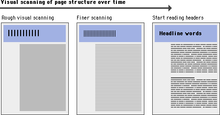
The overall graphic balance and organization of the page is crucial to drawing the reader into your content. A dull page of solid text will repel the eye as a mass of undifferentiated gray, without obvious cues to the structure of your information. A page dominated by poorly designed or overly bold graphics or typography will also distract or repel users looking for substantive content. You will need to strike an appropriate balance between attracting the eye with visual contrast and providing a sense of organization:
Visual balance and appropriateness to the intended audience are the keys to successful design decisions. The most effective designs for general Internet audiences use a careful balance of text and links with relatively small graphics. These pages load into browsers quickly, even when accessed from slow modems, yet still achieve substantial graphic impact:
When establishing a page design for your Web site, consider your overall purpose, the nature of your content, and, most important, the expectations of your readers.
Establish a layout grid and a style for handling your text and graphics, then apply it consistently to build rhythm and unity across the pages of your site. Repetition is not boring; it gives your site a consistent graphic identity that creates and then reinforces a distinct sense of "place" and makes your site memorable. A consistent approach to layout and navigation allows readers to adapt quickly to your design and to confidently predict the location of information and navigation controls across the pages of your site.
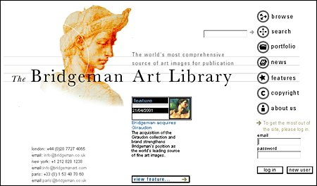
If you choose a graphic theme, use it throughout your Web site. The Bridgeman Art Library home page banner, below, sets the graphic theme for the site and introduces distinctive typography and a set of navigation buttons:
Below is a banner at the top of an interior page in the Bridgeman Art Library site. Note how the typography and the navigation theme are carried over to the interior banners. There is no confusion about whose site you are navigating through:
Although Web pages and conventional print documents share many graphic, functional, and editorial similarities, the computer screen, not the printed page, is the primary delivery site for Web-based information, and the computer screen is very different from the printed page. Computer screens are typically smaller than most opened books or magazines. A common mistake in Web design is spreading the width of page graphics beyond the area most viewers can see on their seventeen- or nineteen-inch display screens:
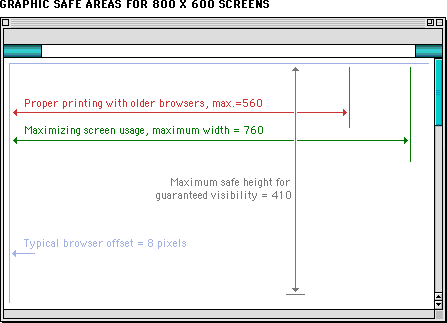
The "safe area" for Web page graphics is determined by two factors: the minimum screen size in common use and the width of paper used to print Web pages.
Most display screens used in academia and business are seventeen to nineteen inches (forty-three to forty-eight centimeters) in size, and most are set to display an 800 x 600-pixel screen. Web page graphics that exceed the width dimension of the most common display screens look amateurish and will inconvenience many readers by forcing them to scroll both horizontally and vertically to see the full page layout. It's bad enough to have to scroll in one (vertical) direction; having to scroll in two directions is intolerable.
Even on small computer screens it is possible to display graphics that are too wide to print well on common letter-size, legal-size, or A4 paper widths. Current browser versions attempt to resolve printing problems by providing the option to scale the page contents to fit the standard paper width. However, many users are unaware of the "fit to page" option. Another problem is that wide pages that are scaled to fit are often illegible because the type has been scaled excessively. In many Web pages, however, printing is a secondary concern. Just be aware that your readers will either lose the right margin of your layout or produce a scaled document if they print wide pages in standard vertical print layout. Pages with lots of text should always be designed to print properly because most readers will print those pages to read them more comfortably. If the page layout is too wide readers will lose several words from each line of text down the right margin or have to contend with small type.
The graphic safe area dimensions for printing layouts and for page layouts designed to use the maximum width of 800 x 600 screens are shown below:
Graphic "safe area" dimensions for layouts designed to print well:
Maximum width = 560 pixels
Maximum height = 410 pixels (visible without scrolling)
Graphic "safe area" dimensions for layouts designed for 800 x 600 screens:
Maximum width = 760 pixels
Maximum height = 410 pixels (visible without scrolling)
Determining the proper length for any Web page requires balancing four factors:
Researchers have noted the disorientation that results from scrolling on computer screens. The reader's loss of context is particularly troublesome when such basic navigational elements as document titles, site identifiers, and links to other site pages disappear off-screen while scrolling. This disorientation effect argues for the creation of navigational Web pages (especially home pages and menus) that contain no more than one or two screens' worth of information and that feature local navigational links at the beginning and end of the page layout. Long Web pages require the user to remember too much information that scrolls off the screen; users easily lose their sense of context when the navigational buttons or major links are not visible:
In long Web pages the user must depend on the vertical scroll bar slider (the sliding box within the scroll bar) to navigate. In some graphic interfaces the scroll bar slider is fixed in size and provides little indication of the document length relative to what's visible on the screen, so the reader gets no visual cue to page length. In very long Web pages small movements of the scroll bar can completely change the visual contents of the screen, leaving the reader no familiar landmarks to orient by. This gives the user no choice but to crawl downward with the scroll bar arrows or risk missing sections of the page.
Long Web pages do have their advantages, however. They are often easier for creators to organize and for users to download. Web site managers don't have to maintain as many links and pages with longer documents, and users don't need to download multiple files to collect information on a topic. Long pages are particularly useful for providing information that you don't expect users to read online (realistically, that means any document longer than two printed pages). You can make long pages friendlier by positioning "jump to top buttons" at regular intervals down the page. That way the user will never have to scroll far to find a navigation button that quickly brings him or her back to the top of the page.
All Web pages longer than two vertical screens should have a jump button at the foot of the page:
If a Web page is too long, however, or contains too many large graphics, the page can take too long for users with slow connections to download. Very large Web pages with many graphics may also overwhelm the RAM (random access memory) limitations of the user's Web browser, causing the browser to crash or causing the page to display and print improperly.
It makes sense to keep closely related information within the confines of a single Web page, particularly when you expect the user to print or save the text. Keeping the content in one place makes printing or saving easier. But more than four screens' worth of information forces the user to scroll so much that the utility of the online version of the page begins to deteriorate. Long pages often fail to take advantage of the linkages available in the Web medium.
If you wish to provide both a good online interface for a long document and easy printing or saving of its content:
In general, you should favor shorter Web pages for:
In general, longer documents are:
Consistency and predictability are essential attributes of any well-designed information system. The design grids that underlie most well-designed paper publications are equally necessary in designing electronic documents and online publications, where the spatial relations among on-screen elements are constantly shifting in response to the user's input and system activity.
Current implementations of HyperText Markup Language do not allow the easy flexibility or control that graphic designers routinely expect from page layout software or multimedia authoring tools. Yet HTML can be used to create complex and highly functional information systems if it is used thoughtfully. When used inappropriately or inconsistently, the typographic controls and inlined graphics of Web pages can create a confusing visual jumble, without apparent hierarchy of importance. Haphazardly mixed graphics and text decrease usability and legibility, just as they do in paper pages. A balanced and consistently implemented design scheme will increase readers' confidence in your site.
No one design grid system is appropriate for all Web pages. Your first step is to establish a basic layout grid. With this graphic "backbone" you can determine how the major blocks of type and illustrations will regularly occur in your pages and set the placement and style guidelines for major screen titles, subtitles, and navigation links or buttons. To start, gather representative examples of your text, along with some graphics, scans, or other illustrative material, and experiment with various arrangements of the elements on the page. In larger projects it isn't possible to exactly predict how every combination of text and graphics will interact on the screen, but examine your Web layout "sketches" against both your most complex and your least complex pages.
Your goal is to establish a consistent, logical screen layout, one that allows you to "plug in" text and graphics without having to stop and rethink your basic design approach on each new page. Without a firm underlying design grid, your project's page layout will be driven by the problems of the moment, and the overall design of your Web site will seem patchy and confusing.
A Web page can be almost any length, but you've only got about forty-five square inches "above the fold" — at the top of your page — to capture the average reader, because that is all he or she will see as the page loads. One crucial difference between Web page design and print page design is that when readers turn a book or magazine page they see not only the whole next page but the whole two-page spread, all at the same time. In print design, therefore, the two-page spread is the fundamental graphic design unit.
Print design can achieve a design unity and density of information that Web page design cannot emulate. Regardless of how large the display screen is, the reader still sees one page at a time, and even a twenty-one-inch screen will display only as much information as is found in a small magazine spread:
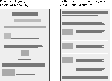
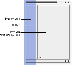
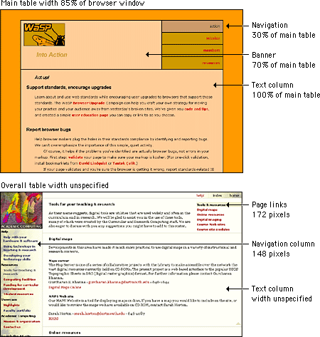
Most Web page designs can be divided vertically into zones with different functions and varying levels of graphics and text complexity. As vertical scrolling progressively reveals the page, new content appears and the upper content disappears. A new graphic context is established each time the reader scrolls down the page. Web page layouts should thus be judged not by viewing the whole page as a unit but by dividing the page into visual and functional zones and judging the suitability of each screen of information. Notice the vertical structure of the home page reproduced below. The top screen of information is much denser with links because it is the only area that is sure to be visible to all users:
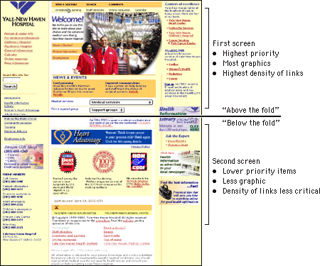
Many Web authors surrender to the giddy thrills of large home page graphics, forgetting that a Web page is not just a visual experience — it has to function efficiently to retain its appeal to the user. Remember that the page builds its graphic impact only gradually as it is downloaded to the user. The best measure of the efficiency of a page design is the number of options available for readers within the top four inches of the page. A big, bold graphic may tease casual Web surfers, but if it takes the average reader thirty seconds to download the top of your page, and there are few links to be seen until he or she scrolls down the page (causing even longer delays), then you may lose a big part of your audience before you offer them links to the rest of your site.
Careful graphic design will give your Web site a unique visual identity. A "signature" graphic and page layout allows the reader to grasp immediately the purpose of the document and its relation to other pages. Graphics used within headers can also signal the relatedness of a series of Web pages. Unlike designers of print documents, designers of Web systems can never be sure what other pages the reader has seen before linking to the current page. Sun Microsystems's many Web pages and subsites all include a signature header graphic that includes basic navigation links:

Even if you choose not to use graphics on your pages, the header area of every Web page should contain a prominent title at or near its top. Graphics placed above the title line should not be so large that they force the title and introductory text off the page on standard office-size display screens. In a related series of documents there may also be subtitles, section titles, or other text elements that convey the relation of the displayed document to others in the series. To be effective, these title elements must be standardized across all the pages in your site.
Every Web page should contain basic data about the origin and age of the page, but this repetitive and prosaic information does not need to be placed at the top of the page. Remember, too, that by the time readers have scrolled to the bottom of your Web page the navigation links you might have provided at the top may no longer be visible. Well-designed page footers offer the user a set of links to other pages in addition to essential data about the site.
The pages in the IBM Web site all carry a distinctive footer graphic with a consistent visual and functional identity:
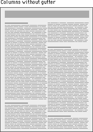
Laying out Web pages involves a bit of wizardry. HTML was designed by engineers and scientists who never envisioned it as a page layout tool. Their aim was to provide a way to describe structural information about a document, not a tool to determine a document's appearance. Once the real world started to work on the Web, graphic designers began adapting the primitive tools of HTML to produce documents that looked more like their print counterparts. The point was not to produce "jazzier" or "prettier" pages. The layout conventions of print documents have evolved over hundreds of years for concrete and practical reasons, and they offer many functional advantages over the simplistic, single-column page layout envisioned by the original designers of the World Wide Web.
The Web is a flexible medium designed to accommodate different types of users and a variety of display devices. Unlike a printed document, which is "fixed" in its medium, the look of a Web page depends on such elements as the display size, resolution, and color settings, the height and width of the browser window, software preferences such as link and background color settings, and available fonts. Indeed, there is no way to have complete control over the design of a Web page. The best approach, then, is to embrace the medium and design flexible pages that are legible and accessible to all users.
One of the visual properties that Cascading Style Sheets are meant to describe is how elements are positioned on the page. Style sheet positioning allows designers to set margins, to position text and images on the page relative to one another, to hide and show elements, and to stack elements so they overlay one another. In theory, style sheet positioning should provide all the design control needed to lay out visually appealing and legible Web pages. In practice, however, browser inconsistencies have rendered style sheet positioning useless, at least for the time being. Though the W3C specifications for style sheet positioning contain most of the tools needed for good design, Microsoft and Netscape have done a particularly poor job of implementing them, so that properties such as borders and margins display quite differently from browser to browser. If you are creating a site for a diverse audience you should steer clear of style sheet positioning for now and design your pages using layout tables as described below. If standards compliance is a priority, use style sheet positioning for page layout, but keep your layouts simple and be ready to accept variability across browsers and platforms.
If you simply place a chunk of text on a Web page, the dimensions of the viewer's browser window will determine the line length. When the user resizes his or her window, the text reflows to fill the new space. Although this adaptable "feature" of Web documents is central to the premise of the Web, it can hinder the user's experience with the content. All the issues of legibility, readability, and style that we discuss in this manual rely on the Web designer's ability to position words, images, and screen elements on the "page" with some precision. Without some adherence to established typographic conventions you may confuse and ultimately lose your readers.
Because of the limitations of HTML and the inconsistencies of CSS, the only reliable layout tools for site designers at this time are HTML tables.
The ideal line length for text layout is based on the physiology of the human eye. The area of the retina that is used for tasks requiring high visual acuity is called the macula. The macula is small, typically less than 15 percent of the area of the retina. At normal reading distances the arc of the visual field covered by the macula is only a few inches wide — about the width of a well-designed column of text, or about twelve words per line. Research shows that reading slows and retention rates fall as line lengths begin to exceed the ideal width, because the reader then needs to use the muscles of the eye or neck to track from the end of one line to the beginning of the next line. If the eye must traverse great distances on a page, the reader is easily lost and must hunt for the beginning of the next line. Quantitative studies show that moderate line lengths significantly increase the legibility of text. Use tables to limit the line length, ideally to ten to twelve words per line.
Margins define the reading area of your page by separating the main text from nontext elements, such as interface elements and other unrelated graphics. Margins also provide contrast and visual interest. Use table cells to establish margins, and use them consistently throughout your site to provide unity.
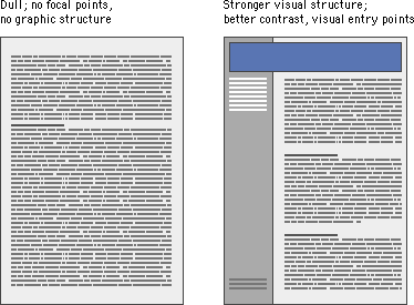
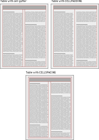
One common use of tables that increases both legibility and functionality of page layouts is a multicolumn layout, with the page divided into columns of main text, site navigation, and perhaps a third column with page-level navigation, pull-quotes, and links to related sites. Multiple columns provide a flexible space for variations in page layout and narrow the text column to a comfortable line length.
In print the space between columns is called a gutter. Gutters keep columns from running into one another:
You can use tables to create gutters in three ways: (1) by adding a cell to your table that functions as the gutter, (2) by using the CELLPADDING attribute of the TABLE tag (the space between the cell contents and the cell), and (3) by using the CELLSPACING attribute of the TABLE tag (the space surrounding the cell):
When we talk about tables we are not speaking of the beveled beauties that HTML offers to present tabular content. We are using tables to get around the limitations of HTML, and we are using them in ways for which they were not intended. These are invisible tables whose sole purpose is to give us control over page elements, so be sure to set BORDER="0" in your TABLE tag. And if you do use tables to present tabular information, use spacing, alignment, and indents, not borders, to delimit tabular information.
The behavior of an HTML table depends largely on how its cells are defined. One "feature" of tables is that they try to be accommodating; they expand and collapse to accommodate their contents and to fit the dimensions of the viewer's browser window. In their most basic form, tables are not much more precise than plain text.
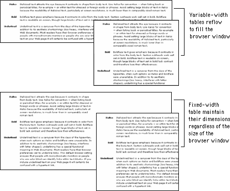
It is possible to create flexible layout tables that resize gracefully without sacrificing the integrity of your design, but if you are turning to layout tables for precision you will need to use fixed-width layout tables.
Putting content into a fixed-width table means that your page layout will be stable whatever the size of the user's screen or browser window. Designing in a stable environment means that you can fix the position of elements on the page and control typographic features such as line length and spacing. A downside of a controlled layout is that on large display screens a major portion of screen real estate goes unused. You can avoid the "wasteland" effect of a fixed layout by centering the table in the browser window or by designing a background graphic to fill the empty areas of the screen.
In a fixed-width table you must define cell widths with absolute values. This will keep the tables from expanding to fill the window. Then, to keep tables from collapsing when the browser window is too small to accommodate their dimensions, include an invisible image equal to the width of the cell in each table cell. These two techniques will force table cells to maintain their dimensions regardless of the size of the browser window.
A popular viewpoint is that designers should embrace the nature of Web documents and create flexible layouts that adapt to different viewing conditions. To do this, you need to be willing to abandon control of aspects of your page design, notably line length. Flexible design is in many ways more challenging than fixed design because it requires a deep understanding of HTML and its implementation across platforms and browsers. It also requires that you think "outside the box" of your own configuration and come up with graphics and layouts that will still "work" under varying viewing conditions.
Tables are inherently flexible, so one approach to flexible design is to let table cells size themselves according to their contents and the size of the browser window. Another approach is to specify cell widths using percentage values; for example, set the left scan column width to 40 percent and the main text column width to 60 percent. That way the columns will resize when the window size is changed, but they will always maintain their relative proportions regardless of the size of the browser window. You can also use a combination of fixed and unspecified table cell widths to create a flexible layout. Using this technique you specify in pixels the width of the columns that require absolute positioning — for example, a navigation column or gutter — and leave the remaining column, such as the text column, unspecified so that it adapts to fill the screen.
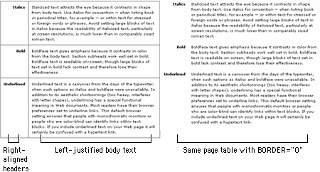
Tables can be used to combine different text alignments on the page. In this example the text in the left column is right justified, and the text in the right is left justified.
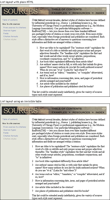
Tables can also be used to format such elements as bulleted lists or indents. For example, even with the aid of style sheets, the BLOCKQUOTE or list elements of HTML may produce clumsy-looking results, with overly indented text and excessive white space. You can use invisible tables to control more precisely how these typographic devices render on the page.
You can use tables to color areas of your pages by placing the BGCOLOR attribute in your table tag and assigning it a color. You can color an entire table, a table row, or an individual table cell. Table coloring is an easy, low-bandwidth approach to adding visual identity and structure to a page without relying on graphics.
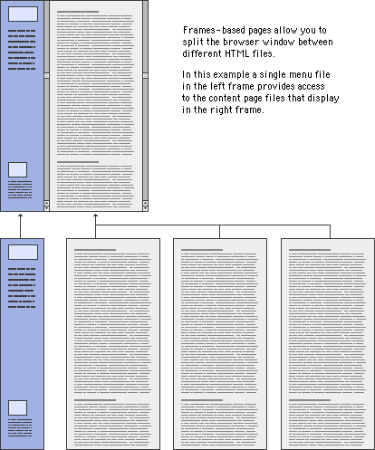
Tables give the designer much greater flexibility in positioning images on a page than simple inline image placement. You can use tables to create complex layouts that combine text and images or multimedia materials. The example below is shown with borders both on and off to depict the underlying table used to establish the layout:
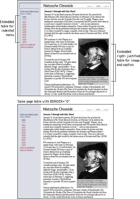
Something fancy you can do with tables is to take a composite image, split it in pieces, and then recombine it in the cells of a table. This technique is useful for creating wraparound effects, image captions, or rollovers. The following example is depicted with borders on and off to show how the table is formatted:
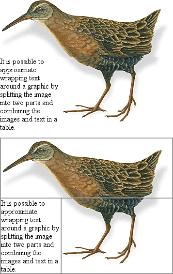
Watch out for hard returns in your HTML code when using tables to join an image. A hard return before a closing table data tag (</TD>) will add space between the table cells. You will also need to set the CELLPADDING, CELLSPACING, and BORDER parameters of the TABLE tag to zero in order for the image to join correctly. Finally, be sure to include an invisible image to keep the cells in your tables from collapsing (see the section on fixed-width tables).
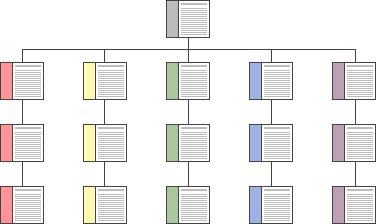
Frames are meta-documents that call and display multiple HTML documents in a single browser window. A frame document contains no BODY HTML tags, just the parameters for the frames and the URLs of the HTML documents designated to fill them. Frames-based pages do not function as an integrated unit, which is both good and bad. Frames are useful for certain content and greatly facilitate site maintenance. They provide a good way to maintain narrative and design consistency in your site; you can split the browser screen between site navigation and the material you wish to bring up with a link.
But frames also impose interface and design limitations. Frames can easily confuse readers who wish to print material on a page or bookmark a page for later reference or navigate using the browser's "Forward" and "Back" buttons. And screen space becomes an issue with frames; if you use frames to divide the browser screen, you will force many readers to scroll both horizontally and vertically to see the full contents of each frame. The current consensus among Web design and usability experts is that frames should be used only in the rare instances when their limited advantages clearly outweigh the many problems they can cause.
Frames are useful in a site whose contents are expected to change frequently. Because a frames-based site can be designed to have a single file for navigation, if you add or remove pages from the site you will have to modify only that one file. Our online Web Style Guide, for example, requires that a number of files be changed if we add or delete a page because each page in the site has its own navigation. If we had used frames in our design, we would have had a single file for the section menu, and when we needed to add a page, only that file would have had to be changed to reflect the addition. As it is, when we add a page to a section we must edit each file in that section to add the new link.
Frames can give a targeted area of your site a functional coherence. Say your site contains a collection of poems by Emily Dickinson. You could create a virtual "reading room" for her poetry using frames, with the leftmost frame providing the navigation links and the main frame at the right displaying the poems. Because most visitors linger in this area and would use the links you provide for navigation, the quirky navigation of the "Back" button would not be too intrusive.
You can also use frames to provide additional interactivity to your page. Frames allow you to put a page up on the user's screen and change its contents without rewriting the screen. The frames can interact; clicking a link in one frame can change the contents of the other. For example, a text with annotations in one frame can be linked to a footer frame, so that clicking on the text reference fills the footer frame with the corresponding note:
Many page designers have avoided frames because of their prescribed borders and limited flexibility. Current versions of browser software, however, allow many more frame parameters to be defined. In fact, frame borders can now be set to zero. This allows you to design using the functionality of frames without requiring them to be visual and perhaps inharmonious elements on your page.
The visual relationship between the content in frames is usually obvious for users who can see: for example, navigation links in the left frame, content in the right. Without the benefit of visual cues, however, blind users will have difficulty orienting themselves in a frames-based layout. As discussed above, there are many reasons to avoid a frames-based layout, but if you must use frames, be sure to include titles for FRAMESET tags and a NOFRAMES alternative to navigating your site.
<FRAMESET COLS="20%, 80%" TITLE="Web Style Guide">

<FRAME SRC="nav.html" TITLE="Navigation">

<FRAME SRC="chapter1.html" TITLE="Chapter 1: Process">

<NOFRAMES><A HREF="content.html" TITLE="Table of Contents">Web Style Guide Table of Contents</A>

</NOFRAMES>

</FRAMESET>
Readers experience Web pages in two ways: as a direct medium where pages are read online and as a delivery medium to access information that is downloaded into text files or printed onto paper. Your expectations about how readers will typically use your site should govern your page design decisions. Documents to be read online should be concise, with the amount of graphics carefully "tuned" to the bandwidth available to your mainstream audience. Documents that will most likely be printed and read offline should appear on one page, and the page width should be narrow enough to print easily on standard paper sizes.
Each page should contain a title, an author, an institutional affiliation, a revision date, copyright information, and a link to the "home page" of your site. Web pages are often printed or saved to disk, and without this information there is no easy way to determine where the document originated. Think of each page in your site as a newspaper clipping, and make sure that the information required to determine its provenance is included.
Don't set out to develop a "style" for your site, and be careful about simply importing the graphic elements of another Web site or print publication to "decorate" your pages. The graphic and editorial style of your Web site should evolve as a natural consequence of consistent and appropriate handling of your content and page layout.
In page layout the top of the page is always the most dominant location, but on Web pages the upper page is especially important, because the top four inches of the page are all that is visible on the typical display screen. Use this space efficiently and effectively.
Subtle pastel shades of colors typically found in nature make the best choices for background or minor elements. Avoid bold, highly saturated primary colors except in regions of maximum emphasis, and even there use them cautiously.
Horizontal rules, graphic bullets, icons, and other visual markers have their occasional uses, but apply each sparingly (if at all) to avoid a patchy and confusing layout. The same consideration applies to the larger sizes of type on Web pages. One reason professional graphic designers are so impatient with plain HTML is that the H1 and H2 header tags display in grotesquely large type on most Web browsers. The tools of graphic emphasis are powerful and should be used only in small doses for maximum effect. Overuse of graphic emphasis leads to a "clown's pants" effect in which everything is garish and nothing is emphasized.
Every Web browser interprets HTML and CSS tags a little differently. Tables, forms, and graphic positioning and alignment tags will all work a bit differently in each brand or operating system version of Web browser. These subtleties normally pass unnoticed, but in very precise or complex Web page layouts they can lead to nasty surprises. Never trust the implementation of HTML, CSS, JavaScript, Java, or any plug-in architecture until you have seen your Web pages displayed and working reliably in each brand of browser. If significant numbers of your readers are using the Macintosh, Linux, or UNIX operating systems, you should also test your more complex pages and programming functionality in those operating systems. Unfortunately, platform-specific bugs remain common in the major Web browsers.
Many accessibility issues have to do with presenting certain types of content, and these are covered in the chapters on typography, graphics, and multimedia. But you can take measures with your page design to improve access for users with physical disabilities, particularly those who use assistive technologies to access Web pages. There are also basic decisions you'll need to make about your design approach: whether to adopt a no-holds-barred stance and push the boundaries of Web design or create simple, clear designs that will accommodate all users.
The biggest page-design barrier for disabled users is the use of layout tables. In particular, layout tables can make things unpleasant for blind users. Many blind users rely on software that reads Web pages aloud or outputs information to a speech synthesizer or braille display. Current software looks at the HTML code of the pages and reads tables in a cell-by-cell, or linearized, fashion. This means that each cell of the table becomes a line or paragraph of text that is read in sequence (imagine releasing all content from table cells and displaying it down a single-column page). A complex layout containing multiple nested tables will produce a sort of aural cubism, with unrelated bits of information appearing from nowhere and disrupting the natural flow of the content. Worse still is the case with older screen readers, which look not at source code but instead at the rendered page. This software starts at the top left of the page and reads line by line, producing a garbled stream of gibberish for the multicolumn layouts that are so common on the Web.
The best solution is to use CSS instead of layout tables to create columns and to control spacing, but as discussed above, browser support remains too patchy and inconsistent for style sheet positioning to be a real option (see Layout with Style Sheets). Until CSS support improves, keep your use of layout tables simple and clean. Each time you add another nested table, first consider whether it is essential to your design and if the function could be handled some other way. The simpler the table, the better sense it will make when linearized.
Attention to accessibility needn't squelch the creative and experimental nature of Web design. There is room on the Web for designs based on complex tables, large graphics, and technologies such as Flash, but these pages need to come with an equivalent, accessible version. If there is simply no way to design your primary pages for access, provide a link to an alternative page containing the same or equivalent content in a more accessible format.
If you use graphics for navigation, be sure to include redundant text links so that those users who cannot see your graphics have an alternate method for navigating your site. Also be sure to include the ALT attribute for all graphics and imagemaps (see Graphics, ALT-text).
All users benefit from clear and consistent Web site design, but for some users it is critical. With a lack of spatial cues and with radically different approaches to navigation that must be relearned at every site, it is far too easy to get disoriented or lost on the Web. For people with cognitive disabilities such as memory or learning disabilities, this difficulty is magnified manyfold. In the long run, there is really no place on the Web for a clever, quirky, or highfalutin design approach. Stick with a simple language and navigation applied consistently throughout your site, and everyone will benefit.
Beach, M., and E. Floyd. 1998. Newsletter sourcebook, 2d ed. Cincinnati, Ohio: Writer's Digest.
Brewer, Judy, ed. 2001. How people with disabilities use the Web. http://www.w3c.org/wai/eo/Drafts/pwd-Use-Web (31 March 2001).
Bringhurst, Robert. 1996. The elements of typographic style, 2d ed. Vancouver, B.C.: Hartley and Marks.
Chisholm, Wendy, Gregg Vanderheiden, and Ian Jacobs, eds. 1999. Web content accessibility guidelines 1.0. http://www.w3c.org/tr/wai-webcontent/wai-pageauth.html (17 January 2001).
Harrower, Tim. 1998. The newspaper designer's handbook, 4th ed. Boston: McGraw-Hill.
Hurlburt, Allen. 1978. The grid: A modular system for the design and production of newspapers, magazines, and books. New York: Van Nostrand Reinhold.
Lie, Håkon Wium, and Bert Bos. 1999. Cascading Style Sheets: Designing for the Web, 2d ed. Reading, Mass.: Addison-Wesley.
Meyer, Eric A. 2000. Cascading Style Sheets: The definitive guide. Sebastopol, Calif.: O'Reilly.
Müller-Brockmann, Josef. 1996. Grid systems in graphic design, 4th ed. Basel: Verlag Niggli.
Niederst, Jennifer. 1999. Web design in a nutshell: A desktop quick reference. Sebastopol, Calif.: O'Reilly.
Pulman, Chris. 1998. Some things change.... In The education of a graphic designer, ed. Steven Heller. New York: Allworth.
Wilson, Adrian. 1967. The design of books. Salt Lake City, Utah: Peregrine Books.