 | |
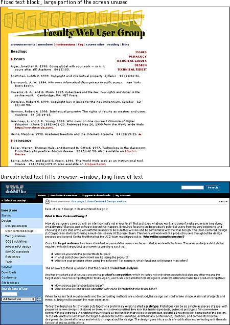
Line lengthText on the computer screen is hard to read not only because of the low resolution of computer screens but also because the layout of most Web pages violates a fundamental rule of book and magazine typography: the lines of text on most Web pages are far too long for easy reading. Magazine and book columns are narrow for physiological reasons: at normal reading distances the eye's span of acute focus is only about three inches wide, so designers try to keep dense passages of text in columns not much wider than that comfortable eye span. Wider lines of text require readers to move their heads slightly or strain their eye muscles to track over the long lines of text. Readability suffers because on the long trip back to the left margin the reader may lose track of the next line. You can use invisible tables ( In the end, the decision to restrict line length is a philosophical one. From a design standpoint, a measure that is comfortable for reading is good practice. One of the fundamental principles of the Web, however, is that users should be able to structure their own view. Users with a large monitor may not want their text blocks circumscribed if it means that a large portion of their screen goes unused. A low-vision user with fonts set large will not appreciate being forced to view long pages with short lines of text. So although leaving text free to fill the browser window may affect readability, following conventions may also affect the accessibility and legibility of your documents.  When designing a fixed-width layout, we typically use page layout tables with text cells no wider than about 365 pixels. If 12-point Times New Roman type is used, this cell width yields a line about fifty characters long, averaging about nine to ten words per line. We believe that this achieves the best balance between space efficiency and legibility. If you choose a flexible layout approach, use CSS leading controls to increase line spacing to 15 or 16 points (see White space). Additional line spacing allows a somewhat longer line length without sacrificing legibility. |
|
|