by Patrick J. Lynch
and Sarah Horton

11 Graphics
Graphics Markup
Height and width tags
All your page graphics source tags (even small button or icon graphics) should include height and width tags. These tags tell the browser how much space to devote to a graphic on a page, and they instruct the browser to lay out your web page even before the graphics files have begun to download. Although this does not speed up downloading of the image files (only a faster data connection can do that), it does allow the user to see the page layout more quickly. The text blocks will fill out first and then the graphics files will “pour” into the allotted spaces. This means that the user can start to read your page while the graphics are downloading.
Alt-text
html has several built-in fallbacks designed to allow web pages to work under different conditions. One of these is the “alt” attribute of the <img> tag. The alt attribute allows you to supply an alternate text description with any images you place on your page. Users who cannot see your images will see or hear the text you supply using the alt attribute:
<img src="banner.gif" height="30" width="535" alt="Web Style Guide">
In the above example, users accessing the Web Style Guide site with graphic loading turned off would see the alternate text “Web Style Guide” in place of the banner graphic. Visually impaired users using screen readers to access web pages would hear the phrase “Web Style Guide” read aloud. Google Images would use the alternate text to catalog the image (fig. 11.17).
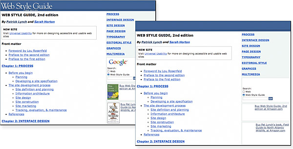
Figure 11.17 — Page with images on (left) and off (right). Always check to see if your pages make sense even without the images in place.
Writing good alt-text is an epigrammatic art, challenging your ability to describe the content and function of an image in just a few words. The W3C offers this helpful guidance: “A good test to determine if a text equivalent is useful is to imagine reading the document aloud over the telephone. What would you say upon encountering this image to make the page comprehensible to the listener?” Notice that the goal is to make the page comprehensible, not the image. The point is not to use words to express the details and nuances of an image but rather to describe the image within the context of the page. This distinction is critical in deciding how much, or how little, to say about an image.
For functional images, such as buttons, logos, and icons, the alt-text should say in words the same thing that the image says visually. A banner graphic that identifies the company should do the same with alt-text: “Acme Carpet Cleaners.” Navigation graphics labeling the major site sections should include the same labels in the alt-text: “Home,” “Services,” “Prices,” “Location,” “Contact Us.” Interface icons should describe the functionality represented by the icon:
<img src="up.gif" height="10" width="10" alt="Go to top of page">
Informational graphics, such as product photographs, convey information that may be difficult to encapsulate in one short phrase. One approach is to provide alt-text that tells what the image represents: “Acme Carpet Cleaners storefront.” If the purpose of the image is to help guide people to the store, the alt-text might read differently: “Acme Carpet Cleaners, the red brick building on the corner of Carpenter and Main.” For complex images that convey a good deal of information, the best approach is to use an image caption to describe fully in words the information conveyed in the image.
At times alt-text is not useful—for example, for interface images like custom bullets or icons—and in those cases you should include an empty alt attribute (alt="") in your <img> tag. An empty alt attribute hides the graphic from text-only browsers and assistive technologies like screen readers. If you leave out the alt-text altogether, screen reader users might hear the words “image, image, image, image” because most software is designed to let users know when there is an undescribed image on the page. If you include an empty alt attribute to indicate that the image is purely decorative, the software will skip the image.
Colored backgrounds
Web colors offer a zero-bandwidth means to change the look of your pages without adding graphics. They also allow you to increase the legibility of your pages, tune the background color to complement foreground art, and signal a broad change in context from one part of your site to another. Universalusability.com uses background colors as an easy way to enliven the visual impact of their otherwise low-bandwidth pages (fig. 11.18).
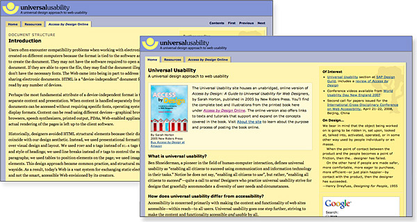
Figure 11.18 — Graphic impact with minimal GIF or JPEG graphics. Large color fields produced with pure CSS can add great visual impact without adding large images to download.
Picking the background color is easy in wysiwyg (what you see is what you get) web page layout programs such as Adobe Dreamweaver. Unfortunately, picking a color without one of these programs is a procedure only a propeller-head could enjoy. The color is specified in the tag in hexadecimal code, in which the six elements give the red, green, and blue values that blend to make the color. In the tag, the hex code is always preceded by a “#” sign: (#rrggbb). Because this whole business is now handled visually by the new generation of wysiwyg page editors and image editors like Adobe Photoshop, we will not delve further into the arcana of hexadecimal rgb color selection.
Background colors and legibility
A primary factor affecting legibility is the contrast between text and background. Low-contrast type diminishes the reader’s ability to differentiate between the color of the background and the text, which in turn makes it difficult to distinguish letterforms. The web is rife with pages whose legibility is marginal because of poorly chosen background and text color combinations. Text that is hard to read is tiring for a fully sighted reader, and certain color combinations make pages unreadable for colorblind users (10 percent of males are partially colorblind) (fig. 11.19).
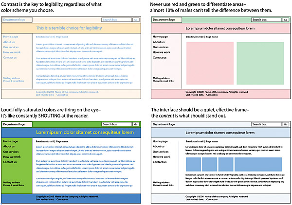
Figure 11.19 — Use a light touch when creating background colors. The background should stay in the background and should never compete for attention with the actual page content.
Contrast has the most influence on color differentiation—specifically brightness, or light-dark, contrast. Black text on a white (or slightly tinted) background yields the best overall type contrast and legibility. Black backgrounds are significantly less legible than white backgrounds, even when white type is used for maximum contrast. Colored backgrounds can work as an alternative to white if the colors are kept in muted tones and are low in overall color saturation (pastels, light grays, and light earth tones work best). Complementary colors, such as yellow and blue, produce more contrast than adjacent colors, such as orange and green.
Background graphics
Cascading Style Sheets offer powerful tools for designing layouts that include background graphics. With css, you can set a background graphic and define where it displays, whether it repeats, and, if so, in what direction, whether the image is fixed in place or scrolls with the page, and more. Background graphics can be attached to the entire page or to individual elements, such as the banner, navigation, or content area (fig. 11.20).

Figure 11.20 — Background graphics can add depth, texture, and interest to the page as well as help delineate page elements.
Your use of background graphics depends entirely on your goals for your web site. It is foolish to use large or visually complex background textures on any page that is heavily used by busy people looking for work-related information—the long download times, amateurish aesthetics, and poor legibility will simply annoy your users. That said, in the hands of a skilled graphic designer who is creating web pages designed for impact, the option to use background graphics opens up many interesting visual design possibilities.