by Patrick J. Lynch
and Sarah Horton

3 Information Architecture
Site Structure
When confronted with a new and complex information system, users build mental models. They use these models to assess relations among topics and to guess where to find things they haven’t seen before. The success of the organization of your web site will be determined largely by how well your site’s information architecture matches your users’ expectations. A logical, consistently named site organization allows users to make successful predictions about where to find things. Consistent methods of organizing and displaying information permit users to extend their knowledge from familiar pages to unfamiliar ones. If you mislead users with a structure that is neither logical nor predictable, or constantly uses different or ambiguous terms to describe site features, users will be frustrated by the difficulties of getting around and understanding what you have to offer. You don’t want your user’s mental model of your web site to look like figure 3.1.
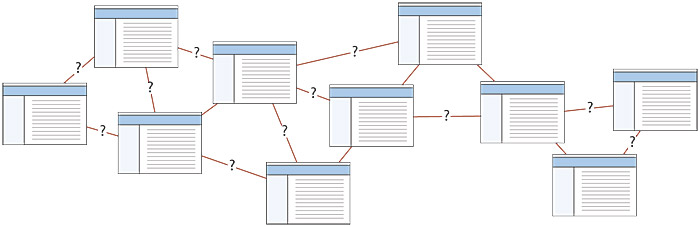
Figure 3.1 — Don’t make a confusing web of links. Designers aren’t the only ones who make models of sites. Users try to imagine the site structure as well, and a successful information architecture will help the user build a firm and predictable mental model of your site.
The browse functionality of your site
Once you have created your site in outline form, analyze its ability to support browsing by testing it interactively, both within the site development team and with small groups of real users. Efficient web site design is largely a matter of balancing the relation of major menu or home pages with individual content pages. The goal is to build a hierarchy of menus and content pages that feels natural to users and doesn’t mislead them or interfere with their use of the site.
Web sites with too shallow an information hierarchy depend on massive menu pages that can degenerate into a confusing laundry list of unrelated information. Menu schemes can also be too deep, burying information beneath too many layers of menus. Having to navigate through layers of nested menus before reaching real content is frustrating (fig. 3.2).
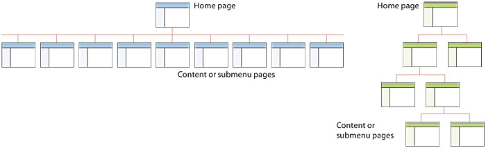
Figure 3.2 — Examples of the “Goldilocks problem” in getting the site structure “just right.” Too shallow a structure (left) forces menus to become too long. Too deep a structure (right) and users get frustrated as they dig down through many layers of menus.
If your web site is actively growing, the proper balance of menus and content pages is a moving target. Feedback from users (and analyzing your own use of the site) can help you decide if your menu scheme has outlived its usefulness or has weak areas. Complex document structures require deeper menu hierarchies, but users should never be forced into page after page of menus if direct access is possible. With a well-balanced, functional hierarchy you can offer users menus that provide quick access to information and reflect the organization of your site.
Site search as navigation
If your site has more than a few dozen pages, your users will expect web search options to find content in the site. In a larger site, with maybe hundreds or thousands of pages of content, web search is the only efficient means to locate particular content pages or to find all pages that mention a keyword or search phrase. Browse interfaces composed of major site and content landmarks are essential in the initial phases of a user’s visit to your site. However, once the user has decided that your site may offer what he or she is looking for, the user crosses a threshold of specificity that only a search engine can help with:
- No browse interface of links can assure the user that he or she has found all instances of a given keyword or search phrase.
- Search is the most efficient means to reach specific content, particularly if that content is not heavily visited by other users and is therefore unlikely to appear as a link in a major navigation page.
As with popular books at the library or the hit songs on iTunes, content usage on large web sites is a classic “long-tail” phenomenon: a few items get 80 percent of the attention, and the rest get dramatically less traffic. As the user’s needs get more specific than a browser interface can handle, search engines are the means to find content out there in the long tail where it might otherwise remain undiscovered (fig. 3.3).
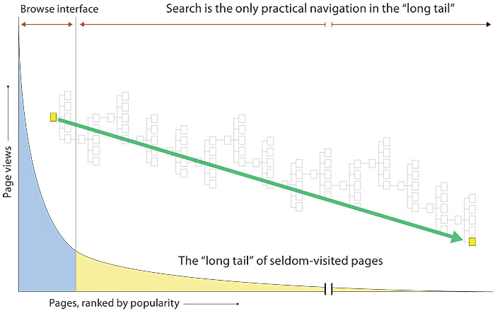
Figure 3.3 — The “long tail” of web search. Large sites are just too large to depend solely on browsing. Heavily used pages are likely to appear on browsing menus pages, but obscure pages deep within the site will only be found and read through web search technologies.
Site structural themes
Web sites are built around basic structural themes that both form and reinforce a user’s mental model of how you have organized your content. These fundamental architectures govern the navigational interface of the web site and mold the user’s mental models of how the information is organized. Three essential structures can be used to build a web site: sequences, hierarchies, and webs.
Sequences
The simplest and most familiar way to organize information is to place it in a sequence. This is the structure of books, magazines, and all other print matter. Sequential ordering may be chronological, a logical series of topics progressing from the general to the specific, or alphabetical, as in indexes, encyclopedias, and glossaries. Straight sequences are the most appropriate organization for training or education sites, for example, in which the user is expected to progress through a fixed set of material and the only links are those that support the linear navigation path (fig 3.4, top).
More complex web sites may still be organized as a logical sequence, but each page in the sequence may have links to one or more pages of digressions, parenthetical information, or information on other web sites (fig. 3.4, bottom).
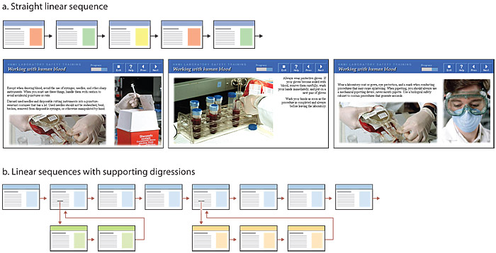
Figure 3.4 — Some web sites, such as the training site diagrammed above (top), are meant to be read in a linear sequence. Programming logic can offer customized content for particular audiences and allow digressions from the main sequence of pages (bottom diagram).
Hierarchies
Information hierarchies are the best way to organize most complex bodies of information. Because web sites are usually organized around a single home page, which then links to subtopic menu pages, hierarchical architectures are particularly suited to web site organization. Hierarchical diagrams are very familiar in corporate and institutional life, so most users find this structure easy to understand. A hierarchical organization also imposes a useful discipline on your own analytical approach to your content, because hierarchies are practical only with well-organized material.
The simplest form of hierarchical site structure is a star, or hub-and-spoke, set of pages arrayed off a central home page. The site is essentially a single-tier hierarchy. Navigation tends to be a simple list of subpages, plus a link for the home page (fig 3.5a).
Most web sites adopt some form of multitiered hierarchical or tree architecture. This arrangement of major categories and subcategories has a powerful advantage for complex site organization in that most people are familiar with hierarchical organizations, and can readily form mental models of the site structure (fig. 3.5b).
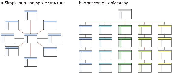
Figure 3.5 — Hierarchies are simple and inevitable in web design. Most content works well in hierarchical structures, and users find them easy to understand.
Note that although hierarchical sites organize their content and pages in a tree of site menus and submenus off the home page, this hierarchy of content subdivisions should not become a navigational straitjacket for the user who wants to jump from one area of the site to another. Most site navigation interfaces provide global navigation links that allow users to jump from one major site area to another without being forced to back up to a central home page or submenu. In figure 3.6, tabs in the header allow the user to move from one major content area to another, the left navigation menu provides local topic categories, and a search box allows the user to jump out of categorical navigation and find pages based on a web search engine.
Figure 3.6 — Local (left column) and global (tabs below the header) navigation systems provide a flexible and easy to understand navigation system.
Webs
Weblike organizational structures pose few restrictions on the pattern of information use. In this structure the goal is often to mimic associative thought and the free flow of ideas, allowing users to follow their interests in a unique, heuristic, idiosyncratic pattern. This organizational pattern develops with dense links both to information elsewhere in the site and to information at other sites. Although the goal of this organization is to exploit the web’s power of linkage and association to the fullest, weblike structures can just as easily propagate confusion. Ironically, associative organizational schemes are often the most impractical structure for web sites because they are so hard for the user to understand and predict. Webs work best for small sites dominated by lists of links and for sites aimed at highly educated or experienced users looking for further education or enrichment and not for a basic understanding of a topic (fig. 3.7).
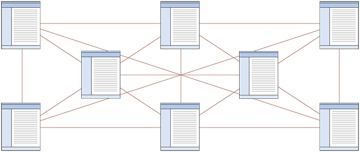
Figure 3.7 — A simple web of associated pages.
Summary
Most complex web sites share aspects of all three types of information structures. Site hierarchy is created largely with standard navigational links within the site, but topical links embedded within the content create a weblike mesh of associative links that transcends the usual navigation and site structure. Except in sites that rigorously enforce a sequence of pages, users are likely to traverse your site in a free-form weblike manner, jumping across regions in the information architecture, just as they would skip through chapters in a reference book. Ironically, the clearer and more concrete your site organization is, the easier it is for users to jump freely from place to place without feeling lost (fig. 3.8).
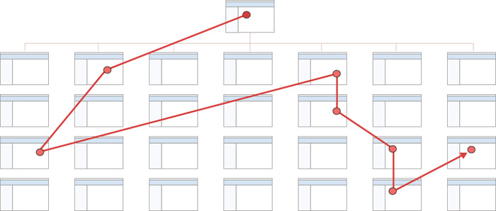
Figure 3.8 — We structure sites as hierarchies, but users seldom use them that way. A clear information structure allows the user to move freely and confidently through your site.
The nonlinear usage patterns typical of web users do not absolve you of the need to organize your thinking and present it within a clear, consistent structure that complements your overall design goals. Figure 3.9 summarizes the three basic organization patterns against the linearity of the narrative and the complexity of the content.
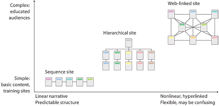
Figure 3.9 — Choose the right site structure for your audience and content.