by Patrick J. Lynch
and Sarah Horton

7 Page Design
Visual Design
Some foundational ideas are so thoroughly ingrained in modern life that we hardly see them for their ubiquity and familiarity. The concept of “module and program”—regular building blocks of repeating patterns that when joined together produce an organized whole—permeates our information-age lives even more thoroughly than it did the lives of our ancestors in the industrial revolution launched by manufacturing innovators like Eli Whitney.
As the industrial world grew more complex, document designers in the mid-1800s began to adapt modular programs to newspaper, catalog, financial, and other publications, and modern page layout was born. In the early twentieth century the Bauhaus designers adopted the elements of visual logic discovered by the Gestalt perceptual psychologists, and those German and Swiss designers created modern graphic design (see Visual Design Principles sidebar, below).
The primary purposes of graphic design are to:
- Create a clear visual hierarchy of contrast, so you can see at a glance what is important and what is peripheral
- Define functional regions of the page
- Group page elements that are related, so that you can see structure in the content
A simple page grid establishes discrete functional areas, and adequate negative space defines the figure-ground relationships for the page. The page uses familiar principles of page layout, and users can easily predict the location of major content and functional elements.
Crowded pages confuse the figure-ground relationships of page elements by creating an ambiguous field of visual texture, with little contrast to draw the eye and few landmarks to help the user understand content organization. Crowded elements also cause 1 + 1 = 3 effects, adding visual confusion.
As you design the html and css for menu lists, content lists, page header graphics, and other design elements, always consider the spacing, grouping, similarity, and overall visual logic of the patterns you create on the page so that you provide easily seen structure, not confusing detail.
Proximity and uniform connectedness are the most powerful Gestalt principles in page layout; elements that are grouped within defined regions form the basis for content modularity and “chunking” web content for easy scanning. A well-organized page with clear groups of content shows the user at a glance how the content is organized and sets up modular units of content that form a predictable pattern over pages throughout the site (fig. 7.7).
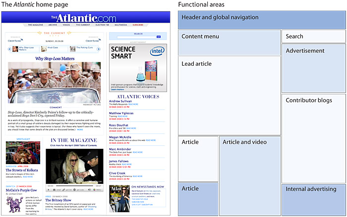
Figure 7.7 — The functional units of The Atlantic’s home page use the Gestalt principles of proximity and enclosure to organize a complex visual field and keep it extremely legible.
Consistency
Establish a layout grid and a style for handling your text and graphics, and then apply it consistently to build rhythm and unity across the pages of your site. Repetition is not boring; it gives your site a consistent graphic identity that creates and then reinforces a distinct sense of “place” and makes your site memorable. A consistent approach to layout and navigation allows users to adapt quickly to your design and to predict with confidence the location of information and navigation controls across the pages of your site.
If you choose a graphic theme, use it throughout your site. The Hiram College home page banner sets the graphic theme for the site and introduces distinctive typography and a set of navigation tabs. Note how the typography and the navigation theme are carried over to the interior banners. There is no confusion about whose site you are navigating through (fig. 7.8).
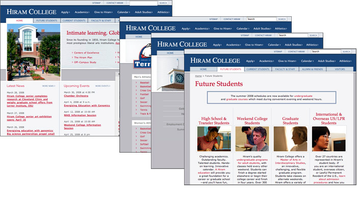
Figure 7.8 — Consistent organizational identity across all levels of a site. www.hiram.edu
Contrast
The primary task of graphic design is to create a strong, consistent visual hierarchy in which important elements are emphasized and content is organized logically and predictably. Graphic design is visual information management, using the tools of page layout, typography, and illustration to lead the reader’s eye through the page. Readers first see pages as large masses of shape and color, with foreground elements contrasting against the background field. Then they begin to pick out specific information, first from graphics if they are present, and only after this do they start parsing the harder medium of text and begin to read individual words and phrases (fig. 7.9).
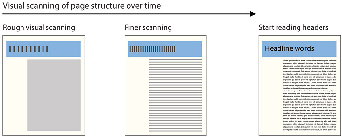
Figure 7.9 — The reader’s visual scanning proceeds from a very general perception of contrast through finer levels of attention and finally to actual reading of the major headlines.
The overall graphic balance and organization of the page is crucial to drawing the user into your content. A page of solid text will repel the casual reader with a mass of undifferentiated gray, without obvious cues to the structure of your information. A page dominated by poorly designed or overly bold graphics or typography will also distract or repel users seeking substantive content. You will need to strike an appropriate balance between attracting the eye with visual contrast and providing a clear sense of organization, through the variations in contrast that result from proper proximities, groupings, figure-ground relationships, and headings. Visual balance and appropriateness to the intended audience are the keys to successful design decisions. The most effective designs for general audiences employ a careful balance of text and links with relatively small graphics. These pages load quickly yet have substantial graphic impact (fig. 7.10).
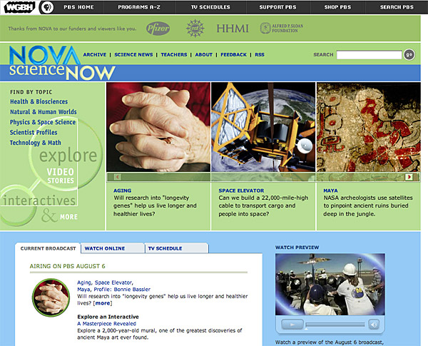
Figure 7.10 — NOVA’s website achieves great visual impact with a careful collection of relatively small images coupled with colored backgrounds and text.
Color and contrast in typography
Color and contrast are key components of universal usability. Text legibility is dependent on the reader’s ability to distinguish letterforms from the background field. Color differentiation depends mostly on brightness and saturation. Black text on a white background has the highest level of contrast since black has no brightness and white is all brightness. Hue is also a factor, with complementary colors, such as blue and yellow, producing the greatest contrast. Be sure your color choices do not make it hard for users to distinguish text from background. Also, never forget that almost 10 percent of male readers have some trouble distinguishing fine shades of red from shades of green (fig. 7.11).
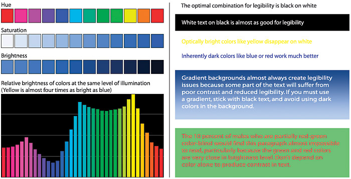
Figure 7.11 — Not all colors and color combinations are created equal, especially for the 10 percent of males who have some degree of color-blindness.
Contrast variability
Web pages viewed on mobile devices are usually compromised by the mobile environment: small screens, tiny text, lack of optimal screen resolution and color, and sun or other lighting glare all degrade the legibility of web pages seen outside the office or home environment. Even many laptops have displays that don’t do a good job of showing fine color or shade distinctions, and the colors on pages viewed via computer projector are normally washed out. Test your designs on a number of devices and laptops and in a variety of conditions, especially if you are using subtle colors to define important page functions or content. In general it’s best to use a more robust, high-contrast typography color scheme.
Avoid overusing contrast
Horizontal rules, decorative graphic bullets, prominent icons, and other visual markers have their occasional uses, but apply each sparingly (if at all) to avoid a patchy and confusing layout. The tools of graphic emphasis are powerful and should be used only in small doses for maximum effect. Overuse of graphic emphasis leads to a “clown’s pants” effect in which everything is equally garish and nothing is emphasized.
Color palettes chosen from nature are an almost infallible guide to color harmony, particularly if you are not a trained graphic designer. Subtle, desaturated colors make the best choices for backgrounds or minor elements. Avoid bold, highly saturated primary colors except in regions of maximum emphasis, and even there use them cautiously (fig. 7.12).
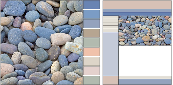
Figure 7.12 — Colors drawn from nature are almost inherently harmonious and subdued.
White space
With today’s larger display screens and more complex graphic interfaces, your web page is likely to be sharing the screen with many other windows and desktop elements. Use white space to avoid crowding the edges of the browser windows with important elements of your page content. In fixed-width layouts, consider floating the page in the center of the browser window. If your page width is reasonable, this should produce some visual relief for your page even on a crowded computer screen (fig. 7.13a). For “liquid” layouts, consider pages that use 90–95 percent of the screen instead of the full 100 percent, leave some background around the functional areas of the page to provide visual relief, and avoid unfortunate “1 + 1 = 3” interactions with elements outside the browser window (fig. 7.13b).
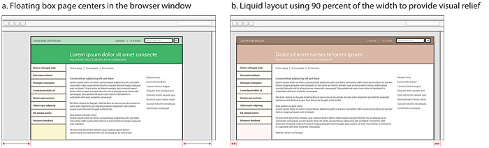
Figure 7.13 — Visual relief helps isolate the page content from the “noise” of other programs and windows on the screen.
All graphic design is ultimately the management of white space—the ground field behind all figure elements on the page. To understand graphic design, you must appreciate that the ground field around page elements is as active and important a part of the design as any figure element on the page. Filling all the white space on a page is like removing all the oxygen from a room—an efficient use of space perhaps, but decidedly difficult to inhabit.
Style
Don’t set out to develop a “style” for your site, and be careful about simply importing the graphic elements of another web site or print publication to decorate your pages. The graphic and editorial style of your web site should evolve as a natural consequence of consistent and appropriate handling of your content and page layout. Prefer the conventional over the eccentric, never let the framing overwhelm the content, and remember that the best style is one that readers never notice—where everything feels logical, comfortable (even beautiful) but where a heavy-handed design never intrudes on the experience.
Simplicity
All users benefit from clear and consistent web site design, but for some users it is critical. With a lack of spatial cues and with radically different approaches to navigation that must be relearned at every site, vision-impaired users can easily get disoriented or lost on the web. For people with cognitive disabilities, such as memory or learning disabilities, this difficulty is magnified manyfold. Stick with a simple language and navigation applied consistently throughout your site, and everyone will benefit. Google’s various support sites are a model of simple, clear design, with minimal but highly functional page framing and interface elements (fig. 7.14).
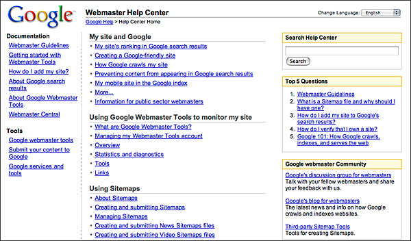
Figure 7.14 — Google’s minimal design aesthetic makes their pages easy to use and instantly recognizable.
The gestalt of visual design
The fundamental principles of Gestalt perception and human visual processing form the basic toolbox of all graphic design. Web design adds the dimensions of interactivity and a wide range of possible display media, but the core principles of graphic design, document organization, editorial standards, and communication on the page have not changed. The web as it exists today is clearly an extension of print publishing, not because of any failure of imagination from designers and technologists, but because centuries of designing documents for readers have taught the world useful lessons in how humans read and absorb information.