by Patrick J. Lynch
and Sarah Horton

8 Typography
Characteristics of Type on the Web
Although the basic rules of typography are much the same for both web pages and conventional print documents, type on-screen and type printed on paper are different in crucial ways. The computer screen renders typefaces at a much lower resolution than is found in books, magazines, and even pages output from inexpensive printers. Most magazine and book typography is printed at 1200 dots per inch (dpi) or greater, whereas computer screens rarely show more than about 85 pixels per inch (ppi).
The current Apple Macintosh and Microsoft Windows operating systems use anti-aliased type to increase the apparent resolution of type on the computer screen. Anti-aliasing works by smoothing the edges around type, so that at normal screen reading distances the type looks much like high-resolution printed type. Anti-aliasing works: careful legibility and reading studies have long shown that it improves reading speed and accuracy. The letterforms look fuzzy when enlarged but appear sharp when viewed under normal reading conditions (fig. 8.1).
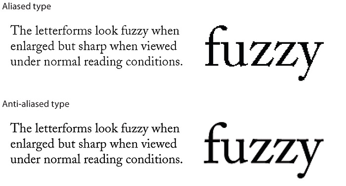
Figure 8.1 — Comparison of aliased and anti-aliased typography.
In addition to much lower type resolution, the usable area of typical computer screens is a little smaller than a typical trade book spread (particularly in height), and typical laptop displays are quite limited in their vertical dimension. These maximum-area calculations assume that the reader has maximized the browser window on the screen, but much of the time it is likely that the browser will be sharing screen space with other windows the reader has open on the screen.
On-the-fly construction
The most distinctive characteristic of web typography is its variability. Web pages are built on the fly each time they are loaded into a web browser. Each line of text, each headline, and each unique font and style are re-created by a complex interaction of the web browser, the web server, and the operating system of the reader’s computer. The process is fraught with the unexpected: a missing font, an out-of-date browser, a peculiar set of font preferences designated by the reader. You should regard your web page layouts and typography as suggestions of how your pages should be rendered—you’ll never know exactly how they will look on the reader’s screen.
Content structure and visual logic
The originators of html were scientists who wanted a standard means to share particle physics documents. They had little interest in the exact visual form of the document as seen on a particular computer screen. In fact, html was designed to enforce a clean separation of content structure and graphic design. In the early 1990s the intent was to create a “World Wide Web” of pages that both display on every system and browser available, including browsers that “read” content to visually impaired users, and can be accurately interpreted by automated search and analysis engines.
In disregarding the graphic design and editorial management traditions of publishing, the original designers of the web ignored human motivation and the desire to persuade. Early web programmers were so concerned about making web documents machine-friendly that they produced documents that only machines (or particle physicists) would want to read. In focusing solely on the structural logic of documents, they ignored the need for the visual logic of sophisticated graphic design and typography.
Cascading Style Sheets
This division between structural logic and visual logic is reconciled through the use of Cascading Style Sheets. Style sheets provide control over the exact visual style of headers, paragraphs, lists, and other page elements. For example, if you prefer <h3> headers to be set in Arial bold type, you can specify those details in a style sheet. In this way you can retain the logical use of html’s structural tags without sacrificing graphic design flexibility.
Advantages of CSS
This book is not a manual on html, and covering the full design implications of Cascading Style Sheets is well beyond the scope of this chapter. If you are not using css to manage the graphic design of your web site, you should certainly incorporate css design techniques with your next site redesign.
Cascading Style Sheets offer web designers two key advantages in managing complex web sites:
- Separation of content and design. css gives site developers the best of both worlds: content markup that reflects the logical structure of the information, and the freedom to specify exactly how each html tag will look.
- Efficient control over large document sets. The most powerful implementations of css will allow site designers to control the graphic look and feel of thousands of pages by modifying a single master style sheet document (fig. 8.2).
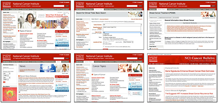
Figure 8.2 — Multiple web page designs and typography all controlled by a single master style sheet.
Style sheets provide greater typographic control with less code. Using plain html, you need to define the physical properties of an element such as the <h1> tag each time you use it.
<h1 align="center"><font face="Verdana, Helvetica, Arial, sans-serif" size="6" color="gray">Section heading< /h1>
When you define these properties using css, that single definition, or rule, applies to every instance of the <h1> element in all documents that reference the style sheet.
h1 { text-align: center; font-size: 1.4em; font-family: Verdana, Helvetica, Arial, sans-serif; color: gray }
In addition, style sheets offer more formatting options than plain html tags and extensions. For example, spacing between lines of type, or leading, can be controlled using style sheets, as can such text properties as letter spacing and background color.
But the greatest advantage of css is that it enables universal usability by giving you the ability to control the way your site looks in very different display circumstances. For example, some browsers have a feature that allows users to override author-defined style sheets with their own style sheet. This means that users can define a custom style sheet that meets their viewing needs.
For example, a low-vision user might define a style sheet that renders all headings and paragraphs at 32 pixels and sets the background to black and the text to white for maximum contrast. But these measures will not work, or will work in a limited fashion, on pages that are formatted using presentation markup. If the text color is set using <font color> and headings are set using <font size> and boldface <b> for emphasis, the user-defined style sheet will have no paragraph or heading tags to restyle.
If you define formatting using style sheets, users who need to customize the page can do so. Web pages styled with old-fashioned <font> tags are like text soup—they have no logical structure to analyze or work with—and therefore they are both less accessible and dramatically less relevant to search engines (fig. 8.3).
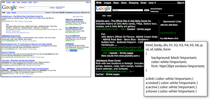
Figure 8.3 — User-defined style sheets allow users with special needs the ability to systematically change the display to suit their needs, if the page was designed to maximize CSS control of the visual display.
How style sheets work
Web style sheets are not new. Every graphic web browser has incorporated style sheets, even as far back as Mosaic, the earliest graphic web browser. Before css it just wasn’t possible to modify the fixed styles that browsers used to determine, for example, exactly how heading 1 (<h1>) headers look on the screen. The fundamental idea behind css is to let site authors and users determine the size, style, and layout details for each standard html tag.
If you have ever used the “styles” features of a page layout or word processing program, you’ll understand the basic idea behind css. The styles feature of a word processor is used to determine exactly how your titles, subheadings, and body copy will look, and then the text is formatted when you apply a style to each element. Once all the text has been styled, you can change the look of each occurrence of an element simply by changing its style information: for example, setting “Heading 1” elements in Times New Roman.
If you change your mind and want another font, you just change the Heading 1 style, and every Heading 1 in your whole document then changes to reflect the new font. css works in the same way, except that with css you can set up one master style sheet that will control the visual styling of every page in your site that is linked to the master style sheet.
Media style sheets
We can use css to provide formatting appropriate to a specific context. Many media are represented in the html and css specifications, but of those, “print” and “handheld” are the most widely supported. Print style sheets control formatting of pages when they are printed on paper, and handheld style sheets control formatting when pages are accessed using a mobile device. This functionality has significant implications since the qualities of good typography differ across media. For example, the characteristics that make type readable on-screen look oversized and clumsy on paper. By using media style sheets tuned to different contexts, we can deliver good typography across many media (fig. 8.4).
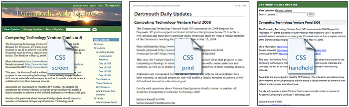
Figure 8.4 — Media style sheets optimize the look of the page content across different display media.
Consistency
As in traditional print publishing, high-quality web sites adhere to established type style settings consistently throughout the site. Consistency gives polish to a site and encourages visitors to stay by creating an expectation about the structure of a text. If sloppy, inconsistent formatting confounds this expectation you will decrease your readers’ confidence in your words, and they may not return. You should decide on such settings as fonts, inter-paragraph spacing, the size of subheads, and so on and then create a written style guide to help you maintain these settings as you develop the site. This step is especially critical for large sites that incorporate numerous pages. And with css you will have powerful tools to maintain the consistency of styles throughout your site. This is particularly true if you use a master style sheet for your whole site via the “link” option in css.