by Patrick J. Lynch
and Sarah Horton

9 Editorial Style
Links
Two types of links are used in web sites: navigational links that connect pages within a site such as the links in the page header above ("book contents, chapter contents", and the classic “embedded” hypertext links within the content that offer parenthetical material, footnotes, digressions, or parallel themes that the author believes will enrich the main content of the page. Although navigational links can cause problems in site design, more disruptive is the overuse or poor placement of embedded hypertext links.
Embedded hypertext links pose two fundamental design problems. They disrupt the flow of content in your site by inviting the user to leave your site. They can also radically alter the context of information by dumping the users into unfamiliar territory without preamble or explanation when they follow the embedded links to new pages—particularly when those new pages are outside your site.
The primary design strategy in thoughtful hypertext is to use links to reinforce your message, not to distract users or send them off chasing a minor footnote in some other web site. Most links in a web site should point to other resources within your site, pages that share the same graphic design, navigational controls, and overall content theme. Whenever possible, integrate related visual or text materials into your site so that users do not have the sense that you have dumped them outside your site’s framework. If you must send your reader away, make sure the material around the link makes it clear that the user will be leaving your web site and entering another site by following the link. Provide a description of the linked site along with the link so that users understand the relevance of the linked material (fig. 9.3).
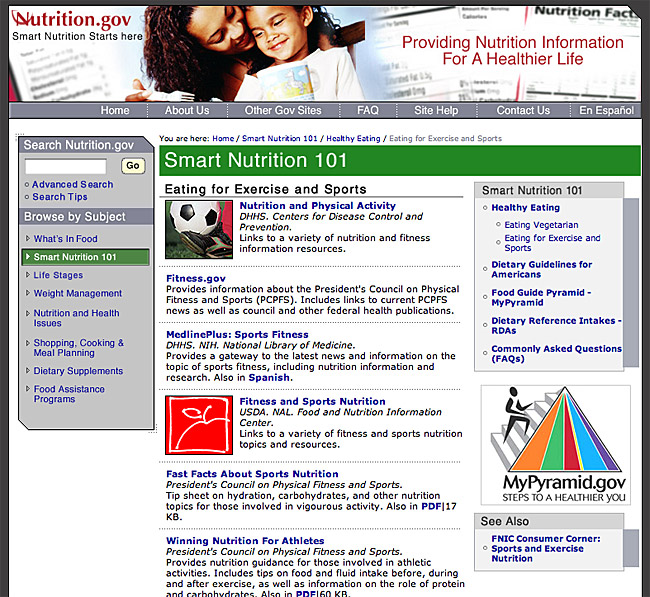
Figure 9.3 — Provide context along with links so that users know whether the links are to pages within the same section, elsewhere in your site, or in external resources.
When placing links on the page, put only the most salient links within the body of your text, and group all minor, illustrative, parenthetic, or footnote links at the bottom of the document where they are available but not distracting.
Descriptive links
Most of your web visitors are passing through on their way to some other destination and will appreciate your efforts to make the trip as straightforward and predictable as possible, with few meaningless side trips or dead ends. Key to the success of any trip is the clarity of the signage along the way, which in the web context comes in the form of links.
Links are the signposts that help users know which route is most likely to get them to their destination. Good link text gives users a description of the page that will load, allowing them to make informed decisions about which path to take. Bad link text, such as nondescriptive “click here” links or catchy but meaningless phrases, forces the user to follow the link to learn its destination. Nondescriptive links often lead to dead ends, requiring users to retrace their steps and waste time.
When writing links, never construct a sentence around a link phrase, such as “click here for more information.” Write the sentence as you normally would, and place the link anchor on the keyword or phrase that best describes the additional content you are linking to.
- Poor: Click here for more information on link underlines.
- Better: For universal usability, use link underlines to ensure that all users can identify links.
Links and search
Web links aren’t just a convenience for the user; they also add semantic meaning to the page. By choosing to link a particular word or phrase you have signaled to both users and search engines that it is potentially important as a search keyword.
Link underlines
Underlining is a carryover from the days of handwriting and the typewriter, when options such as bold and italics were not readily available as ways to distinguish elements such as headings and emphasized words or phrases. Typographically, underlining is undesirable, since it interferes with the legibility of letterforms. However, link underlines ensure that users who cannot see colors can distinguish links from other text—users with color vision issues, and users who access the web on devices that do not display color. For universal usability, links must be visually identifiable with or without color. Links that display within a navigation column or button bar are clearly links and do not necessarily need underlining. However, links that appear within body text should be underlined to set them off from the surrounding text.
Visited and unvisited links
Most web sessions involve trial and error. For example, finding a phone number or a price or location may involve multiple rounds of searching and following unproductive paths. The process can become circuitous if there is no way to tell where you have already looked, with repeat visits to pages that did not prove fruitful. By providing different link colors for visited and unvisited links, you allow users to identify the paths they have already taken (fig 9.4).
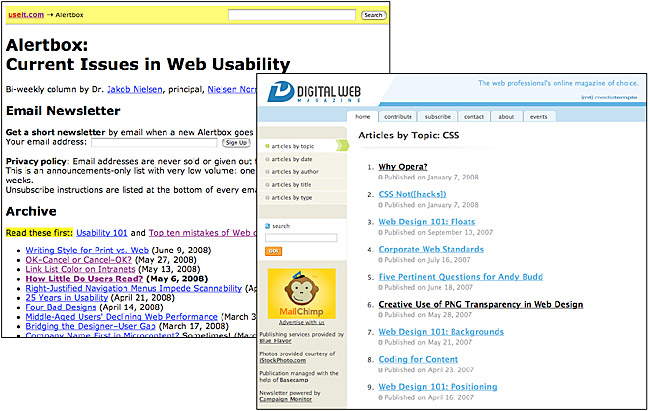
Figure 9.4 — Link color allows readers to differentiate visited and unvisited pages. Link colors can be standard browser colors (left) or custom colors set using CSS (right).