Basic diagrams also work well on the computer screen if they are carefully designed to match the grid of pixels on the screen. Graphics built with orthogonal lines (straight horizontal or vertical lines) or diagonal lines at 45-degree angles work best for the screen, as this enlarged view illustrates:
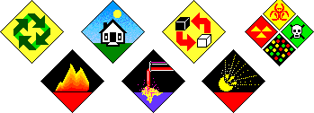
Complex icons are hard to interpret, and they look mushy and confusing on the screen. Keep icons and navigation graphics as simple as possible:
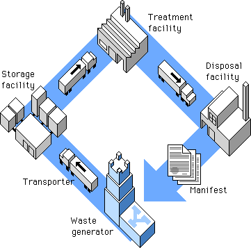
Simple isometric perspective graphics also work well because they depend on straight lines and 45-degree diagonals. Although the restrictions of working within fixed line angles make the technique unsuitable for many diagrammatic graphics, it is possible to build complex illustrations using this technique. The regularity of the isometric line work and the absence of the complexities of perspective bring order to graphics that might otherwise be too complex for Web page presentation:
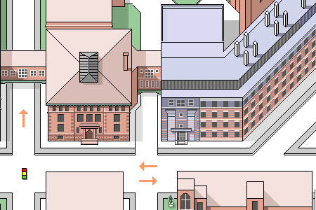
Another benefit of keeping diagrammatic art and maps simple is that graphic simplicity is ideally suited to the LZW encoding compression algorithm used in GIF graphics (see GIF files). This 450 x 306-pixel GIF graphic is large for a Web page, but it compresses to a mere 8 KB because the contents are well suited to LZW compression:
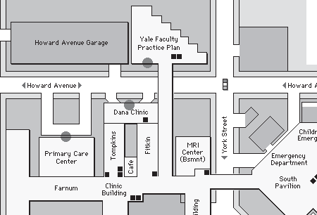
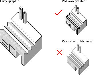
Be careful about choosing the proper sizes for this type of illustration. Graphics carefully built to match the pixel grid cannot be resized automatically in Photoshop — they must be redrawn by hand to larger or smaller sizes to avoid a mushy, fuzzy look that destroys their effectiveness:
The low resolution of the computer screen is insufficient for displaying diagrams that incorporate many curves or angles; lines that do not follow the pixel grid appear jagged. To optimize these kinds of diagrams for Web pages you'll need to use antialiasing to smooth the boundaries and make the jagged edges less apparent:
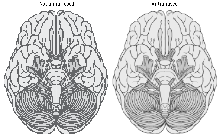
At great magnification antialiased graphics may have fuzzy boundaries, but at normal magnification antialiasing produces smooth, natural-looking line work.