All your page graphics source tags (even small button or icon graphics) should include HEIGHT and WIDTH tags. These tags tell the browser how much space to devote to a graphic on a page, and they instruct the browser to lay out your Web page even before the graphics files have begun to download. Although this does not speed up downloading (only a faster data connection can do that), it does allow the user to see the page layout more quickly. The text blocks will fill out first and then the graphics files will "pour" into the allotted spaces. This means that the user can start to read your page while the graphics are downloading.
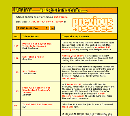
Web background colors offer a "zero-bandwidth" means to change the look of your pages without adding graphics. They also allow you to increase the legibility of your pages, tune the background color to complement foreground art, and signal a broad change in context from one part of your site to another. A List Apart uses background colors as an easy way to enliven the visual impact of their otherwise low-bandwidth pages:
Picking the background color is easy in WYSIWYG (what you see is what you get) graphic Web page layout programs. Unfortunately, picking a color without one of these Web page editors is a procedure only a propellerhead could enjoy. The color is specified in the tag in hexadecimal code, in which the six elements give the red, green, and blue values that blend to make the color. In the tag, the hex code is always preceded by a "#" sign: (#RRGGBB). Because this whole business is now handled visually by the new generation of WYSIWYG page editors and image editors like Adobe Photoshop, we will not delve further into the arcana of hexadecimal RGB color selection.
The Web is rife with pages whose legibility is marginal due to poorly chosen background color – text color combinations. Text that is hard to read is a hindrance for a fully sighted reader, and certain color combinations make pages unreadable for colorblind users (10 percent of males are partially colorblind). The legibility of type on the computer screen is already compromised by low screen resolution. The typical Macintosh or Windows computer screen displays text at 72 to 80 dots per inch (about 5,200 dots per square inch), or almost 300 times lower resolution than a typical magazine page (1,440,000 dots per square inch). Black text on a white (or very slightly tinted) background yields the best overall type contrast and legibility. Black backgrounds are significantly less legible than white backgrounds, even when white type is used for maximum contrast. Colored backgrounds can work as an alternative to plain browser-default gray if the colors are kept in very muted tones, and low in overall color saturation (pastels, light grays, and light earth tones work best).
Early in 1995 Netscape Navigator version 1.1 gave Web page authors the ability to use small tiled GIF or JPEG graphics (or a single large graphic) to form a background pattern behind the Web page. The feature is controversial in Web design discussions, because pages that use large background images take longer to download and because the background patterns tend to make pages harder to read unless they are carefully designed.
To be suitable for use as a background texture, the graphic should be a small GIF or JPEG, ideally no more than about 100 x 100 pixels in size. In our experience, JPEG background patterns load slightly faster than equivalent GIF graphics. Typical graphics used for background patterns are homogeneous textures:
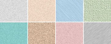
The image will repeat both horizontally and vertically to fill the browser window.
How you might use background graphics depends entirely on your goals for your Web site, the access speeds that are typical for your target audience, and whether a graphic background matches the aesthetic goals of your Web site. It is foolish to use large or visually complex background textures on any page that is heavily accessed by busy people looking for work-related information — the long download times, amateurish aesthetics, and poor legibility will simply annoy your users. That said, in the hands of a skilled graphic designer who is creating Web pages designed for graphic impact, the option to use background textures opens up many interesting visual design possibilities. This is particularly true in universities and commercial organizations where fast network access is commonplace and bandwidth is not the obstacle it is to many modem-based users.
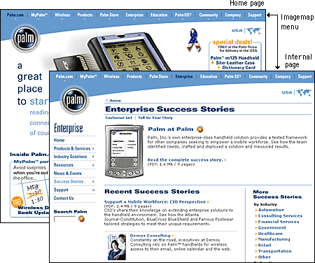
Imagemaps offer a way to define multiple "live" link areas within a graphic on a Web page. Imagemaps have become a standard feature of most professionally designed Web sites because they offer an effective combination of visual appeal and, when used properly, space-efficient functionality. Imagemaps are particularly effective when incorporated into moderately sized "splash" graphics at the top of home pages or into the "signature" graphics or logos that define your pages. For example, Palm uses a space-efficient imagemap menu on its home page. The graphic is more than a menu; it helps define the signature "look" of pages within the Palm Web site:
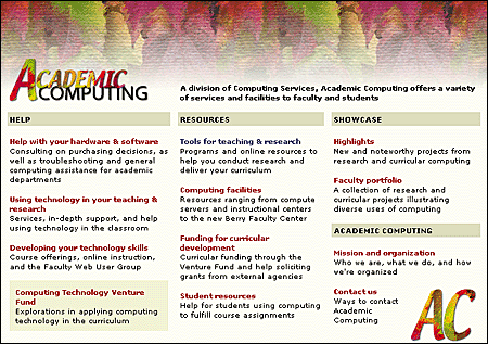
Imagemaps are the only way to incorporate multiple links into a graphic illustration, as in this anatomic example:
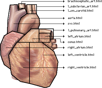
Imagemaps are also the ultimate way to overcome the vertical, list-oriented, graphically inflexible norms of conventional Web pages built with standard HTML tags. With imagemaps you can abandon HTML page layout and build links into large graphics, just as you might in CD-ROM authoring programs. Keep in mind, however, that such designs are suitable only for audiences with high bandwidth access to the Web or the local intranet.