 | |
NavigationA rich set of graphic navigation and interactivity links within your Web pages will pull users' attention down the page, weaning them from the general-purpose browser links and drawing them further into your content. By providing your own consistent and predictable set of navigation buttons you also give the user a sense of your site's organization and make the logic and order of your site visually explicit. In this example the rich graphics and many links offered by the Salon technology and business page immediately draw the reader into the site: 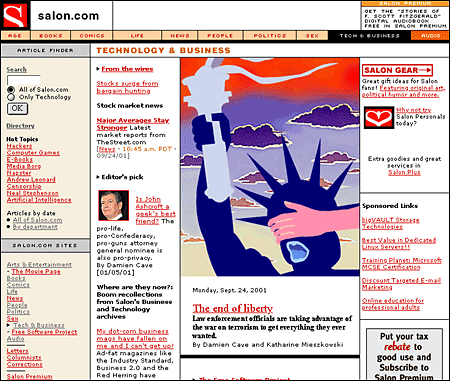 Provide context or lose the readerReaders need a sense of context, of their place within an organization of information. In paper documents this sense of "where you are" is a mixture of graphic and editorial organizational cues supplied by the graphic design of the book, the organization of the text, and the physical sensation of the book as an object. Electronic documents provide none of the physical cues we take for granted in assessing information. When we see a Web hypertext link on the page we have few cues to where we will be led, how much information is at the other end of the link, and exactly how the linked information relates to the current page. Even the view of individual Web pages is restricted for many users. Most Web pages don't fit completely on a standard office display monitor (800 x 600 pixels), and so there is almost always a part of the page that the user cannot see: 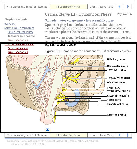
Web pages need to give the user explicit cues to the context and organization of information because only a small portion of any site (less than a page) is visible at one time: 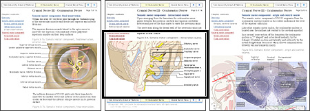
As the Web page designer it is up to you to provide these functional and context cues. "Going back" and going to the previous pageAll hypertext systems share a common feature that has no direct precedent in print media: going "back" through a series of links you have previously visited is not the same as paging "back" through the preceding pages of an ordered sequence of pages. When users click on a hypertext link in a Web document they often are transported from one Web site to another, perhaps even from one country to another. Once made, the hypertext link is bidirectional; you can "go back" to the Web site you just left by clicking on the "Back" button of the viewer. Having hit the "Back" button, you can move to the new Web site again by hitting the "Forward" button: 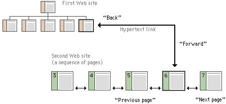
Button barsFor the information designer hypertext links are a mixed blessing. The radical shifts in context that links create can easily confuse Web users, who need organized cues and interface elements if they are to follow and understand hypertext links from one Web page to another. This is particularly true when users need to be able to follow (or at least recognize) an ordered sequence of documents. Notice in the diagram above that although the user has entered the second Web site at page 6, the site is an ordered sequence of pages. If the standard Web browser "Back" and "Forward" buttons are augmented with "Next Page" and "Previous Page" buttons built into the page, the user will have interface tools to navigate through the information in your site in the sequence you intended. Button bars can also display location information much as running chapter headers do in printed books: 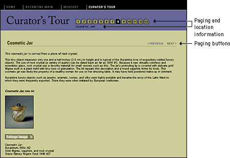 Unlike the "Back" and "Forward" buttons, whose functions are relative only to the pages you have seen most recently, "Next Page" and "Previous Page" buttons in a document are fixed links you provide to associated documents. By providing paging buttons and links to local home pages and contents pages you give users the tools to understand how you have organized your Web site information, even if they have not entered your Web of pages through a home page or contents page. The buttons don't prevent people from reading the information in whatever order they choose, but they do allow readers to follow the sequence of pages you have laid out: 
Button bars are also the most logical place for links back to your home page or to other menu pages related to the current page. A button bar can be built with text-based links or a series of individual button graphics at the top or bottom of the page:  |
|
|