One of the defining principles of the Web is that it should provide all people, regardless of physical or technological readiness, with access to information. Since the Web took off as a visual medium, the goals of design have been at odds with the goals of accessibility. When designers began to use large images, proprietary media formats, and complex page layouts to produce well-designed documents, the Web became a better-looking place, but those users who require clean HTML for access were shut out from many pages. Today, the course of Web design is shifting back to its original purpose. HTML has matured to offer more visual controls, so designers have more tools at hand to create structured and navigable Web sites without resorting to hacks and workarounds. Around the world, initiatives are under way to mandate that disabled users have equal access to Internet resources, including the guidelines issued by the Web Accessibility Initiative (WAI) of the World Wide Web Consortium (W3C) and, in the United States, the amendments to Section 508 of the Rehabilitation Act of 1973. The result is that Web interface design is intricately tied to accessibility design. It is the responsibility of Web designers to understand and support the needs of disabled users.
The underlying principle of Web accessibility guidelines is simple: if you provide information in any medium besides plain text, you should always provide an alternate, or fallback, version. The notion of fallbacks is at the core of the language of the Web, allowing rich and varied content to transform gracefully under different conditions. It also lies behind the injunction that no content should become outdated and inaccessible because of the progress of technology. To meet these goals, HTML includes methods for providing fallbacks for some types of nontext content.
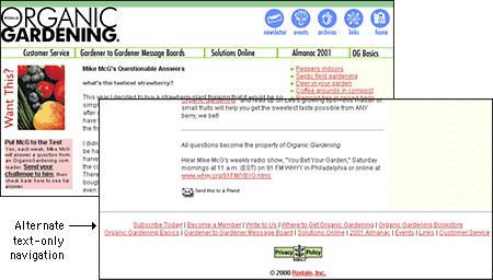
As an example, one of the beauties of the Web and HTML is the ability to build in "alternate" text descriptions so that users without graphics capabilities can understand the function of graphics on your pages. Blind users using specially designed software will hear (via synthesized speech) the alternate messages you supply along with your graphics ("ALT" attributes in HTML) and so will not completely miss the content of your pictures and graphic navigation buttons. Users with text-only browsers or those who have turned off image display will see the alternate text in place of the visual content. If you use graphic menu systems for navigation, these text-based alternate menus are an especially important aid to users who cannot see your graphics (see Graphics, Accessibility). If you use graphics like single-pixel GIFs as spacers in your page layout, always be sure to include a blank ALT statement in the spacer image source tag (ALT=""). The blank ALT statement hides the graphic from text-only browsers and from browsers that read text aloud for visually impaired users:
<IMG SRC="pixel.gif" HEIGHT="1" WIDTH ="1" ALT="" HSPACE="5">You should also include alternates as part of your page design for users who cannot access your primary content. For example, provide an equivalent text-only navigation menu for visually impaired users who cannot use your graphical menus. Or if you have video of a lecture or presentation on your site, include a text transcript or subtitles so that deaf users can have access to the materials.

Your content can be made more accessible if you use Cascading Style Sheets (CSS) to style your pages. With CSS-styled pages, users can easily apply personalized formatting to Web documents. A page designed using red text against a green background, for example, presents a problem for users with red-green color blindness: the contrast between text and background may not be great enough for the text to be distinguishable. If the colors are set via a style sheet, users can set their browser preferences to override your settings and can apply their own style sheet to the page instead. With CSS-styled pages, the user can transform Web content into a format that addresses their requirements for accessibility.
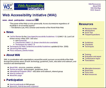
All professionally designed Web sites or intranet sites should meet at least the minimum standards for accessibility as defined by the World Wide Web Consortium guidelines. The W3C Web site contains extensive information on the details of how to make your site reasonably accessible to blind, deaf, or other disabled users. Until recently Web designers faced difficulties in implementing many of the W3C accessibility suggestions because the most popular versions of the major Web browsers either did not implement newer technology standards like Cascading Style Sheets or implemented them inconsistently. Now that both Netscape Navigator 6 and Internet Explorer 5 are almost completely compatible with W3C standards, however, the reasons for not using CSS and other tools to increase the accessibility of Web information to disabled readers are disappearing.

We all hope that every reader will arrive using the latest version of a major Web browser and that their computers will be state-of-the-art models using fast connections to the Internet. The reality is almost always less than ideal. You don't need to design your Web site exclusively for the lowest common denominator of current computing and network technology, but you do need to consider what your site will look like to those readers who do not have the best equipment, current software, or good Internet connections. The problems here are aggravated by the fact that Web site developers generally have much better equipment than the average Web site reader. Don't design for your machine, design for your average reader.
Always check your page designs on typically sized display screens (800 x 600 pixels) to be sure that all major navigation and content areas fit well within the horizontal area of the screen. Usually that will limit your page layouts to no more than 760 pixels in width. Many users with slow modem connections routinely turn off the image display in their browser. Try turning off graphics in your Web browser and look at your pages — are they still intelligible and navigable? Do you use ALT statements for every graphic? Do you use blank ALT statements (ALT="") to hide irrelevant graphics or spacer graphics from text-only browsers?
Do not produce Web sites that depend on one browser technology or browser plug-in ("This site is optimized for Internet Explorer 5.5 and Macromedia Flash 5"). Such notes on the home page of a corporate or enterprise Web site look sophomoric and will drive away most adult users. Design for everyone using major browsers released in the two previous years. If you must depend on proprietary browser plug-ins, try to position the material that is dependent on the plug-in deeper within the site, where presumably the reader will already have made a commitment to your content and may not mind the bother of having to download a plug-in to see special features. Once readers have a clearer sense of what they might gain by bothering to download a browser plug-in, they can make an informed decision.