
It's as large as life, and twice as natural!
— Lewis Carroll, Through the Looking-Glass
PERHAPS THE MOST POWERFUL aspect of computing technology is the ability to combine text, graphics, sounds, and moving images in meaningful ways. The promise of multimedia has been slow to reach the Web because of bandwidth limitations, but each day brings new solutions. Although there are numerous methods for creating Web multimedia, we recommend using stable technology that works for the great majority of client machines. Plug-ins that extend the capabilities of your Web pages are a mixed blessing. You risk losing your audience if you require them to jump through hoops to view your content.
Web designers must always be considerate of the consumer. A happy customer will come back, but one who has been made to wait and is then offered goods that are irrelevant is likely to shop elsewhere. Because multimedia comes with a high price tag, it should be used sparingly and judiciously.
All too often Web authors include visual or moving elements on the page for the purpose of holding the user's attention. This approach is based on the assumption that Web users have short attention spans, which in many cases may be true. However, the solution is not to add gratuitous "eye candy" to your Web presentation, which may, in fact, command too much of the user's attention and detract attention from the main content of your page. When thinking about adding media to your Web pages, consider first and foremost the nature of your materials. Use images, animations, video, or sound only when relevant to your message.
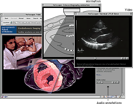
Bear in mind, too, that there are technical limitations to the delivery of audiovisual content via the Web. For example, long-duration video and video requiring smooth motion or clear details require large amounts of bandwidth to deliver and may tax the playback capacity of the user's machine. A significant amount of downsampling and compression is required to create a file that is small enough to be delivered via the Web. In some cases, these compromises may be too significant to warrant the effort. When you are considering adding multimedia to your pages, make sure the technology can meet the demands of your content. You don't want users to spend extra time and energy retrieving files that cannot be illustrative owing to limitations of the technology.
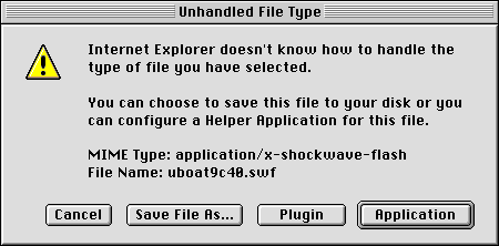
Also be wary of fledgling technologies. Plug-ins that allow users to see new and exciting things using their favorite browser software are constantly being introduced. This is especially true of multimedia; the options for encoding and delivering audio, animations, and video are dizzying. Although designers may be tempted to create files that employ the functionality offered by custom plug-ins, they should bear two things in mind. First, the bother and potential confusion of downloading and installing plug-ins will deter many users. Second, it is not prudent to create content in a custom file format that could quickly become obsolete. It is best to create your multimedia content in the standard formats for operating systems and browser software.
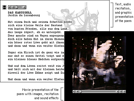
This somewhat conservative discussion of multimedia considerations needs one important qualification. If you are creating a site for a specific audience and not for global interests you will probably have more flexibility and can ask more from your users. You can require them to use specific browser software and plug-ins, and you can include data-intensive multimedia elements in your presentation. Say, for example, that your site is academic and your audience is a group of students or faculty with specialized interests. You are charged with the task of creating a custom site that fully addresses these interests, so function should define form. A foreign-language teaching site, for example, could contain bandwidth-intensive audio and video elements because the students who visit the site will use these multimedia elements to improve their abilities with the language. These students are not casual visitors; they are invested in the content, so they will tolerate lengthy download times and more demanding site interaction. And because your audience is defined and finite, you can take steps to ensure that they know what to expect and are prepared when they visit your site.
Simply because we can digitize hours' worth of analog video and stream it out over the Web doesn't mean that we should. The value of having the text of Paradise Lost on computer is not in making it available for reading — most people prefer to read the work in print. We digitize texts in order to use the strengths of computing, such as searching and linking, to enhance our understanding of the material. This holds true for multimedia, too: we need to consider how best to use the computer and not simply translate analog video and audio content to the computer screen. Networked multimedia requires scaling and compression, which means that much of the content created for analog delivery does not work well on the Web. The key to successful Web multimedia is to tailor your content for Web delivery.
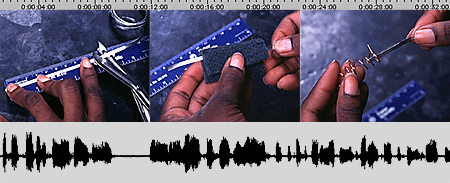
Audio is an extremely efficient way to deliver information. Consider a training video on measuring and weighing chemical compounds. Which track — audio or video — would be the most important in conveying information? In the sound track a narrator explains the procedure, and in the video track someone is measuring and weighing compounds. Which track would you remove if necessary? Which could stand alone? The audio track. Consider enhancing your presentation with an audio component. Audio can be captured and optimized fairly easily, and it compresses well.
When recording original audio, take the time to do it right. Low-frequency background noises, such as the hum of a ventilation system, will be inseparable from your audio track; no amount of tweaking will eliminate it altogether. Remember, too, that the downsampling and compression you will have to perform to make your audio Web deliverable will emphasize any flaws in your recording.
Slide shows are another method for delivering multimedia on the Web. In a slide show, you synchronize audio with still images. Through this approach you provide information via audio and add visual emphasis with still images. As an example, to present the training video mentioned above as a slide show, you would use video editing software to synchronize the narration with still images of the weighing and measuring procedure. Still images compress much more efficiently than video, and because slide shows do not require smooth motion, the movie frame rate can be low. This in turn means that you can devote more data to image quality and size.
Video is the most challenging multimedia content to deliver via the Web. One second of uncompressed NTSC (National Television Standards Committee) video, the international standard for television and video, requires approximately 27 megabytes of disk storage space. The amount of scaling and compression required to turn this quantity of data into something that can be used on a network is significant, sometimes so much so as to render the material useless. If at all possible, tailor your video content for the Web.

Most Web animation requires special plug-ins for viewing. The exception is the animated GIF format, which is by far the most prevalent animation format on the Web, followed closely by Macromedia's Flash format. The animation option of the GIF format combines individual GIF images into a single file to create animation. You can set the animation to loop on the page or to play once, and you can designate the duration for each frame in the animation.

Animated GIFs have several drawbacks. One concerns the user interface. GIF animations do not provide interface controls, so users have no easy way to stop a looping animation short of closing the browser window. They also lack the means to replay nonlooping animation. Second, the animated GIF format does not perform interframe compression, which means that if you create a ten-frame animation and each frame is a 20 KB GIF , you'll be putting a 200 KB file on your page. And the final drawback is a concern that pertains to animations in general. Most animation is nothing more than a distraction. If you place animation alongside primary content you will simply disrupt your readers' concentration and keep them from the objective of your site. If you require users to sit through your spiffy Flash intro every time they visit your site, you are effectively turning them away at the door.
There is a place for animation on the Web, however. Simple animation on a Web site's main home page can provide just the right amount of visual interest to invite users to explore your materials. There, the essential content is typically a menu of links, so the threat of distraction is less than it would be on an internal content page. Also, subtle animation such as a rollover can help guide the user to interface elements that they might otherwise overlook. Animation can also be useful in illustrating concepts or procedures, such as change over time. When you have animation that relates to the content of your site, one way to minimize the potential distraction is to present the animation in a secondary window. This technique offers a measure of viewer control: readers can open the window to view the animation and then close the window when they're through.
Multimedia places high demands on the network, the computer, and the user. The challenge thus lies in preparing files that are small enough to be accessible to the broadest possible audience yet are of sufficient quality to be worth the effort. To balance quality against accessibility you'll need to understand both the characteristics of different media formats and the limitations of delivering media in a networked environment, and you must be ready to compromise.
Analog source generally comes with certain established characteristics. For example, CD-quality audio is sampled at 44.1 KHz, 16-bit stereo sound, and video is usually 640 x 480 pixels in dimension and plays at 30 frames per second (fps). However, analog source digitized at full resolution would require enormous amounts of disk storage and is far too large to be used on a network. One way to prepare media for network delivery is to reduce the data by, for example, downsampling the audio material to 11.025 KHz, 8-bit mono sound. This reduces file size but also substantially reduces quality. Another way to reduce file size is to apply compression.
Compression first eliminates redundant data from a file and then removes less important data to shrink file size still further. This process is achieved using algorithms, or "codecs" (short for compressors-decompressors), that handle the media compression and the decompression when it is played. The codecs that are used for Web delivery use lossy compression: the process removes data from the original source material. You should never compress material multiple times, because each process will lower the video quality.
In preparing media for Web delivery, you should aim for files that can be managed by the average network connection and desktop machine of your target audience. The key measure is the data rate, normally measured in kilobytes per second (KBps), which is the amount of data that is used to represent one second of movie playback. For users to play your files in real time without hiccups or delays, you need to set a data transmission rate that is slightly lower than the throughput of your users' connections.
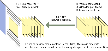

The technology of networked media consists of three main components: the server, the network, and the client machine. These three components must work in tandem to deliver good Web multimedia to the desktop. It makes no difference how high-end your video server and network are if your users are running low-end desktop machines that cannot handle the demands of playback.
The wildest of all these wild cards is bandwidth. If you purchase a high-end media server, you can expect a certain level of performance. You can predict playback performance on desktop machines. These elements are somewhat measurable. But unless you are working with a dedicated network, bandwidth will be hugely variable and difficult to predict. Issues regarding bandwidth run from the basic configuration of your connection to the network to the amount of network traffic at any given time.
Given these variables, the parameters for creating and delivering Web multimedia are not easily defined. They will vary depending on the scope and content of your project. If you are creating a Web site for a corporate intranet, for example, your media can be more technologically demanding than if you send it worldwide over the Internet. The key is to be well acquainted with the configuration of your client base and prepare accordingly.
Streaming technology sends data to the desktop continuously but does not download the entire file. In the optimal scenario, the content is stored on a media server, which maintains a constant conversation with the client to determine how much data the user can support. Based on this information, the server adjusts the data stream accordingly and sends just enough data to the client.
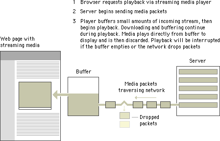
Streaming offers many benefits, the first of which is random access. Streaming technology permits movies to be viewed at any point in the video stream. If your reader is accessing an hour's worth of video and wishes to view only the last five minutes, he or she can use the controls to move forward to the desired starting point. Another benefit is a lower storage demand on the client machine. Streaming media plays directly to the display; it is not stored in memory or on the hard drive.
The strengths of streaming are also its shortcomings. To play a movie in real time the player software needs to keep up with the incoming data sent from the server. As a result, if there are glitches in the network or if the client machine cannot handle playback, the data may simply be lost. Streaming playback requires significant processing power, so playback may be suboptimal if the processor has to drop frames to keep up with the incoming stream. Also, streaming media needs to be heavily compressed to create a file small enough to play in real time.
Downloadable media is temporarily stored on the client machine in memory or on the hard drive. Most downloadable media is progressive, which means that the information necessary for playback is stored at the beginning of the file. Progressive download allows playback before the entire file has downloaded. Downloadable media is sent to the client using the same HTTP protocol as a Web page, so no special server is required. As long as the download speed stays above the data rate of the movie, playback will be uninterrupted.
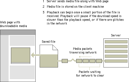
The quality of downloadable media is generally higher than that of streaming media. Because the data rate is not required to remain low enough to play the material in real time, more data can be devoted to image quality and motion. Downloadable media also has integrity: all the data in the original movie is contained in the downloaded version. This means that playback is predictable and that you can download the data onto your disk for future use.
The main drawback of downloadable media is the storage demand it places on the client machine. Even videos of short duration require many megabytes of storage. The other problem is that downloadable media does not allow random access. If you want to view only the last few minutes of a long clip you must wait for the entire clip to download. One solution to both of these problems is to split longer media segments into smaller chunks. This reduces the demands on the client machine and allows users more direct access to the material they want.
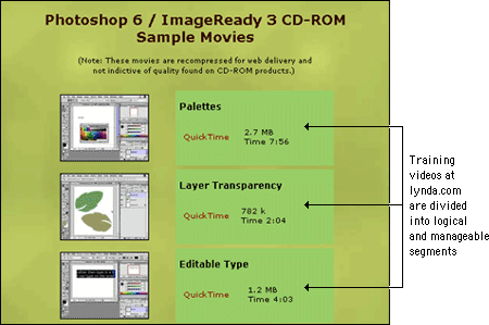
The combination of low-bandwidth considerations and primitive interface options creates interesting design challenges for Web developers who wish to incorporate multimedia elements into their sites. Designers need to inform users when they are entering a high-bandwidth area and give them the tools they need to control their experience once in the area.
One aspect of the Web is that you don't always know where you're going or what you'll find there. For some this uncertainty is exciting. For many, it is annoying, particularly when a long wait is involved. Most frustrating, perhaps, is when you finally receive the requested page only to find that is not what you expected or that it contains materials in a format you are not set up to view. With content that is as technologically demanding as multi-media, it is especially important to give users enough information to make an informed decision before they click, so that they know what to expect and are prepared to receive your materials.
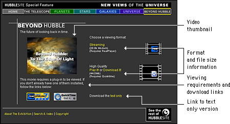
High-demand content such as large multimedia files should not be part of your basic page design. These materials should appear on secondary pages that are described and can be accessed from the main pages of your site. Make the menu page a plain HTML page that loads quickly and does not require special software. Include descriptive information about the materials along with previews such as still shots from the video. Include the run time for time-based media, and include the file size for materials that download. In addition, fully explain any special software requirements for accessing the materials and provide a download link. Your users should have a clear idea of what your materials are before they begin to download. With a menu interface, users can confirm that their systems are properly configured and that they have enough bandwidth, time, and patience to load the materials.
Be sure to give users status information and controls when you are presenting multimedia materials. The QuickTime controller bar is an extremely effective interface element that provides both controls and status information. It allows users both to adjust the volume control and to play, stop, and scrub through a movie, and it provides information about the movie's download status.

If you don't include controls, users will hit your page with no way to control their viewing environment. For example, if a visitor is looking at your page at a public workstation and you have looping bird calls as a background sound without any control options, the visitor will experience an unsettling (and potentially embarrassing) moment when he or she cannot control interaction with your site. Many users in this situation will simply close the browser window to make the sound stop, which means that they never get to see the page content.
When designing a media interface, let interaction with your media be entirely user-driven. Always include user controls, such as a media controller bar, and make sure that users have a way to turn it off. Avoid prescribed playback options like auto play or looping that take control from the user. With auto play, for example, media files begin playing when a Web page is loaded. If the page has other elements, such as descriptive text, the user who wants just the text will find the video distracting. Design your media interface so that files play only when the user explicitly elects to initiate playback.
It is nearly impossible to construct a multimedia presentation that will be accessible by every user on the World Wide Web. Whenever you put multimedia content on your Web pages you potentially shut out users. For example, vision-impaired users cannot see content such as graphics, video, or animations. To access visual content, they need a text alternative that can be spoken by a screen reader. Hearing-impaired users rely on content they can see, and so they need a visual alternative to any audible materials. Initiatives such as Section 508 and the Web Accessibility Initiative (WAI) have produced guidelines and mandates requiring that nontext content be rendered in an alternate format that is accessible to disabled users, such as text captions for audible content and text descriptions of visual content. This is why it is particularly important when planning for multimedia content to consider users with disabilities: both technology-disabled users who are connecting to the Internet via slow modems on outdated machines and physically disabled users for whom multimedia content may be out of reach.
The best way to ensure that your materials are accessible is to provide alternate versions designed to accommodate different users. For example, when creating Web video using QuickTime, developers can link different versions of their movie saved at varying levels of quality and compression. Then, when a user requests the movie via a Web page, QuickTime sends the version that the user's network connection can best accommodate. This approach supports divisions in technology resources, but alternate views also benefit those who are excluded from multimedia for physical reasons. By providing alternate views of your multimedia content, your information becomes accessible to people who cannot appreciate it in its native format because of physical limitations.
Text is the most widely accessible content there is. For physically disabled users, text can be magnified or read by special software or rendered by a braille reader. For those with technology limitations, text loads quickly and can be viewed on nongraphical browsers. Another strength of text over media content is that it can be read and indexed by search engines and translated into other languages. The best alternate, then, to multimedia content is the written word. For instance, if you are providing video content on your site, the simplest alternate to include is a text transcript of the audio track for hearing-impaired users. An even better approach would be to use the text as captions synchronized with the video. To address the needs of visually impaired users, you could also include a text description of the video track, either as a separate audio track or as text. Or simplify the materials by reducing the video track to a series of still images synchronized with the audio for users with reduced vision or cognitive difficulties.
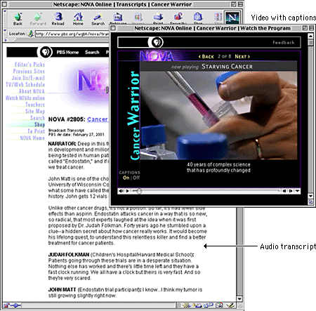
At minimum, you can use basic HTML to give disabled users information about multimedia content. For example, you can use the ALT parameter to include a short description of the animation in your applet or animated GIF HTML code. Because almost all browsing devices can handle text, if you include this basic descriptive text, users who have their Web pages read to them will at least be able to understand the function of the visual content.
Brewer, Judy, ed. 2001. How people with disabilities use the Web. http://www.w3c.org/wai/eo/Drafts/pwd-Use-Web (31 March 2001)
Chisholm, Wendy, Gregg Vanderheiden, and Ian Jacobs, eds. 1999. Web content accessibility guidelines 1.0. http://www.w3c.org/tr/wai-webcontent/wai-pageauth.html (17 January 2001).
CPB/WGBH National Center for Accessible Media. Rich media resource center. http://ncam.wgbh.org/richmedia (29 March 2001).
Kelsey, Logan, and Jim Feeley. 2000. Shooting video for the Web. DV (February). http://www.dv.com/magazine/2000/0200/videoforweb0200.html (28 March 2001).
Nielsen, Jakob. 1995. The alertbox: Current issues in Web usability. http://www.useit.com/alertbox.
———.1999. Designing web usability: The practice of simplicity. Indianapolis, Ind.: New Riders.
Simpson, Ron. 1998. Cutting edge Web audio. Upper Saddle River, N.J.: Prentice Hall.
Stern, Judith, and Robert Lettieri. 1999. QuickTime Pro for Macintosh and Windows. Berkeley, Calif.: Peachpit.
Terran Interactive. 1995 – 2000. Cleaner 5 User Manual. San Jose, Calif.: Terran Interactive. [See also http://www.terran-int.com]
———. 1999. How to produce high-quality QuickTime. San Jose, Calif.: Terran Interactive. [See also http://www.terran-int.com/QuickTime/Article]
Waggoner, Ben. 1999. Making great Web video. DV (October). http://www.dv.com/magazine/1999/1099/webvideo1099.pdf (28 March 2001).