Determining the proper length for any Web page requires balancing four factors:
Researchers have noted the disorientation that results from scrolling on computer screens. The reader's loss of context is particularly troublesome when such basic navigational elements as document titles, site identifiers, and links to other site pages disappear off-screen while scrolling. This disorientation effect argues for the creation of navigational Web pages (especially home pages and menus) that contain no more than one or two screens' worth of information and that feature local navigational links at the beginning and end of the page layout. Long Web pages require the user to remember too much information that scrolls off the screen; users easily lose their sense of context when the navigational buttons or major links are not visible:

In long Web pages the user must depend on the vertical scroll bar slider (the sliding box within the scroll bar) to navigate. In some graphic interfaces the scroll bar slider is fixed in size and provides little indication of the document length relative to what's visible on the screen, so the reader gets no visual cue to page length. In very long Web pages small movements of the scroll bar can completely change the visual contents of the screen, leaving the reader no familiar landmarks to orient by. This gives the user no choice but to crawl downward with the scroll bar arrows or risk missing sections of the page.
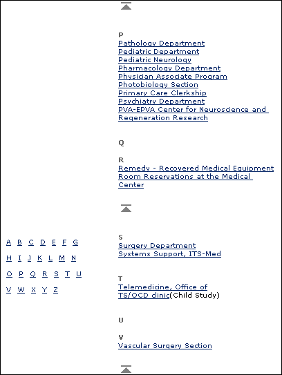
Long Web pages do have their advantages, however. They are often easier for creators to organize and for users to download. Web site managers don't have to maintain as many links and pages with longer documents, and users don't need to download multiple files to collect information on a topic. Long pages are particularly useful for providing information that you don't expect users to read online (realistically, that means any document longer than two printed pages). You can make long pages friendlier by positioning "jump to top buttons" at regular intervals down the page. That way the user will never have to scroll far to find a navigation button that quickly brings him or her back to the top of the page.

All Web pages longer than two vertical screens should have a jump button at the foot of the page:

If a Web page is too long, however, or contains too many large graphics, the page can take too long for users with slow connections to download. Very large Web pages with many graphics may also overwhelm the RAM (random access memory) limitations of the user's Web browser, causing the browser to crash or causing the page to display and print improperly.
It makes sense to keep closely related information within the confines of a single Web page, particularly when you expect the user to print or save the text. Keeping the content in one place makes printing or saving easier. But more than four screens' worth of information forces the user to scroll so much that the utility of the online version of the page begins to deteriorate. Long pages often fail to take advantage of the linkages available in the Web medium.
If you wish to provide both a good online interface for a long document and easy printing or saving of its content:
In general, you should favor shorter Web pages for:
In general, longer documents are: