Site planning with a team is often easier if you base your major structural planning and decisions on a shared master site diagram that all members of the group can work with. The site diagram should evolve as the plan evolves and can act as the core planning document as changes are proposed and made in the diagram. Site diagrams are excellent for planning both the broad scope of the site and the details of where each piece of content, navigation, or interactive functionality will appear. In well-equipped Web projects the team meetings often center on a computer and data projector showing Web pages or PowerPoint graphics. Although there is no substitute for looking at actual Web pages, ironically, this reliance on data projection is a severe limitation in explaining complex Web site structures to a team. No matter how good your data projector is, you can show only one Web page at a time in a Web browser, and no current data projector can match the resolution, size, or flexibility (you can write on it) of a large paper diagram. For major planning meetings we often print at least one very large color diagram of the site organization, so that everyone can see the "big picture" as it develops from meeting to meeting. The site diagram dominates the middle of the conference table, becoming a tactile, malleable representation of the plan as it evolves. Everyone is free to make notes on it or suggest improvements in the site structure, and the revised diagram becomes the official result of the meeting.
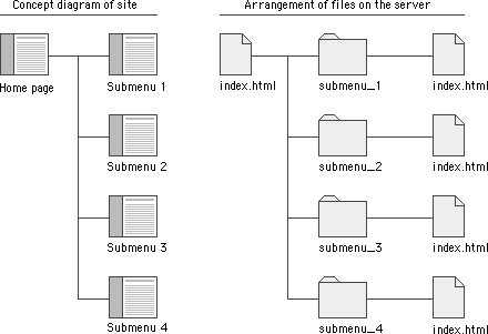
Site diagrams are also useful when your project moves from planning to actual Web page production. As the new site is built up in a directory on the Web server, the site diagram is often the first place programmers look to gain an understanding of how the site files should be subdivided into directories ("folders") on the server.
The pattern of directories and subdirectories of the site files should mirror the major content divisions and structures as shown on the site diagram:

As the site directories and subdirectories are organized on the server, information on the exact names used for major directories and files should be added to the site diagram, so that everyone on the team has a ready current reference to the naming conventions and file locations in the site.
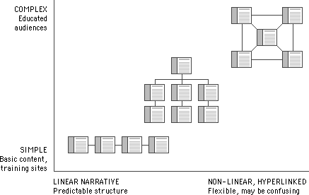
Most complex Web sites share aspects of all three types of information structures. Except in sites that rigorously enforce a sequence of pages, users are likely to use your site in a free-form weblike manner, just as they would a reference book. But the nonlinear usage patterns typical of Web surfers do not absolve you of the need to organize your thinking and present it within a clear, consistent structure that complements your design goals. The chart below summarizes the three basic organization patterns against the "linearity" of the narrative and the complexity of the content:
