In architecture as in all other operative arts, the end must direct the operation. The end is to build well. Well building hath three conditions. Commodity, firmness, and delight.
— Sir Henry Wotton, The Elements of Architecture
THE DESIGN OF THE SITE will determine its organizational framework. At this stage you will make the tactical design decisions about what your audience wants from you, what you wish to say, and how to arrange the content to best meet your audience's needs. Although people will notice the graphic design of your Web pages right away, the overall organization of the site will have the greatest impact on their experience.
The fundamental organizing principle in Web site design is meeting users' needs. Ask yourself what your audience wants, and center your site design on their needs. Many organizations and businesses make the mistake of using their Web sites primarily to describe their administrative organization, and only secondarily do they offer the services, products, and information the average user is seeking. Most readers won't care how your company or department is organized and will be put off if such inside information is all your site appears to offer. Talk to the people who make up your target audience, put yourself in their shoes, and make the items and services they want the most prominent items on the home page.
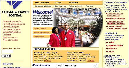
Notice, in the illustration below, how the major categories in the Yale–New Haven Hospital home page center on the needs and interests of various audiences, not on how the hospital is organized:
Our day-to-day professional and social lives rarely demand that we create detailed architectures of what we know and how those structures of information are linked. Yet without a solid and logical organizational foundation, your Web site will not function well even if your basic content is accurate, attractive, and well written. Cognitive psychologists have known for decades that most people can hold only about four to seven discrete chunks of information in short-term memory. The way people seek and use reference information also suggests that smaller, discrete units of information are more functional and easier to handle than long, undifferentiated tracts.
There are five basic steps in organizing your information:
Most information on the World Wide Web is gathered in short reference documents that are intended to be read nonsequentially. This is particularly true of sites whose contents are mostly technical or administrative documents. Long before the Web was invented, technical writers discovered that readers appreciate short "chunks" of information that can be located and scanned quickly. This method for presenting information translates well to the Web for several reasons:
The concept of a chunk of information must be flexible and consistent with common sense, logical organization, and convenience. Let the nature of the content suggest how it should be subdivided and organized. At times it makes sense to provide long documents as a subdivided and linked set of Web pages. Although short Web documents are usually preferable, it often makes little sense to divide a long document arbitrarily, particularly if you want users to be able to print easily or save the entire document in one step.
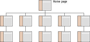
Hierarchical organization is virtually a necessity on the Web. Most sites depend on hierarchies, moving from the most general overview of the site (the home page), down through increasingly specific submenus and content pages. Chunks of information should be ranked in importance and organized by the interrelations among units. Once you have determined a logical set of priorities, you can build a hierarchy from the most important or general concepts down to the most specific or detailed topics.
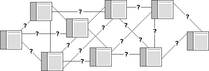
When confronted with a new and complex information system, users build mental models. They use these models to assess relations among topics and to guess where to find things they haven't seen before. The success of the organization of your Web site will be determined largely by how well your system matches your users' expectations. A logical site organization allows users to make successful predictions about where to find things. Consistent methods of displaying information permit users to extend their knowledge from familiar pages to unfamiliar ones. If you mislead users with a structure that is neither logical nor predictable, they will be frustrated by the difficulties of getting around. You don't want your users' mental model of your Web site to look like this:
Once you have created your site, analyze its functionality. Efficient Web site design is largely a matter of balancing the relation of menu, or home, pages with individual content pages. The goal is to build a hierarchy of menus and pages that feels natural to users and doesn't mislead them or interfere with their use of the site.
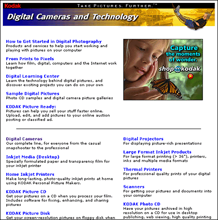
Web sites with too shallow a hierarchy depend on massive menu pages that can degenerate into a confusing "laundry list" of unrelated information:

Menu schemes can also be too deep, burying information beneath too many layers of menus. Having to navigate through layers of nested menus before reaching real content is frustrating:
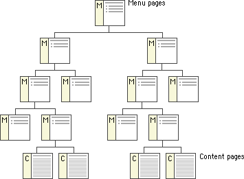
If your Web site is actively growing, the proper balance of menus and content pages is a moving target. Feedback from users (and analyzing your own use of the site) can help you decide if your menu scheme has outlived its usefulness or has weak areas. Complex document structures require deeper menu hierarchies, but users should never be forced into page after page of menus if direct access is possible. With a well-balanced, functional hierarchy you can offer users menus that provide quick access to information and reflect the organization of your site.
The most important step in planning your site is to organize your information. Thinking carefully about what you want to say and how you want to say it requires that you become intimately acquainted with your site content. Create outlines, chunk your information into sections and subsections, think about how the sections relate to one another, and create a table of contents. This exercise will help immensely when it comes time to build the individual pages of your site and may determine the eventual success of your Web site.
A well-organized table of contents can be a major navigation tool in your Web site. The table is more than a list of links — it gives the user an overview of the organization, extent, and narrative flow of your presentation:
If you are interested in the World Wide Web you can hardly escape references to hypertext and hypermedia. The computer press is full of fuzzy thinking about how Web-based information can somehow "link everything to everything." The implication is that with the Web you can dispense with one of the most challenging aspects of presenting information — putting it into a logical order and creating an interesting and understandable resource for readers. But if your idea of how one section of your site relates to other areas is hazy, if you have no comprehensive narrative or clear sense of organization, your readers will know it soon enough, and most will leave in pursuit of material that is better organized.
Web sites are built around basic structural themes. These fundamental architectures govern the navigational interface of the Web site and mold the user's mental models of how the information is organized. Three essential structures can be used to build a Web site: sequences, hierarchies, and webs.
The simplest way to organize information is to place it in a sequence. Sequential ordering may be chronological, a logical series of topics progressing from the general to the specific, or alphabetical, as in indexes, encyclopedias, and glossaries. Straight sequences are the most appropriate organization for training sites, for example, in which the reader is expected to go through a fixed set of material and the only links are those that support the linear navigation path:

More complex Web sites may still be organized as a logical sequence, but each page in the main sequence may have links to one or more pages of digressions, parenthetical information, or information on other Web sites:

Information hierarchies are the best way to organize most complex bodies of information. Because Web sites are usually organized around a single home page, hierarchical schemes are particularly suited to Web site organization. Hierarchical diagrams are very familiar in corporate and institutional life, so most users find this structure easy to understand. A hierarchical organization also imposes a useful discipline on your own analytical approach to your content, because hierarchies are practical only with well-organized material.
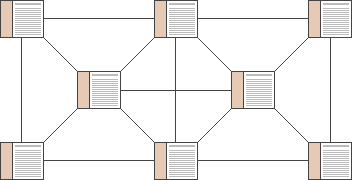
Weblike organizational structures pose few restrictions on the pattern of information use. In this structure the goal is often to mimic associative thought and the free flow of ideas, allowing users to follow their interests in a unique, heuristic, idiosyncratic pattern. This organizational pattern develops with dense links both to information elsewhere in the site and to information at other sites. Although the goal of this organization is to exploit the Web's power of linkage and association to the fullest, weblike structures can just as easily propagate confusion. Ironically, associative organizational schemes are often the most impractical structure for Web sites because they are so hard for the user to understand and predict. Webs work best for small sites dominated by lists of links and for sites aimed at highly educated or experienced users looking for further education or enrichment and not for a basic understanding of a topic.
Site planning with a team is often easier if you base your major structural planning and decisions on a shared master site diagram that all members of the group can work with. The site diagram should evolve as the plan evolves and can act as the core planning document as changes are proposed and made in the diagram. Site diagrams are excellent for planning both the broad scope of the site and the details of where each piece of content, navigation, or interactive functionality will appear. In well-equipped Web projects the team meetings often center on a computer and data projector showing Web pages or PowerPoint graphics. Although there is no substitute for looking at actual Web pages, ironically, this reliance on data projection is a severe limitation in explaining complex Web site structures to a team. No matter how good your data projector is, you can show only one Web page at a time in a Web browser, and no current data projector can match the resolution, size, or flexibility (you can write on it) of a large paper diagram. For major planning meetings we often print at least one very large color diagram of the site organization, so that everyone can see the "big picture" as it develops from meeting to meeting. The site diagram dominates the middle of the conference table, becoming a tactile, malleable representation of the plan as it evolves. Everyone is free to make notes on it or suggest improvements in the site structure, and the revised diagram becomes the official result of the meeting.
Site diagrams are also useful when your project moves from planning to actual Web page production. As the new site is built up in a directory on the Web server, the site diagram is often the first place programmers look to gain an understanding of how the site files should be subdivided into directories ("folders") on the server.
The pattern of directories and subdirectories of the site files should mirror the major content divisions and structures as shown on the site diagram:
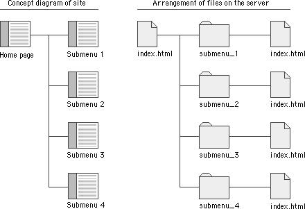
As the site directories and subdirectories are organized on the server, information on the exact names used for major directories and files should be added to the site diagram, so that everyone on the team has a ready current reference to the naming conventions and file locations in the site.
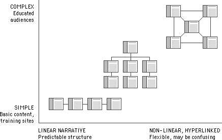
Most complex Web sites share aspects of all three types of information structures. Except in sites that rigorously enforce a sequence of pages, users are likely to use your site in a free-form weblike manner, just as they would a reference book. But the nonlinear usage patterns typical of Web surfers do not absolve you of the need to organize your thinking and present it within a clear, consistent structure that complements your design goals. The chart below summarizes the three basic organization patterns against the "linearity" of the narrative and the complexity of the content:
All presentations of information are governed by parameters determined by the objectives, the practical logistics of the chosen medium, and the audience. The figure below plots major themes for information delivery against two fundamental variables — the linearity of the structure of your presentation and the length of the typical user's contact time:
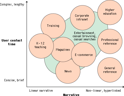
Some general modes of Web use are more structured and depend on audiences who arrive knowing what they wish to accomplish without the need for site-supplied motivation. Corporate intranets, training sites, educational sites, reference sites, and many well-known news and information sites benefit from audiences that know what to expect at a particular site and arrive there with a specific goal in mind. E-commerce and entertainment sites have a complex dual mission to balance: to motivate casual browsers to spend time in the site and become customers as well as to provide fast access to products and information to experienced users.

Naive designers and clients eager to do almost anything to attract attention to a Web site consistently make the mistake of maximizing immediate graphic impact over all other possible attributes of a site design. They have the misguided notion that if you constantly hit the reader between the eyes with a huge, noisy graphic or Flash animation, you will sustain their attention. Sometimes this does work — for about ten to fifteen seconds. "Eye candy" is a quick blast of visual sweets, but you can't build a Web site on a moment's attention. Most readers quickly tire of blaring animated graphics and the long downloads, plug-in compatibility irritations, and distracting stimuli that complicate such sites. A successful site requires real, sustained engagement, and you get that only by offering both sophisticated visual stimuli and a site that is structured to meet the needs of its audience quickly and effectively.
Web-based training applications tend to be linear in design and typically present few opportunities to digress from the central flow of the presentation. Don't confuse readers or confound your own expectations by offering many links away from the central message. Restricting links to the "Next" and "Previous" paging functions guarantees that everyone will see the same core presentation and allows you to predict users' contact time more accurately. Most training presentations assume a contact time of less than one hour or are broken up into sessions of an hour or less. Tell your readers how long the session will last, and warn them not to digress from the required material if they are to receive credit for the training. Training applications typically require a user log-in and often present forms-based quiz questions in true-false or multiple-choice formats. User registration data and scores are typically stored in a database linked to the Web site.

Good teaching applications are also built around a strong central narrative, but they typically offer more opportunities to pursue interesting digressions from the main themes of the Web site. The information presented is usually more sophisticated and in-depth than in training applications. Links are the most powerful aspect of the Web, but they can also be a distraction that may prevent visitors from getting through the presentation. If you wish to provide links to other Web-based resources beyond your local site, you might consider grouping the links on a separate page away from the main body of the material. Often readers will want to print material from a teaching site and read it later from paper. Make this easy for them by providing a "printing" version that consolidates many separate pages into one long page.
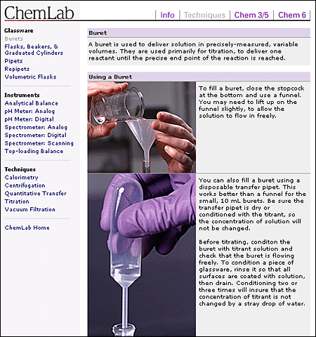
The audiences for heuristic, self-directed learning will chafe at design strategies that are too restrictive or linear. The typical corporate or academic user of such sites is usually fairly knowledgeable in the subject area. The Web is an ideal medium for "just in time" training, where users pick just the specific topic where they need education. Flexible, interactive, nonlinear design structures are ideal for these readers because it is difficult to predict exactly which topics will most interest them. The design must permit fast access to a wide range of topics and is typically dense with links to related material within the local site and beyond on the World Wide Web. Text-based lists of links work well here for tables of contents and indexes because they load fast and are full of information, but well-designed graphics and illustrations are also needed so that this easily bored audience will stay involved with the material. Contact times are unpredictable but are often shorter than for training or teaching sites because the readers are usually under time pressure. Easy printing options are another must for this audience.
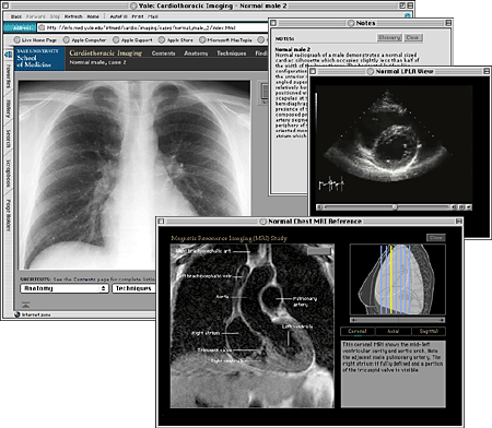
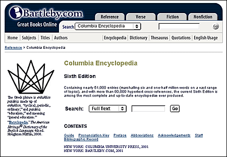
The best-designed reference Web sites allow readers to pop into the site, find what they want, and easily print or download what they find. There is typically no "story" to tell, so usage patterns are nonlinear. Nonessential graphics should be minimal and undistracting, and content and menu structure must be carefully organized to support fast search and retrieval, easy downloading of files, and convenient printing options. A well-designed search engine is a must for sites with more than thirty pages, or sites that store long text documents in single Web pages. You may wish to investigate more sophisticated multiparameter search software instead of relying on single keyword searches. Contact time is typically brief in reference sites: the shorter the better.
Unlike the sites covered thus far, entertainment sites usually cater to an audience whose interests and motivations are usually much less focused. This audience needs to be grabbed immediately by compelling graphic and text presentations, or they'll simply hop somewhere else in search of stimulation. As in any other design genre, what is "compelling" depends entirely on the audience's expectations. Slate's sophisticated mix of political commentary and social criticism depends heavily on clever, well-written headlines and teasers. The well-designed home page presentation is derived entirely from presentation styles used in political and current affairs magazines, because that's exactly the audience Slate is seeking.
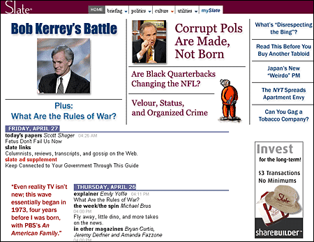
Unfortunately, content presentation in entertainment and magazine sites is consistently marred by the intrusion of banner ads, whose winking, blinking, and blaring colored boxes interfere with on-screen reading.
News sites have largely adapted the existing design genres of print newspapers and magazines to the smaller format of the Web. Virtually all of the design conventions used on the New York Times Web site derive from well-established print precedents, although ironically, the New York Times's louder, more colorful Web presence owes more to the exaggerated visual hierarchies of USA Today than to the Times's conservative print conventions.
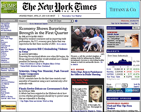
Fortunately, aside from the newspapers themselves, there are excellent resources available for learning the conventions and terminology of journalistic graphic design. Tim Harrower's Newspaper Designer's Handbook and other similar books are filled with useful presentation devices that translate easily to a Web page and have the additional benefit of being familiar to the news audience.
In e-commerce sites the crucial design parameters are efficient navigation and search, along with speed to the final "place order" button. During the "dot-com" market bubble many new e-commerce sites spent fortunes of their investors' money on elaborate Macromedia Flash or digital video presentations and quickly failed — some went bankrupt before the site was launched. Meanwhile, the Web's most successful commerce sites kept things technically simple and basic. Amazon, eBay, Yahoo!, and other successful Web commerce sites use remarkably spare page design schemes and simple text- or tab-based navigation systems. Another area where e-commerce sites often fail is in providing search engines that are smart enough to "degrade gracefully" when there is no exact match to a request. If a shopper types in "PDA" and the inventory fails to turn up any products by that exact name, the search engine should default to a list of "personal digital assistants" made by various manufacturers.
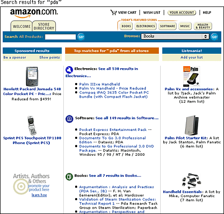
Amazon has experimented with various tab systems as the site has grown, but the choice of tabs as a navigation system was wise — tabs are one of the few real-world graphic navigation metaphors to have translated to the screen. Tabs work with only about eight or fewer choices, however. As tabs multiply, their sheer number creates confusion.
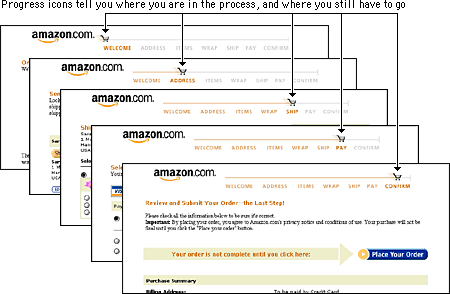
Amazon's order processing screens are also a model of navigation design for Web commerce. Most well-designed order screens are short and deal with topics one at a time (review items in "shopping cart," provide shipping address, add credit card information, and so on) on screens that don't require scrolling. But this forces the order process to take place over multiple screens, which could become tedious if not for the "you are here" progress icons at the top of the screen. The lesson here is clear: all e-commerce processes involve some tedium for the buyer. Yet if you provide information on the user's current position, the slow series of screens becomes less of a problem because the user knows what to expect.
Web sites vary enormously in their style, content, organization, and purpose, but all Web sites that are designed primarily to act as information resources share certain characteristics.
All Web sites are organized around a home page that acts as a logical point of entry into the system of Web pages in a site. In hierarchical organizations, the home page sits at the top of the chart, and all pages in the Web site should contain a direct link back to the home page. The World Wide Web URL for a home page is the Web "address" that points users to the Web site. In many cases, home page addresses are used more than home and business street addresses.
The thirty square inches at the top of a home page comprise the most visible area of the Web site. Most readers will be looking at your site on a seventeen- to nineteen-inch monitor, and the top four or five vertical inches are all that is sure to be visible on their screens. The best visual metaphor here is to a newspaper page — position matters. It's nice to be on the front page, but stories "above the fold" are much more visible than those below. In sites designed for efficient navigation the density of links at the top of the home page should be maximal — you'll never get a better chance to offer your readers exactly what they want in the first page they see:
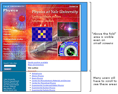
Home pages perform a variety of functions. Some designs primarily take advantage of the high visibility of the home page; it's the most visited page of your site and is therefore ideal for posting news and information. The high visibility of the home page also makes it the ideal place to put a menu of links or table of contents for the site. Navigation schemes in sites that use the home page for news and menu listings are often centered on the home page, using it as the "home base" for most navigation through the site. Other home page designs use the home page as the first opportunity to steer audiences into subtopic or special interest areas of the site. The following are the most common home page design strategies:
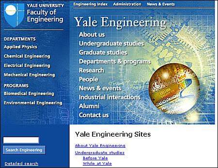
Menu-like lists of links dominated the design of most home pages in the first few years of the Web, and this remains the most common type of home page. Menu-style pages need not be dominated by plain lists of text-based HTML links — graphic imagemaps are often more space efficient, packing the maximal number of links into every square inch of the page. Sophisticated designs combine graphic imagemaps and blocks of text-based links. Text links offer less visual impact but are much easier to change on short notice.
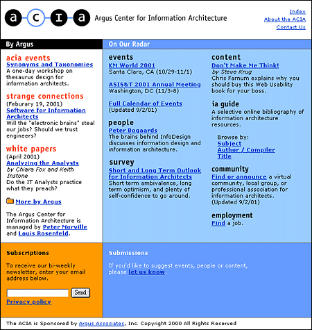
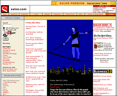
The home pages of such organizations as the New York Times and CNN (Cable News Network) are obvious examples here, but many organizations take advantage of the high visibility of their home pages to make announcements to both employees and the larger Web audience. Live information makes a home page more attractive and more likely to generate repeat visits. Many home page designs reserve one or more areas for late-breaking news, calendar events, or alert messages. If you choose this approach, standardize the location and nature of the news areas within a general page framework that remains stable over time. Readers will be disoriented if your home page changes too much from week to week.
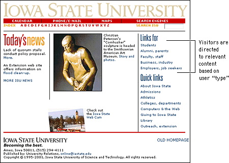
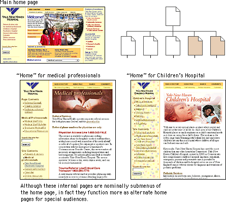
Large Web sites offer so much information to so many audiences that it can be impossible to represent the depth and breadth of the site content in a single home page. In addition, readers often come to a Web site with specific interests or goals in mind. In such cases it is often advantageous to use the home page to split the audience immediately into interest groups and to offer them specific, more relevant information in menu pages deeper within the site.
Splash screens, or site covers, are the most controversial of all site elements. For many readers, site covers are simply an additional and annoying mouse click between them and the content they are seeking. Such readers would like to be presented with a site index at the start rather than a splash screen with pretty graphics or spiffy animations. The key is to assess your audience and then choose the entry that seems most appropriate.
Consider the function of your site. Is your typical visitor there for a single visit or will they visit often? An online tool such as a calendar or search engine should not have a purely aesthetic site cover, because visitors may visit the site several times a day. An elegant but nonfunctional cover on such a site will soon become tedious. Of course, visitors who do not wish to enter through the front door can simply bookmark an internal page of your site, such as the table of contents. But if you find yourself repeatedly making this argument for using a splash screen, you may wish to adapt or even remove your cover to better accommodate your audience.
The success of splash screens depends enormously on the expectations of the site visitor. If you were to visit a site about a poet you would enter with different expectations than you would when visiting a site about carpal tunnel syndrome. Visitors to a site about poetry may not simply be out Web foraging but may instead be looking for an experience, for art, for entertainment. A mysterious, enigmatic, aesthetically pleasing facade might just entice such visitors in.
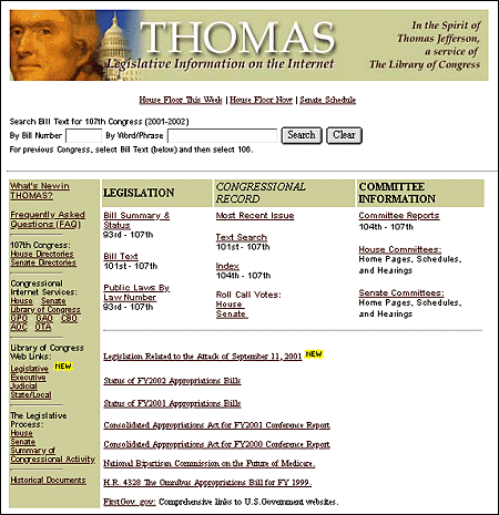
ONE OF THESE FOUR BASIC SCHEMES may dominate the home page design, but increasingly home pages are a complex amalgam of all strategies. The Library of Congress's THOMAS home page mixes images, menu lists, and special interest sections:
The primary layout decision you will make about your home page is how heavily you will use graphics on the page. Most corporate, institutional, and education home pages display at least a small graphic banner across the top of the home page, and in commercial sites the trend is rapidly moving toward complex mixtures of links embedded in graphic imagemaps and links in text that emulate the look and functions of CD-ROM multimedia title pages or print magazines. Although strong graphics can be effective at grabbing a browser's attention, large graphic menus impose long loading times for pages, especially for users linking to the Internet via modems or slow network connections. Even if the user is accessing your Web site at Ethernet speeds, graphic menus may still load many times slower than text-based lists of links.
This dichotomy between slow-loading but attractive graphics-based home pages and fast-loading but prosaic text-based home pages also reflects the need to address multiple audiences with different expectations. The goals for most Web sites are to transmit internal information (to students, employees, and clients) and to communicate with potential clients and the general Web-browsing public. The Guggenheim Museum has opted for a graphic home page design, but the layout is carefully designed to stay within the dimensions of the average office monitor. Because the graphic area is moderately sized, the page loads reasonably quickly for a graphic menu:

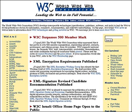
The relatively plain, mostly text-based home page for the World Wide Web Consortium offers an efficient ratio of links per kilobyte of page size, but at some cost in pure visual appeal. The page is fast-loading and well designed for its audience of Web specialists but would not attract the average browser through presentation alone:
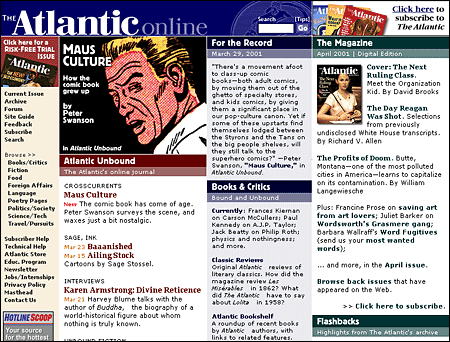
The best way to meet the needs of both casual browsers and highly targeted frequent users is to present alternative views of your Web site. One approach is to make a visually attractive main home page aimed at the general audience of Web browsers but also to offer a more text-oriented alternate home page that emphasizes rapid access to information via detailed text menus. Another approach is to use a graphic banner at the top of the home page, followed by a set of text-based links. The home page for The Atlantic Online reflects this dual approach, with a moderate-sized graphic image topping a well-organized set of text links:
Many Web users who access the Internet via modems choose not to load graphics and thus will not see menu links embedded in imagemap graphics. If you choose to depend on links embedded in imagemaps, it is crucial to provide alternative text-based links that will remain visible even if readers have chosen to turn off the display of graphics. Many sites provide these text-based links in small sizes below the page footer, where they are accessible but do not disrupt the overall design of the page:
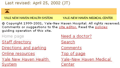
The home page usually gets the most attention in the beginning of a Web site design project. Your home page is important, but remember — it is inherently singular. Don't let the design of the home page dominate your site design strategies. When designing a large Web site it's much more important to concentrate on the standard layout grid that all the internal pages of the site will share. After all, you'll have only one home page, but you could easily have thousands of internal pages as the site grows. If you make a mistake on the home page you only have one page to fix. If you make a mistake in creating the basic internal page grid you could soon have thousands of pages to fix. The overall success of the Web site will depend more on a strong, logical page grid than on the appeal of the site's home page. The details of page layout grids are discussed in the following chapters, but we raise the issue of page grids here because it is a crucial design decision when creating a Web site. Think about it: if you tire of your home page, you have only one page to change. Make a big mistake with your page grid and you could end up with thousands of poorly designed pages.
Constructing a layout grid usually begins by analyzing the content structure you have worked out and deciding what (besides the all-important home page link) you will need for the most general navigation purposes. Here you are trying to establish what links will be present and generally useful on every page of your Web site. If you work in a corporation or any sizeable government or nonprofit enterprise you must also consider how your particular site fits into the larger context of the other Web sites in your enterprise. Does your enterprise already have an established and successful Web design format that you can adopt? If not, carefully consider what links, logos, and other graphic and functional elements reflecting your place in the larger enterprise should be present on all of your pages. The goal is to establish a logical and consistent approach to where basic graphic identity elements, navigation links, and other essential information appear on every page within your site. Terminology is also crucial here: choose your words carefully for links and titles, and solicit comments and feedback from fellow team members and site users. A misleading or confusing label or phrase can ruin the functionality of a link.
A page grid establishes the number, location, and terminology of all major page links and page graphic elements:
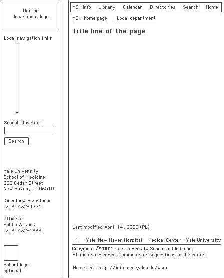
Note that so far we have not discussed specific graphic elements in relation to the page grid. A page grid can be used to enforce a very rigid, visually consistent identity scheme by incorporating information on the exact graphics, logos, fonts, colors, and wording of page elements:

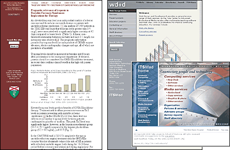
However, a page grid is also a great way to allow a variety of visual approaches to site design within an enterprise while maintaining a reasonably consistent navigational interface for the user. All three of these pages, though they use a variety of colors and graphic schemes, share the same underlying page grid that specifies the position and wording of major navigation links and other page elements:
After establishing the internal page grid you can build the site home page on the same underlying grid, so that readers who come to your site are immediately introduced to the page grid, identity graphics, and navigation scheme that is used throughout the site. The home page grid does not have to be identical to the internal page grid; home pages must provide a much wider range of content and navigation elements than the average internal page. For this reason home pages are often much wider to fill the screen and more graphic than the average internal page:
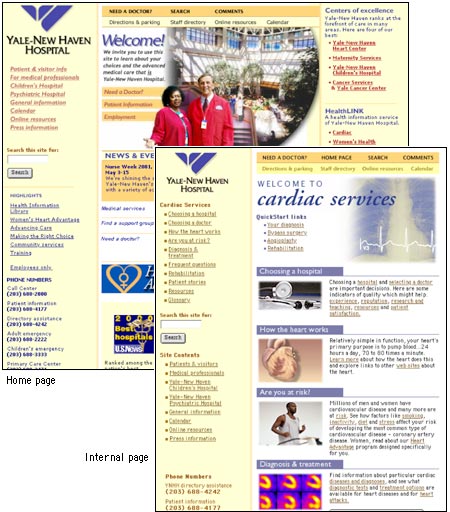
Unless your site is small you will probably need a number of submenu pages that users enter from a general category listing on your home page. In complex sites with multiple topic areas it is not practical to burden the home page with dozens of links — the page grows too long to load in a timely manner, and its sheer complexity may be off-putting to many users. Providing a submenu page for each topic will create a mini-home page for each section of the site. For specialized, detailed submenus you could even encourage frequent users to link there directly. In this way the submenus will become alternate home pages in "subsites" oriented to a specific audience. Be sure to include a basic set of links to other sections of the site on each subsite home page, and always include a link back to your main organization home page.
The World Wide Web is growing so rapidly that even the large commercial Web index services such as Yahoo! and Excite are only partial listings of the information accessible through the Web. When authors begin to build Web sites, their first page is often a collection of favorite links to sites related to their profession, industry, or interests. In a corporate or institutional site, a well-edited, well-maintained "Other useful sites" page may be the most valuable and heavily used resource.
Unlike print media, where the physical heft and dimensions of a book or magazine give instant cues to the amount of information to expect, Web sites often give few explicit indications of the depth and extent of the content available. This is especially true when the home page does not provide an extensive listing of internal site links. Although search facilities offer users quick access to your content, they are no substitute for a clear, well-organized exposition of your site's contents. Even the best search engines are relatively stupid and have only the most primitive means of assessing the priority, relevance, and interrelations of the information resources you offer in your Web site.
Tables of contents and keyword indexes of the information in your Web site are an easy way to give readers a clear sense of the extent, organization, and context of your site content. Tables of contents and indexes are familiar print conventions; readers understand them and will appreciate the overviews, perspectives, and efficient navigation they afford. The main difference between Web-based indexes and their print counterparts is that a Web site index need not be as extensive or detailed as a book index because you can always use a search engine to find every obscure reference to a keyword. A Web site index should point to the most relevant and useful occurrences of a keyword and ignore minor references (those will turn up in a keyword search anyway).
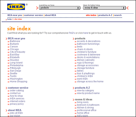
Site maps give the reader an overview of the site contents. Site maps come in two varieties: graphic diagrams that literally use the "map" metaphor and organized list links to major pages within the site.
The form of graphic site maps varies from hierarchical branching diagrams to geographic metaphors, but they all share the same limitations:
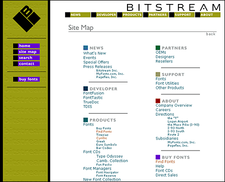
Site maps based on carefully organized text links of major menus and submenu pages and major page titles are much more informative than graphic maps and can easily be updated as your site matures. Most effective text site maps are really just expanded tables of contents. As such they are instantly familiar and understood by the vast majority of the readers in your audience. Bitstream's site map is a particularly well designed example of this type:
Many Web sites need to be updated frequently so that the information they present doesn't become stale. But the presence of new information may not be obvious to readers unless you make a systematic effort to inform them. If items that appear on your home page menu are updated, you could place a "new" graphic next to each updated item. If, however, your site is complex, with many levels of information spread over dozens (or hundreds) of pages, you might consider making a "What's New" page designed specifically to inform users of updated information throughout the site.
Every Web page in a corporate or institutional site should carry a revision date that is changed each time the page is updated so that users can be sure they have the latest version. Many readers print pages from the Web. Without a revision date, your readers have no way of telling whether the page they printed is current or outdated.
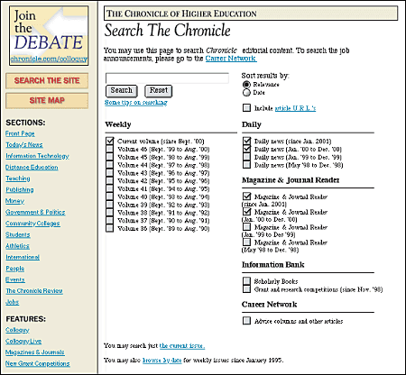
Search facilities are a necessity for large sites and are convenient even for smaller sites that contain long documents. Sites that are updated frequently also require a good search engine, because your menus and site index will probably not keep pace with every change you make in the content pages of the site. But search engines are no substitute for a carefully organized browsing structure of menus and submenus. The two systems, browsing by menu and searching by keyword, complement each other — neither system alone is adequate. Keyword searches give the reader specific links to follow but with no overview of the nature and extent of your content and no feel for how you have organized the information. Menus and tables of contents are great for broad overviews, but if your readers are looking for a specific piece of information not mentioned in the contents, they may miss what you have to offer.
The search software you use will often dictate the user interface for searching. If you update your content frequently, be sure that your search engine's indexing is done at least daily. Also be sure that your readers understand exactly what content is being searched: the entire Web site or just a subsection? If your site is complex you may wish to offer readers a pop-up menu that lists the areas of your site and allows them to limit their search to a specific area. And make sure that the results page also matches the graphic design of the site.
The Web is a bidirectional medium — people expect to be able to send you comments, questions, and suggestions. Always provide at least one link to an email address in a prominent location in your site. You can request user information and feedback using Web page forms and then use a database to store and analyze their input.
The logistical and support staff implications of creating a popular Web site are often overlooked until a crisis develops. Rolling out a new, heavily trafficked Web site is like suddenly adding a second front door to your enterprise. Who will greet the people who come flooding in? Who will answer their questions about your organization and its products and services? Who will collect and analyze the information you receive from your readers? Before you add this functionality to your Web pages, be sure you have an infrastructure in place to handle the fruits of your success.
It is amazing how often site developers forget that not all communication with the organization goes through the Web site. Even if you have a great Web site, people will still want to call you, send you mail and express packages, and fax you documents. Your home page should include the same contact information you provide on your stationery, marketing materials, and business cards. If your home page design doesn't allow adequate space for this information, at least provide a link to another page with contact information.
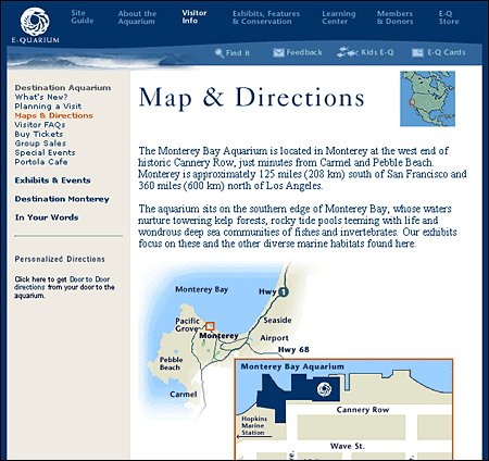
Your Web site is an ideal place to make travel information available to clients, visitors, vendors — anyone who needs to find your organization. Graphic maps, text-based directions, local hotel information, and even internal floor plans can ensure that your visitors will be able to reach you easily and efficiently.
The concept of "documents" in electronic environments like the Web is flexible, and the economics and logistics of digital publishing make it possible to provide information without the costs associated with printing paper documents. Making a report available to colleagues on paper usually means printing a copy for each person, so costs and practicality dictate that paper reports be concise and with limited supporting material. Bibliographies, glossaries, or appendixes that might be too bulky to load into a task force report or committee recommendations document can instead be placed in a Web site, making the information available to colleagues as needed.
The Web and other Internet-based media have evolved a unique institution, the FAQ or "frequently asked questions" page, where the most commonly asked questions from users are listed along with answers. FAQ pages are ideal for Web sites designed to provide support and information to a working group within an institution or to a professional or trade group that maintains a central office staff. Most questions from new users have been asked and answered many times before. A well-designed FAQ page can improve users' understanding of the information and services offered and reduce demands on your support staff.
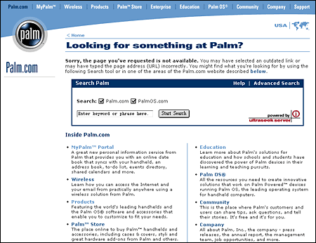
Most Web users are familiar with the "404 error, file not found" screens that pop up on the screen when a Web server is unable to locate a page. The file may be missing because the author has moved or deleted it, or the reader may simply have typed or copied the URL of the page incorrectly. One mark of a really polished Web site is custom-designed and useful error and server message pages. Most standard error screens are generic, ugly, and uninformative. A well-designed error screen should be consistent with the graphic look and feel of the rest of the Web site. The page should offer some likely explanations for the error, suggest alternatives, and provide links to the local home page, site index, or search page:
Most Web sites are designed to be viewed by audiences inside an organization and are often not visible to the larger World Wide Web. Although these intranet sites employ the same technology as sites designed for the larger Web audience, their design and content should reflect the different motivations of intranet users.
External sites are usually aimed at capturing an audience. The overall goal is to maximize contact time, drawing readers deeper into the site and rewarding their curiosity with interesting or entertaining information. One assumption that governs Web design is that readers may have little motivation to stay and must be constantly enticed and rewarded with rich graphics or compelling information to linger within the site.
Successful intranet sites assemble useful information, organize it into logical systems, and deliver the information efficiently. You don't want intranet users lingering over their Web browsers, either in frustration at not being able to find what they are seeking or in idle "surfing." Allow employees and students to get exactly what they need quickly and then move on.
In most institutions the use of the World Wide Web has evolved over the past few years from an informal collection of personal or group home pages into a semiorganized collection of sites listed in one or more master home pages or "front door" sites. Ironically, universities and companies that adopted the Web early are often the least organized, because each department and group has over the years evolved its own idiosyncratic approach to graphic design, user interface design, and information architecture. But the Web and institutional intranets are no longer just a playground for the local "geeks." Patchy, heterogeneous design standards and a lack of cohesive central planning can cripple any attempt to realize productivity gains through an intranet.
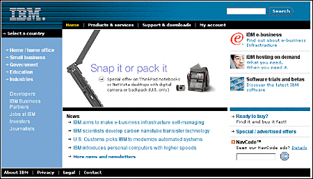
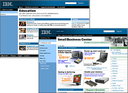
IBM's sites are models of a consistent, in-depth approach to Web design, making it possible for both employees and customers to navigate through a huge, complex information system with one unified visual identity and user interface:
User surveys done at Sun Microsystems in the mid-1990s by user interface expert Jakob Nielsen showed that the average Sun employee used about twelve intranet pages a day and about two new intranet subsites each week, and the numbers are surely many times higher today. Nielsen estimated that his redesign of Sun's intranet user interface would save each employee as much as five minutes a week through consistent companywide application of design and navigation interface standards. The aggregate savings in Sun employee time could amount to as much as ten million dollars a year, through improving productivity and increasing the efficiency with which employees use the company's intranet sites. Consistent, predictable interfaces are the key to a return on the enormous investment enterprises have made in their Web sites and corporate intranets.
All institutions that deploy intranets have clear economic and social motivations to develop and propagate a consistent set of design standards for the development of local Web pages and internal information sources. But obstacles to implementing an institutionwide set of standards are considerable. Groups and individuals may feel that they own the "right" to design and publish as they please, and they often have more Web expertise and experience than senior management. Groups that have used the Web for years already have a considerable investment in their designs and will be reluctant to change. University and nonprofit administrations often lack the economic resources to develop institutional standards manuals and motivate departments to adopt them. The lack of broad consensus on what constitutes proper Web design only complicates the matter.
Consider the overall effect of the National Oceanic and Atmospheric Administration's home page and a few of the major pages just below the home page:
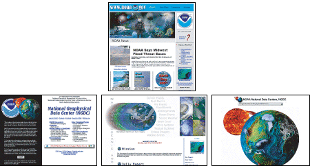
Although each individual site has its merits, in aggregate the user's experience in navigating though the various NOAA sites is cluttered, confusing, and inconsistent in visual identity and user interface. NOAA is hardly alone in this; in the rush to build Web sites most enterprises have produced crazy quilts of inconsistent designs and user interfaces and only now are realizing how painfully visible their confusion and lack of organization are to the outside world. Never judge the success of your particular site design by looking only within the bounds of your enterprise's site. Readers spend most of their time on sites other than your little slice of the Web. The only way to create a sustained and consistent sense of place and easy navigation is to establish broad consensus within the larger enterprise and create sites that look and feel like a consistent whole.
The design and interface problems cited above will be familiar to every corporate or enterprise Webmaster and to anyone who has had to sit on a Web or intranet committee. The human and technical difficulties are all great reasons for doing nothing, but they ignore the most important element of any Web site: the user. If reasonable, consistent design standards are not adopted, the average user suffers confusion, reduced productivity, and lost opportunity to benefit from the promise of Web information sources. The advantages of consistent graphic design and user interface standards are immediately obvious in a user-centered approach to Web design and clearly transcend the parochial interests of participating departments, groups, and individuals. If the typical user of a public site or corporate intranet sees more confusion than useful information, no one will benefit.
Without clear design standards, your overall enterprise Web presence will evolve as a patchy, confusing set of pages — some well designed, some disastrous, and all mere parts of a dysfunctional system. A lack of design standards also limits Web use by imposing complex design decisions on new users who would like to develop sites; it's a daunting task to have to develop new graphic design and interface conventions instead of being able to adopt a professionally designed system of corporate intranet standards.
Fleming, Jennifer. 1998. Web navigation: Designing the user experience. Sebastopol, Calif.: O'Reilly.
Harrower, Tim. 1998. The newspaper designer's handbook, 4th ed. Boston: McGraw-Hill.
Krug, Steve. 2001. Don't make me think! A common sense approach to Web usability. Indianapolis, Ind.: Que.
Nielsen, Jakob. 1995. The alertbox: Current issues in Web usability. http://www.useit.com/alertbox.
———. 1999. Designing Web usability: The practice of simplicity. Indianapolis, Ind.: New Riders.
Rosenfeld, Louis, and Peter Morville. 1998. Information architecture for the World Wide Web. Sebastopol, Calif.: O'Reilly.
Sklar, Joel. 2000. Principles of Web design. Cambridge, Mass.: Course Technology.
Veen, Jeffrey. 2001. The art and science of Web design. Indianapolis, Ind.: New Riders.