All institutions that deploy intranets have clear economic and social motivations to develop and propagate a consistent set of design standards for the development of local Web pages and internal information sources. But obstacles to implementing an institutionwide set of standards are considerable. Groups and individuals may feel that they own the "right" to design and publish as they please, and they often have more Web expertise and experience than senior management. Groups that have used the Web for years already have a considerable investment in their designs and will be reluctant to change. University and nonprofit administrations often lack the economic resources to develop institutional standards manuals and motivate departments to adopt them. The lack of broad consensus on what constitutes proper Web design only complicates the matter.
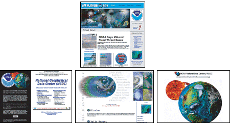
Consider the overall effect of the National Oceanic and Atmospheric Administration's home page and a few of the major pages just below the home page:

Although each individual site has its merits, in aggregate the user's experience in navigating though the various NOAA sites is cluttered, confusing, and inconsistent in visual identity and user interface. NOAA is hardly alone in this; in the rush to build Web sites most enterprises have produced crazy quilts of inconsistent designs and user interfaces and only now are realizing how painfully visible their confusion and lack of organization are to the outside world. Never judge the success of your particular site design by looking only within the bounds of your enterprise's site. Readers spend most of their time on sites other than your little slice of the Web. The only way to create a sustained and consistent sense of place and easy navigation is to establish broad consensus within the larger enterprise and create sites that look and feel like a consistent whole.

The design and interface problems cited above will be familiar to every corporate or enterprise Webmaster and to anyone who has had to sit on a Web or intranet committee. The human and technical difficulties are all great reasons for doing nothing, but they ignore the most important element of any Web site: the user. If reasonable, consistent design standards are not adopted, the average user suffers confusion, reduced productivity, and lost opportunity to benefit from the promise of Web information sources. The advantages of consistent graphic design and user interface standards are immediately obvious in a user-centered approach to Web design and clearly transcend the parochial interests of participating departments, groups, and individuals. If the typical user of a public site or corporate intranet sees more confusion than useful information, no one will benefit.
Without clear design standards, your overall enterprise Web presence will evolve as a patchy, confusing set of pages — some well designed, some disastrous, and all mere parts of a dysfunctional system. A lack of design standards also limits Web use by imposing complex design decisions on new users who would like to develop sites; it's a daunting task to have to develop new graphic design and interface conventions instead of being able to adopt a professionally designed system of corporate intranet standards.