Two basic types of links are used in Web sites: navigational links connect pages within a site and the classic hypertext links offer parenthetical material, footnotes, digressions, or parallel themes that the author believes will enrich the main content of the page. Although navigational links can cause problems in site design, more disruptive is the overuse or poor placement of hypertext links.
Hypertext links pose two fundamental design problems. They disrupt the flow of content in your site by inviting the reader to leave your site. They can also radically alter the context of information by dumping the reader into unfamiliar territory without preamble or explanation.
The primary design strategy in thoughtful hypertext is to use links to reinforce your message, not to distract readers or send them off chasing a minor footnote in some other Web site. Most links in a Web site should point to other resources within your site, pages that share the same graphic design, navigational controls, and overall content theme. Whenever possible, integrate related visuals or text materials into your site so that readers do not have the sense that you have dumped them outside your site's framework. If you must send your reader away, make sure the material around the link makes it clear that the reader will be leaving your Web site and entering another site by following the link. Provide a description of the linked site along with the link so users understand the relevance of the linked material.

The key to good hypertext linking is to maintain context, so that the reader stays within the narrative flow and design environment of your site. If you place a simple link on your page, these plain links will work within a single browser window — your content will disappear and the linked page will fill the window. If you use this kind of link to point away from your site, you will probably lose your readers.
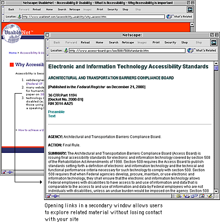
The simplest way to maintain context using links to other sites is to add the TARGET="main" argument to your link tags. This will cause the linked page to appear in a new browser window in front of the one containing your page. This feature allows your reader to access new material without losing visual contact with your site.

Frames offer a more complex way to maintain narrative and design context. Using frames you can split the browser screen between your site and the material you wish to bring up with a link. Frames allow you to supply commentary on material in another site and also to maintain navigation links back to your site (see Page Design, Frames).
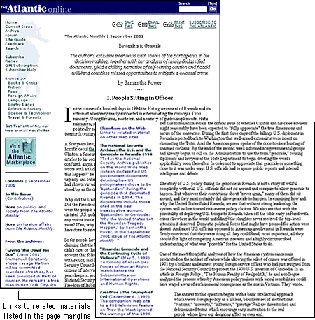
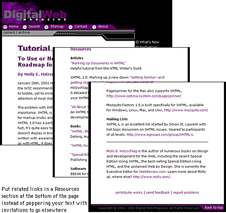
Links are a distraction. It is pointless to write a paragraph and then fill it with invitations to your reader to go elsewhere. You can minimize the disruptive quality of links by managing their placement on the page. Put only the most salient links within the body of your text, and remember that these links should open new browser windows so that you don't supplant the original pages. But most links do not belong in the middle of the page — they won't be important enough to justify the potential distractions they pose. Group all minor, illustrative, parenthetic, or footnote links at the bottom of the document where they are available but not distracting.

If you do place links in the body of your text, pay close attention to your language. Never construct a sentence around a link phrase, such as "click here for more information." Write the sentence as you normally would, and place the link anchor on the word or words that best describe the additional content you are linking to.