First we thought the PC was a calculator. Then we found out how to turn numbers into letters with ASCII — and we thought it was a typewriter. Then we discovered graphics, and we thought it was a television. With the World Wide Web, we've realized it's a brochure.
— Douglas Adams
AMONG THE MANY Web-induced trends, the emergence of a new writing genre designed to accommodate the reading habits of Web users is especially notable. People read differently on the Web. One reason for this is that reading text on-screen is unpleasant. Given the low resolution of the computer screen and the clumsiness of the scrolling page, many readers scan onscreen and print pages for reading. Another reason is that Web reading is not a stationary activity. Users roam from page to page collecting salient bits of information from a variety of sources. They need to be able quickly to ascertain the contents of a page, get the information they are seeking, and move on. Also, because Web pages may be accessed directly without preamble, they must be more independent than print pages. Too many Web pages end up as isolated fragments of information, divorced from the larger context of their parent Web sites through the lack of essential links and the simpler failure to inform the reader properly of their contents.
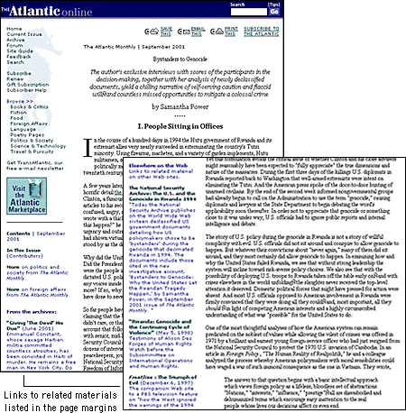
One of the most obvious characteristics of Web writing is hypertext links. Web authors use hypertext links to create or supplement concepts: a list of related links can reinforce their content or even serve as the focus of their site. The problem posed by links has little to do with the Web but is rooted in the concept of hypertext: Can the quick juxtaposition of two separate but conceptually related pieces of information encourage a better understanding of the overall message? A collection of links cannot create or sustain an argument or deliver a collection of facts as efficiently or legibly as conventional linear prose. When there is no sustained narrative, readers are sent aimlessly wandering in their quest for information. Links also become a maintenance issue, because most Web pages are ephemeral. Broken links shake the reader's confidence in the validity and timeliness of content. Links should be used sparingly and as a reinforcement of, not a substitute for, content.
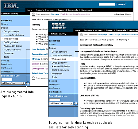
Documents written to be read online must be concise and structured for scanning. People tend to skim Web pages rather than read them word by word. Use headings, lists, and typographical emphasis for words or sections you wish to highlight; these are the elements that will grab the user's attention during a quick scan. Keep these elements clear and precise — use your page and section heads to describe the material. The "inverted pyramid" style used in journalism works well on Web pages, with the conclusion appearing at the beginning of a text. Place the important facts near the top of the first paragraph where users can find them quickly.

That said, keep in mind that much content is not well suited to the telegraphic style that works well for online documents. Web authors often cut so much out of their presentations that what remains would barely fill a printed pamphlet. Concise writing is always better, but don't "dumb down" what you have to say. You can assume that readers will print anything longer than half a page and read it offline. Simply make printing easy for your readers and you can use the Web to deliver content without cutting the heart out of what you have to say.
Another way to style online documents is to break up your information into logical "chunks" connected by hypertext links, but only where it makes sense (see Site Design, "Chunking" information). Don't break up a long document arbitrarily; users will have to download each segment and will have difficulty printing or saving the entire piece. The key to good chunking is to divide your information into comprehensive segments. That way readers will have direct and complete access to the topics they are interested in without having to wade through irrelevant material or follow a series of links to get the whole picture.
For most Web writing you should assume that your carefully crafted prose will not be read word by word. This is not the case, of course, for texts such as journal articles or teaching materials: in many cases these more complicated texts will be printed and read offline. But most online information is best presented using short segments of texts written in a clear, concise style and with ample use of editorial landmarks.
Our writing style example below explains the steps involved in creating a successful Web site. The first style is vague and verbose. The second is concise: we simply list the facts. It is this second writing style that is most suitable for Web documents. Most Web readers are looking for information, and they find it not by reading a Web page word by word but rather by scanning the page for relevant items.
Vague and verbose. You must read every word in this paragraph in order to understand the steps involved in creating Web sites:
Web site development is a complex process that involves many steps and tasks that range from budgeting to design and evaluation. First, you need to define the scope of your project and determine a budget for site development. Then you need to survey and map the structure of your information. The next step is to establish a look and feel for your site, and then comes the actual construction of your site. Once your site is finished you need to make sure people know that it's there and how to find it. Finally, you should spend time evaluating your site's effectiveness. As you embark on the process of developing a Web site, keep these steps in mind and make sure that you have the organizational backing, budget, and personnel you need to make the project a success.
Concise and factual. In this version, we turned the wordy explanation of the process into a concise list of steps to follow:
The process of developing a Web site generally follows these steps:Before beginning to develop a Web site, make sure you have the organizational backing, budget, and personnel you need to perform these steps successfully.
- Site definition and budgeting
- Information architecture
- Site design
- Site construction
- Site marketing
- Tracking and evaluation
Editorial landmarks like titles and headers are the fundamental human interface device in Web pages, just as they are in any print publication. A consistent approach to titles, headlines, and subheadings in your documents will help your readers navigate through a complex set of Web pages.
The text styles we recommend:
Headline style: Bold, capitalize initial letters of words
Down style: Bold, capitalize first word only
Web page titles are designated in the HTML document head section with the TITLE tag. The title is crucial for several reasons. Often the title is the first thing users with slow Internet connections will see; it also becomes the text for any bookmarks the reader makes to your pages. In addition, most search engines regard the page title as the primary descriptor of page content, so a descriptive title increases the chance that a page will appear as the result of a related search query.
The page title should:
Always consider what your page title will look like in a long list of bookmarks. Will the title remind the reader of what he or she found interesting about your pages?
Some points about text formatting specific to the Web:
Two basic types of links are used in Web sites: navigational links connect pages within a site and the classic hypertext links offer parenthetical material, footnotes, digressions, or parallel themes that the author believes will enrich the main content of the page. Although navigational links can cause problems in site design, more disruptive is the overuse or poor placement of hypertext links.
Hypertext links pose two fundamental design problems. They disrupt the flow of content in your site by inviting the reader to leave your site. They can also radically alter the context of information by dumping the reader into unfamiliar territory without preamble or explanation.
The primary design strategy in thoughtful hypertext is to use links to reinforce your message, not to distract readers or send them off chasing a minor footnote in some other Web site. Most links in a Web site should point to other resources within your site, pages that share the same graphic design, navigational controls, and overall content theme. Whenever possible, integrate related visuals or text materials into your site so that readers do not have the sense that you have dumped them outside your site's framework. If you must send your reader away, make sure the material around the link makes it clear that the reader will be leaving your Web site and entering another site by following the link. Provide a description of the linked site along with the link so users understand the relevance of the linked material.

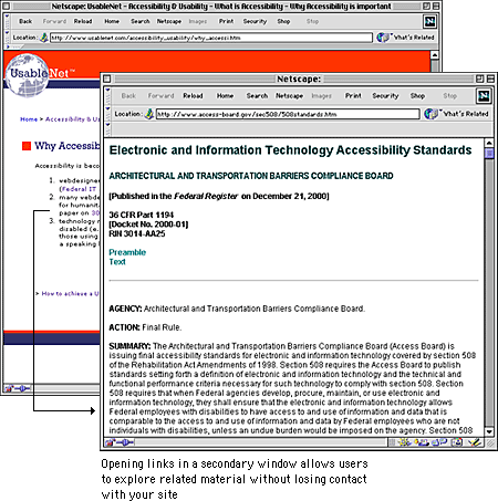
The key to good hypertext linking is to maintain context, so that the reader stays within the narrative flow and design environment of your site. If you place a simple link on your page, these plain links will work within a single browser window — your content will disappear and the linked page will fill the window. If you use this kind of link to point away from your site, you will probably lose your readers.
The simplest way to maintain context using links to other sites is to add the TARGET="main" argument to your link tags. This will cause the linked page to appear in a new browser window in front of the one containing your page. This feature allows your reader to access new material without losing visual contact with your site.

Frames offer a more complex way to maintain narrative and design context. Using frames you can split the browser screen between your site and the material you wish to bring up with a link. Frames allow you to supply commentary on material in another site and also to maintain navigation links back to your site (see Page Design, Frames).
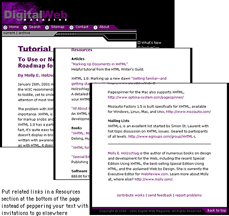
Links are a distraction. It is pointless to write a paragraph and then fill it with invitations to your reader to go elsewhere. You can minimize the disruptive quality of links by managing their placement on the page. Put only the most salient links within the body of your text, and remember that these links should open new browser windows so that you don't supplant the original pages. But most links do not belong in the middle of the page — they won't be important enough to justify the potential distractions they pose. Group all minor, illustrative, parenthetic, or footnote links at the bottom of the document where they are available but not distracting.

If you do place links in the body of your text, pay close attention to your language. Never construct a sentence around a link phrase, such as "click here for more information." Write the sentence as you normally would, and place the link anchor on the word or words that best describe the additional content you are linking to.
Associated Press. 2000. The Associated Press stylebook and briefing on media law. Cambridge, Mass.: Perseus.
Hale, Constance, and Jessie Scanlon. 1999. Wired style: Principles of English usage in the digital age. New York: Broadway Books.
Krug, Steve. 2001. Don't make me think! A common sense approach to Web usability. Indianapolis, Ind.: Que.
Microsoft Corporation. 1995. The Microsoft manual of style for technical publications. Redmond, Wash.: Microsoft Press.
Mullen, R. 1998. The HTML 4 programmer's reference: All platforms. Research Triangle Park, N.C.: Ventana Press.
New York Times. 1999. The New York Times manual of style and usage. New York: Times Books.
Nielsen, Jakob. 1995. The alertbox: Current issues in Web usability. http://www.useit.com/alertbox.
———. 1999. Designing Web usability: The practice of simplicity. Indianapolis, Ind.: New Riders.
Strunk, Jr., William, and E. B. White. 2000. The elements of style, 4th ed. New York: Macmillan.
Zinsser, William. 1998. On writing well: An informal guide to writing nonfiction. 6th ed. New York: HarperReference.