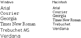
The Macintosh and Windows operating systems display type differently, even when the same typefaces are being used. In general, type displayed on Windows Web browsers will look 2 to 3 points larger than the equivalent face on the Macintosh. Thus a line of 12-point Times type on a Macintosh looks more like 14 points in Times New Roman on a Windows machine. This difference in font rendering can have a big impact on your page layouts. The following table shows the major Microsoft TrueType typefaces in their 12-point sizes, as displayed in both Windows and on a Macintosh.

If you don't have ready access to a machine with "the other" operating system and you use Netscape Navigator, you can use Netscape's "Preferences / Fonts" box to change the default text size from 12 to 14 (Mac users) or from 12 to 11 or 10 (Windows users). If you use Internet Explorer you can use the "Larger" or "Smaller" controls on the button bar to manipulate the default font size of the text.
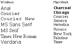
The basic fonts that come with Windows and the Macintosh operating system are listed below. If you are going to specify fonts for your Web documents, you should probably use the typefaces listed here, and you should always specify at least one typeface from each operating system (for example: "Arial, Geneva") to avoid having the browser render your pages in the default font:

Remember that many Macintosh users who have installed Microsoft Office or Microsoft's Internet Explorer Web browser will have "Windows" fonts installed on their systems. If you specify the fonts "Georgia, Times" in your font definitions, many Macintosh users will see their text set in Georgia, just as Windows users do.
Also note in the relative font sizes example on the preceding page that although "Trebuchet" and "Trebuchet MS" are basically the same typeface, the exact name you specify in the font list matters. If you want both Macintosh and Windows users to see the typeface Trebuchet, then use both names in your font declaration.