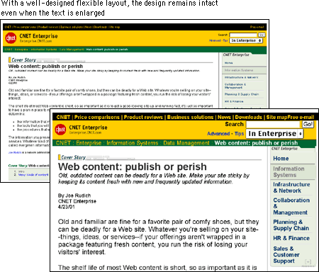
Setting the size of type is a matter of some controversy. The Web is supposed to be a universal medium where users of all kinds have equal access to information. As opposed to a printed medium, where the layout and type are fixed, Web pages should adapt to meet the needs of all comers, so that, for example, low-vision users can set the type of Web documents to display at a size that they find legible. But these adjustments can skew a page layout and send the designer, who diligently designed the page around a specific size of type, into paroxysms. And though variation thwarts the designer who worked to fashion the layout, it is undeniable that the low-vision user ought to be able to gain access to the content.
With the introduction of the FONT tag, designers also gained the ability to set the font size. With CSS, designers have many methods for setting type size, although, as with many other CSS properties, all are not fully supported. The W3C recommends that you let users set the base font size in their browser and that you set all variations using the "em" unit. An em in the Web context is the same as the font height, which makes it a relative unit and therefore flexible. For example, if the user-set default is 12-point, then a 2-em text indent would be 24-point, but if the user used the text zoom feature of the browser to change the size to 16-point, the indent would change to 32-point to reflect the larger type size.
P { font-family: Verdana, Arial, Helvetica, sans-serif; font-size: 1em; text-indent:
2em }
As you might imagine, this flexibility can send page layouts into disarray. If you try this approach, use a flexible page layout that will hold up to large type.

You can also use points to define your type sizes, but bear in mind that this carryover from the print medium has little meaning on a computer screen. Because monitors display at different resolutions, 12-point type on one screen could approximate 14-point type on another. This can be particularly problematic for small point sizes. For example, 6-point type is legible on a Windows display, where the default resolution is 96 ppi, but on a Macintosh, at 72 ppi, it is illegible.

Still, points are familiar and, though variable, offer some means of declaring the relative size of type elements.
H1 { font-family: Verdana, Arial, Helvetica, sans-serif; font-size: 14 pt }

P { font-family: Georgia, "Times New Roman", Times, serif; font-size: 12 pt }
Just remember that declaring your type in points does not mean that the point size you specify is what will actually display on the user's monitor. And because this unit is not "fixed" — that is, type set in points can be resized in the browser — this approach also requires an adaptable layout.
If the integrity of your layout depends on specific type sizes, the most dependable option right now — until there is better CSS support — is to use pixel units in your style declarations. Text defined using pixels will be the same size regardless of the browser's default font size and resolution settings.
P { font-family: Georgia, "Times New Roman", serif; font-size: 12px }
Although this option does offer more stability, be aware that you may be shutting out those users who have good reasons for specifying different font settings.