 | |
Visual hierarchyThe primary task of graphic design is to create a strong, consistent visual hierarchy in which important elements are emphasized and content is organized logically and predictably. Graphic design is visual information management, using the tools of page layout, typography, and illustration to lead the reader's eye through the page. Readers first see pages as large masses of shape and color, with foreground elements contrasting against the background field. Secondarily they begin to pick out specific information, first from graphics if they are present, and only then do they start parsing the harder medium of text and begin to read individual words and phrases: 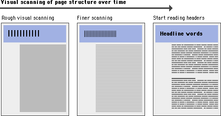
Contrast is essentialThe overall graphic balance and organization of the page is crucial to drawing the reader into your content. A dull page of solid text will repel the eye as a mass of undifferentiated gray, without obvious cues to the structure of your information. A page dominated by poorly designed or overly bold graphics or typography will also distract or repel users looking for substantive content. You will need to strike an appropriate balance between attracting the eye with visual contrast and providing a sense of organization: 
Visual balance and appropriateness to the intended audience are the keys to successful design decisions. The most effective designs for general Internet audiences use a careful balance of text and links with relatively small graphics. These pages load into browsers quickly, even when accessed from slow modems, yet still achieve substantial graphic impact:  When establishing a page design for your Web site, consider your overall purpose, the nature of your content, and, most important, the expectations of your readers. |
|
|