 | |
"Chunking" informationMost information on the World Wide Web is gathered in short reference documents that are intended to be read nonsequentially. This is particularly true of sites whose contents are mostly technical or administrative documents. Long before the Web was invented, technical writers discovered that readers appreciate short "chunks" of information that can be located and scanned quickly. This method for presenting information translates well to the Web for several reasons:
The concept of a chunk of information must be flexible and consistent with common sense, logical organization, and convenience. Let the nature of the content suggest how it should be subdivided and organized. At times it makes sense to provide long documents as a subdivided and linked set of Web pages. Although short Web documents are usually preferable, it often makes little sense to divide a long document arbitrarily, particularly if you want users to be able to print easily or save the entire document in one step. Hierarchy of importanceHierarchical organization is virtually a necessity on the Web. Most sites depend on hierarchies, moving from the most general overview of the site (the home page), down through increasingly specific submenus and content pages. Chunks of information should be ranked in importance and organized by the interrelations among units. Once you have determined a logical set of priorities, you can build a hierarchy from the most important or general concepts down to the most specific or detailed topics. RelationsWhen confronted with a new and complex information system, users build mental models. They use these models to assess relations among topics and to guess where to find things they haven't seen before. The success of the organization of your Web site will be determined largely by how well your system matches your users' expectations. A logical site organization allows users to make successful predictions about where to find things. Consistent methods of displaying information permit users to extend their knowledge from familiar pages to unfamiliar ones. If you mislead users with a structure that is neither logical nor predictable, they will be frustrated by the difficulties of getting around. You don't want your users' mental model of your Web site to look like this: 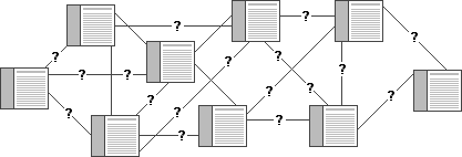
FunctionOnce you have created your site, analyze its functionality. Efficient Web site design is largely a matter of balancing the relation of menu, or home, pages with individual content pages. The goal is to build a hierarchy of menus and pages that feels natural to users and doesn't mislead them or interfere with their use of the site. Web sites with too shallow a hierarchy depend on massive menu pages that can degenerate into a confusing "laundry list" of unrelated information: 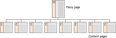
Menu schemes can also be too deep, burying information beneath too many layers of menus. Having to navigate through layers of nested menus before reaching real content is frustrating: 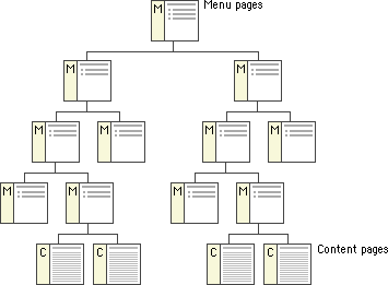
If your Web site is actively growing, the proper balance of menus and content pages is a moving target. Feedback from users (and analyzing your own use of the site) can help you decide if your menu scheme has outlived its usefulness or has weak areas. Complex document structures require deeper menu hierarchies, but users should never be forced into page after page of menus if direct access is possible. With a well-balanced, functional hierarchy you can offer users menus that provide quick access to information and reflect the organization of your site. SummaryThe most important step in planning your site is to organize your information. Thinking carefully about what you want to say and how you want to say it requires that you become intimately acquainted with your site content. Create outlines, chunk your information into sections and subsections, think about how the sections relate to one another, and create a table of contents. This exercise will help immensely when it comes time to build the individual pages of your site and may determine the eventual success of your Web site. A well-organized table of contents can be a major navigation tool in your Web site. The table is more than a list of links — it gives the user an overview of the organization, extent, and narrative flow of your presentation:  |
|
|