 | |
E-commerceIn e-commerce sites the crucial design parameters are efficient navigation and search, along with speed to the final "place order" button. During the "dot-com" market bubble many new e-commerce sites spent fortunes of their investors' money on elaborate Macromedia Flash or digital video presentations and quickly failed — some went bankrupt before the site was launched. Meanwhile, the Web's most successful commerce sites kept things technically simple and basic. Amazon, eBay, Yahoo!, and other successful Web commerce sites use remarkably spare page design schemes and simple text- or tab-based navigation systems. Another area where e-commerce sites often fail is in providing search engines that are smart enough to "degrade gracefully" when there is no exact match to a request. If a shopper types in "PDA" and the inventory fails to turn up any products by that exact name, the search engine should default to a list of "personal digital assistants" made by various manufacturers. 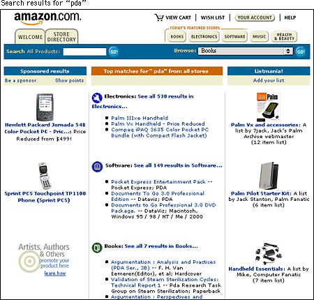 Amazon has experimented with various tab systems as the site has grown, but the choice of tabs as a navigation system was wise — tabs are one of the few real-world graphic navigation metaphors to have translated to the screen. Tabs work with only about eight or fewer choices, however. As tabs multiply, their sheer number creates confusion. Amazon's order processing screens are also a model of navigation design for Web commerce. Most well-designed order screens are short and deal with topics one at a time (review items in "shopping cart," provide shipping address, add credit card information, and so on) on screens that don't require scrolling. But this forces the order process to take place over multiple screens, which could become tedious if not for the "you are here" progress icons at the top of the screen. The lesson here is clear: all e-commerce processes involve some tedium for the buyer. Yet if you provide information on the user's current position, the slow series of screens becomes less of a problem because the user knows what to expect. 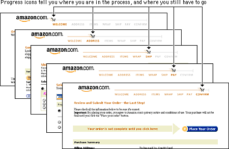 |
|
|