Contents
Interface Design
|
Introduction Basic interface design Access issues Navigation Links & navigation |
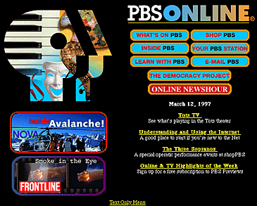
Providing a rich set of graphic navigation and interactivity links within your Web pages will pull the user's attention down the page, weaning them away from the general-purpose browser links, and drawing them further into your content. By providing your own consistent and predictable set of navigation buttons you also help give the user a sense of your site's organization, and makes the logic and order of your site visually explicit. Here the rich graphics and many links offered by the PBS home page immediately draw the reader into the site:

Graphic has been reduced from the original size. www.pbs.org
Provide context or lose the reader
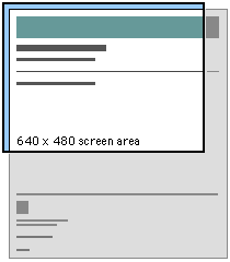
Readers need a sense of context, of their place within an organization of information. In paper documents this sense of "where you are" is a mixture of graphic and editorial organizational cues supplied by the graphic design of the book, the organization of the text, and the physical sensation of the book as an object. Electronic documents provide none of the physical cues we take for granted in assessing information. When we see a Web hypertext link on the page we have few cues to where we will be led, how much information is at the other end of the link, and exactly how the linked information relates to the current page. Even the view of individual Web pages is restricted for most users. Most Web pages don't fit completely on an standard office 14-inch or 15-inch display monitor, and thus there is always part of the page that the user cannot see.

Web pages need to give the user explicit cues to the context and organization of information, because only a small portion of your site (less than a page) is visible at one time:


As the Web page designer it is up to you to provide these functional and context cues to the reader.
References
|
Horton, W. K. 1994. Designing and writing online documentation, 2nd edition. New York: Wiley. PBS Online. Public Broadcasting Corporation Web site. |