Contents
Interface Design
|
Introduction Basic interface design Access issues Navigation Links & navigation |
"Going back" and going to the previous page
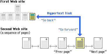
All hypertext systems share a common problem that has no direct precedent in print media: going "back" through a series of links you have previously visited is not the same as paging "back" through the preceding pages of an ordered sequence of pages. When users click on a hypertext link in a Web document they often are transported from one Web site to another, perhaps even from one country to another. Once made the hypertext link is bi-directional; you can "go back" to the Web site you just left by clicking on the "Back" button of the viewer. Having hit the "Back" button, the "Forward" button lets you move to the new Web site again.

Why button bars are useful
For the information designer hypertext links are a mixed blessing. The radical shifts in context that links create can easily confuse Web users, who need organized cues and interface elements if they are to follow and understand hypertext links from one Web page to another. This is particularly true when you want users to be able to follow (or at least recognize) an ordered sequence of documents. Notice in the diagram above that although the user has entered the second Web site at page 6, the site is an ordered sequence of pages.
Fixed versus relative links
Unlike the "Back" and "Forward" buttons in Web viewers like Netscape and Mosaic, whose only functions are relative to the pages you have seen most recently, "Next Page" and "Previous Page" buttons in a document are fixed links you provide to other associated documents. By providing the user with paging buttons and links to local home pages and tables of contents you give your users the tools to understand how you have organized your Web site information, even if they have not entered your web of pages through a home page or table of contents page. The buttons don't prevent you from reading the information in whatever order you choose, but they do allow your reader to follow the sequence of pages you have laid out:

Button bars are also the most logical place to put links back to your home page, or to other menu pages related to the current page. A button bar can be built with text (like ours at C/AIM, below), or a series of individual button graphics at the top or bottom of the page:

References
Apple Computer, Inc. 1992. Macintosh human interface guidelines. Reading, MA: Addison-Wesley. Center for Advanced Instructional Media (C/AIM), Yale University. Horton, W. K. 1994. Designing and writing online documentation, 2nd edition. New York: Wiley. Microsoft Corporation. 1992. The Windows interface: An application design guide. Redmond, WA: Microsoft Press. Shneiderman, B. 1992. Designing the user interface: Effective strategies for effective human-computer interaction. 2nd ed., Reading, Mass.: Addison-Wesley. University of Chicago Press. 1982. The Chicago manual of style. 13th ed., Chicago: University of Chicago Press. Wilson, A. 1974. The design of books. Salt Lake City: Peregrine Smith, Inc. Xerox Corporation. 1988. Xerox publishing standards. New York: Watson-Guptill Publications. |