Contents
Page Design
We seek clarity, order, and trustworthiness in information sources, whether they are traditional paper documents or Web pages. The spatial organization of graphics and text on the Web page can engage the user with graphic impact, direct the user's attention, prioritize information, and make the user's interactions with your Web site more enjoyable and more efficient.
"Man is the great pattern-maker and pattern perceiver. No matter how primitive his situation, no matter how tormented, he cannot live in a world of chaos."Design and visual logic
Edmund Carpenter
Graphic design creates visual logic, an optimal balance between visual sensation and graphic or text information. Without the visual impact of shape, color, and contrast pages are often graphically boring and will not motivate the viewer to investigate their contents. Dense text documents without the contrast and visual relief offered by graphics and careful page layout and typography are also more difficult to read, particularly on the relatively low-resolution screens of current personal computers. However, without the depth and complexity of text, highly graphic pages risk disappointing the user by offering a poor balance between visual sensation, text information, and interactive hypermedia links. In seeking this ideal balance, the primary graphic design constraints in Web pages are the vertical, list-oriented structure of HTML as seen in current Web browsers like Netscape and Internet Explorer, and the practical bandwidth limitations on user access rates that may currently range from 14.4 modems to Ethernet speeds or better.
Graphic Design and the Web
Hypertext Markup Language (HTML), the language of Web page design, is a hypertext system, emphasizing interactive linkages between graphic, text, or media documents. The ability to mix graphics or motion media with text in HTML is much more limited than in other forms of electronic document authoring, or in paper-based publishing. The graphic design vocabulary within HTML is constrained by the vertical list structure of HTML and the uncertainties of designing with device-independent physical and logical typographic controls. However, the ability to imbed hypertext links text and graphics that can take full advantage of the Internet offers unprecedented functional power and flexibility in designing interlinked, interactive information systems.
Efficient Use of the World Wide Web
Although the prospect of networked multimedia in Web pages is exciting, the highly graphic interface design now seen in consumer-oriented CD-ROM multimedia titles is a particularly poor model for current Web page designs. Such highly graphic designs require far more communications bandwidth than even Ethernet typically delivers to current personal computers. Purely graphic menu designs for Web pages that depend on one large imagemap graphic are fine for corporate or educational Intranet use, but are likely to try the patience of users accessing the web via modem.
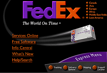
Graphic has been reduced from the original size. www.fedex.com
What excites most people about the Web is the promise of graphic communication, and graphic "splash screens" or home pages can be very successful as long as you fully understand the convenience trade-offs and performance compromises and do not alienate your target audience. Our C/AIM home page design is now a graphic menu that uses JavaScript to randomly choose one of 12 alternate designs to display each time the page is loaded. We chose graphic impact over the diversity of text links because our basic home page menu was short, our focus is multimedia communication, and our target audience is mostly fellow academics and physicians with high-bandwidth access to the Web.
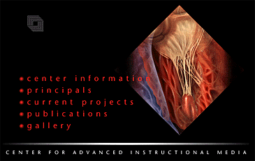
Graphic has been reduced from the original size. www.med.yale.edu/caim/
As Web systems evolve from informal novelties into widespread organizational, educational, and corporate use the expectations for system performance are increasing. For a large organization using a Web intranet system as a management information tool the aggregate effect of the long delays caused by inappropriate use of over-large graphics or other inefficiencies in key menu areas may cripple the cost-effectiveness of the system. This is especially true when many users are accessing your Web site via modems, such as home-office telecommuters, distance-learning students, your sales force, or your field personnel. Most studies on user response to computing system delays suggest that waiting times longer than about 10 seconds are intolerable in routine, repetitive computing tasks. For the past few years the (very slow) Web has gotten a free pass due to its novelty, but it seems unlikely that users will be any more tolerant of Web systems than they are of any other networked service or computing task.
With or without graphics?
If you are currently using a large graphic menu on your site's home page, you should take a close look at the log of "hits" produced by your Web server software. (Your Web server administrator should be able to produce this log for you if you've never seen one.) The server log shows how many times your home page has been requested, or "hit," by readers looking at your page. Each GIF or JPEG graphic image used on your home page should also show a corresponding hit, as the graphics files are requested and downloaded to the reader. If the number of hits on your home page HTML file is significantly larger than the number of hits on the graphic files used on your home page then you know that many users are accessing your page with the graphics turned off in their Web browsers. If your readers are turning off the graphics because your site takes so long to download, then all of the information you have placed into your Web page graphics never reaches your readers.
References
FedEx, Inc. Center for Advanced Instructional Media, Yale University |