Contents
Page Design
Web pages share similarities to individual pages in print publications, but because Web pages may be accessed directly with no preamble, Web pages must be more independent than print pages. Too many Web pages end up as isolated fragments of information, divorced from the larger context of their parent Web sites through lack of essential links, and the simpler failure to properly inform the reader of their contents.
Titles and subtitles
Forget icons, banner graphics, bullets, horizontal rules, and colored backgrounds. Editorial landmarks like titles and headers are the fundamental human interface issue in Web pages, just as they are in any print publication. A consistent approach to the titling, headlines, and subheads in your documents will aid your readers in navigating through a complex set of Web pages.
Headline style
Bold, capitalizing the initial letters, for: | ||
| Document titles | ||
| Other web sites | ||
| Titles of documents referred to within the text | ||
| Proper names, product names, trade names |

Bold, capitalize first word only, for: | ||
| Subheads | ||
| References to other heading within the style manual | ||
| Figure titles | ||
| Lists |
HTML and page titles
Web page titles are designated in the HTML document head section with the "TITLE" tag. the title is crucial, because the page title is often the first thing visible to users using slow Internet connections, and because the title becomes the text for any bookmarks the reader makes to your pages. The page title should:
Incorporate the name of your company, organization, or Web site. | ||
| Form a concise, plainly worded reminder of the page contents. |
Always think of what your page title will look like in a long list of bookmarks. Will your page title remind the reader what was interesting about your pages?
Style for online documents
Documents to be read online must be concise and structured for fast scanning. The "inverted pyramid" style used in journalism works well on Web pages as well. Get the important facts up near the top of the first paragraph where users can find them quickly. Assume readers will print anything longer than half a page rather than read the text online.
Be concise | ||
| Use lists where possible | ||
| Make printing easy |
Longer documents
Many types of documents (like this manual) are not well suited for the telegraphic style that works well for documents designed to be read online. Web authors often cut so much out of Web presentations that what is left would barely fill a print pamphlet. Concise writing is always better, but don't "dumb down" what you have to say
Text for the Web
Some general points about text formatting specific to the Web:
Excessive markup: Beware of too much markup in your paragraphs. Too many links, or too many styles of typeface destroy the homogeneous, even "type color" that characterizes good typsetting. | ||
| Link colors: If you are using custom link colors, choose colors that closely match your text color. Reading from the screen is hard enough already without having to deal with screaming orange or bilious green links. | ||
| Use the best tool: Write your text in a good word processing program with spell-checking and search features. Transfer text to HTML only after it has been proofread. | ||
| Style sheets: Don't use the word processor style sheets to produce "All capitals" or other formatting effects. You will lose those special formats when you convert to plain ASCII text for HTML use. | ||
| Special characters: Don't use the "smart quotes" feature. Avoid all special characters like bullets, ligatures, and typographer's "en" and "em" dashes not supported in standard HTML text. Consult a good HTML guide book for the listing of special and international characters supported through the HTML extended character formatting. | ||
| No auto hyphens: Never use the automatic hyphenation feature of your word processor on text destined for the Web. This may add non-standard "optional hyphen"characters to your text that will not display properly in Web browsers. |
Links and language
If you are new to the Web it can sometimes be awkward to figure out where to place links within sentences. Never construct a sentence around a link phrase such as "click here for more information." Write the sentence as you normally would, and place the link anchor on the most relevant word in the sentence.
Poor: Click here for more information on placing links within your text. | ||
| Better: Web links are powerful, but may also cause problems if they are placed carelessly. |
Parenthetic links
Links are a distraction. It is pointless to write a paragraph and then fill it full of invitations to your reader to go elsewhere. Put only the most salient and interesting links within the main body of your text. Group all minor, illustrative, parenthetic, or footnote links at the bottom of the document where they are available but not distracting.
Print references
Jordan, L. 1976. The New York Times manual of style and usage. New York: Times Books.
Strunk, W., and E. B. White. 1979. The elements of style, 3rd ed. New York: Macmillan.
University of Chicago Press. 1982. The Chicago manual of style. 13th ed. Chicago: University of Chicago Press.
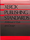
Xerox Corporation. 1988. Xerox publishing standards: A manual of style and design. New York: Xerox Press-Watson Guptill.
Zinsser, W. K. 1990. On writing well., 4th ed. New York: Harper Collins.