 | |
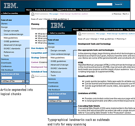
Organizing your proseDocuments written to be read online must be concise and structured for scanning. People tend to skim Web pages rather than read them word by word. Use headings, lists, and typographical emphasis for words or sections you wish to highlight; these are the elements that will grab the user's attention during a quick scan. Keep these elements clear and precise — use your page and section heads to describe the material. The "inverted pyramid" style used in journalism works well on Web pages, with the conclusion appearing at the beginning of a text. Place the important facts near the top of the first paragraph where users can find them quickly.  That said, keep in mind that much content is not well suited to the telegraphic style that works well for online documents. Web authors often cut so much out of their presentations that what remains would barely fill a printed pamphlet. Concise writing is always better, but don't "dumb down" what you have to say. You can assume that readers will print anything longer than half a page and read it offline. Simply make printing easy for your readers and you can use the Web to deliver content without cutting the heart out of what you have to say. Another way to style online documents is to break up your information into logical "chunks" connected by hypertext links, but only where it makes sense (see Site Design, "Chunking" information). Don't break up a long document arbitrarily; users will have to download each segment and will have difficulty printing or saving the entire piece. The key to good chunking is to divide your information into comprehensive segments. That way readers will have direct and complete access to the topics they are interested in without having to wade through irrelevant material or follow a series of links to get the whole picture. |
|
|