by Patrick J. Lynch
and Sarah Horton

11 Graphics
The Role of Web Graphics
First and foremost, consistent interface and identity graphics across a collection of web pages define the boundaries of a web “site.” Although web designers could build a site without graphics, most users would not readily recognize a collection of bare pages as a cohesive “site,” and such a site would seem unpleasantly odd, well outside of design norms and user expectations. Site-defining identity graphics do not need to be elaborate, but they do need to be consistent across the range of pages in a site for the user to establish a sense that your pages are a discrete region—related perhaps to a larger whole if you work in a major enterprise—but in some ways distinct as a “place” (fig. 11.1).
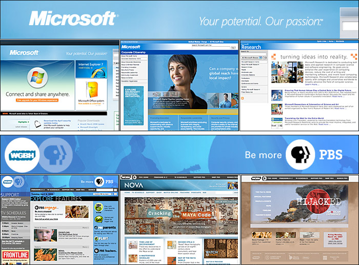
Figure 11.1 — Site graphics are the most powerful tools for defining a distinct sense of “place” across all the pages of the site.
Graphics as content
Graphics serve a number of purposes as elements of content—along with and complementary to text content:
- Illustrations: Graphics can show you things, bringing pieces of the world into your document
- Diagrams: Quantitative graphics and process diagrams can explain concepts visually
- Quantitative data: Numeric charts can help explain financial, scientific, or other data
- Analysis and causality: Graphics can help take apart a topic or show what caused it
- Integration: Graphics can combine words, numbers, and images in a comprehensive explanation
Illustrations
Photographs and illustrations bring the world into your document in a concise and unforgettable way that saves that proverbial “thousand words” of explanation. Why describe something when you can simply—and more memorably—show it? The web is a color medium with an enormous range of display colors, and color graphics on web pages are almost the equal of fine printing on paper, especially when graphics are reproduced at roughly the same size as they might appear in print.
Diagrams and quantitative data
The resolution limitations of the computer screen (72–90 pixels per inch) versus print (300+ dots per inch) begin to show when you create complex charts and diagrams for the computer page. Most chart graphics work as well on the screen as on paper, but the label typography in charts and diagrams must be optimized for display on web screens. The visual detail of complex diagrams converted from print uses is often surprisingly good, but always check the typography within the figure, as labels may become illegible in the conversion process.
Integrated visual presentations
Multifaceted information graphics often integrate quantitative charts, three-dimensional illustrations, and extensive captioning in free-form layouts that become visual narratives capable of explaining complex concepts and natural phenomena (fig. 11.2).
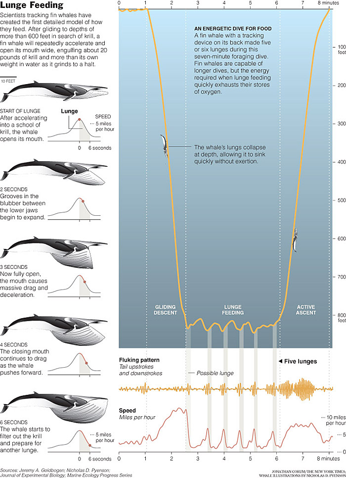
Figure 11.2 — A masterpiece of graphic narrative that seamlessly mixes words, diagrams, and data graphics. Although the diagram was designed for the print New York Times’s Science Times section, the diagram also works very well on the Times web site, proving that you don’t have to “dumb down” complex data graphics for the computer screen.
Graphic communication on the web
A chart or diagram is an implicit promise to the user that you’ll make a complex world easier to understand. Our advice on graphic communications is the same as on written communications:
- Trust the reader’s intelligence. Don’t dumb down your material on the supposition that web users are somehow fundamentally different kinds of people from print readers and have no interest in complexity. Regular readers of web sites may once have been distinguishable from other publishing audiences, but now everyone reads the web.
- Respect the medium. The readers are the same as in print media, but the web has a different profile of strengths and weaknesses. Take advantage of the web’s enormous capabilities to communicate complex color visuals without the expense of printing and physical distribution.
- Tell the truth as you understand it. Distorting quantitative data isn’t just a failure to communicate; it’s a betrayal of the reader’s trust.
- Don’t cherry-pick your data. If you are making a case with visual evidence, don’t process and edit your visuals so heavily that the audience has no choice but to accept your point of view. Trust your audience enough to give them the data: let them look at the same higher-resolution images or ambiguous results that you saw and decide the issue for themselves.
- Be bold and substantial. A serious interest in visual communication doesn’t require that you use only small, mousy graphics in pale colors. Visual evidence can’t become persuasive if no one ever notices it. Just don’t ever try to wow an audience with bright graphics to make up for thin content.