by Patrick J. Lynch
and Sarah Horton

11 Graphics
Characteristics of Web Graphics
The parameters that influence the display of web graphics are the user’s display monitor and network bandwidth capacity. Some web users access the Internet via modem, slow wireless connection, or cell phone network, and others view pages on the small display of a handheld device such as a cell phone or an iPod Touch. This reality imposes limits on the file size and physical dimensions of web graphics. In addition, quality and contrast of display screens vary a good deal, and a poor display could ruin whatever visual effect you had in mind.
Color displays
Color monitors are based on cathode ray tubes or backlighted flat-screen technologies. Because monitors transmit light, displays use the red-green-blue (rgb) additive color model. The rgb model is called “additive” because a combination of the three pure colors—red, green, and blue—“adds up” to white light.
The vast majority of computer screens in use today can display the full 16.8 million colors that are theoretically possible in a 24-bit or 32-bit display screen. This truly photographic range of colors helps compensate for the relatively low resolution of the computer screen when compared to print, so that color photographs and complex illustrations on the web can convey almost the full range of impact and visual information of comparably sized print images. The computer’s operating system organizes the display screen into a grid of x and y coordinates, like a checkerboard. Each little box on the screen is called a “pixel” (short for “picture element”), with 24 or 32 bits of display memory dedicated to each pixel.
Screen resolution
Screen resolution refers to the number of pixels a screen can display within a given area. Screen resolution is usually expressed in pixels per linear inch of screen. Most standard computer displays have resolutions that vary from 72 to 96 pixels per inch (ppi), depending on how the monitor and display card are configured.
Images destined for print can be created at various resolutions, but images for web pages are always limited by the resolution of the computer screen. Thus a square gif graphic of 72 by 72 pixels will be approximately one inch square on a 72-ppi display monitor. When you are creating graphics for web pages you should always use the 1:1 display ratio (one pixel in the image equals one pixel on the screen), because this is how big the image will display on the web page. Images that are too large should be reduced in size with an image editor such as Adobe Photoshop to display at proper size at a resolution of 72 ppi.
Gamma
In computer imaging and display screens, gamma refers to the degree of contrast between the midlevel gray values of an image. The technical explanations of gamma are irrelevant here—the visual effect of changing gamma values is easy to see by looking at an image displayed on both Windows and Macintosh monitors (fig. 11.3).
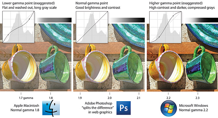
Figure 11.3 — Juggling the differing display gamma settings of the Macintosh and Windows operating systems.
The default gamma settings for Macintosh (1.8 target gamma) and Windows (2.2 target gamma) monitors are quite different, and this can lead to unpleasant surprises when you first see your images displayed on “the other” platform. Mac users will see darker and more contrasting images on Windows displays; Windows users will see images that seem more flat and washed-out when seen on Mac displays. Most web designers opt for a middle-ground solution, lightening images slightly if they work on the Macintosh; darkening images slightly and adding a little contrast if they work in Windows. Web images processed with Adobe Photoshop’s “Save for Web” option will automatically adjust the gamma to an intermediate level appropriate for both Mac and Windows monitors.
Gamma considerations are particularly important when displaying images with very long gray scales (such as fine black-and-white photography) or images in which the exact color values are critical (such as works of art). If you are working with critical images, use Adobe Photoshop’s color proofing options to find the middle ground between too light and too dark images, and view your work on a representative selection of Mac and Windows machines.
Graphics and bandwidth
Although Internet access speeds have improved greatly in the past years, bandwidth continues to be a consideration for web designs, particularly with regards to graphics and multimedia on mobile web devices. Regardless of connection speed, the more graphics you incorporate, the longer the user will wait to see your page.