12 Multimedia
Web Multimedia Strategies
Simply because we can stream hours of video out over the web doesn’t mean that we should. The value of having the text of Paradise Lost online is not in making it available for reading—most people prefer to read the work in print. We digitize texts in order to use the strengths of computing, such as searching and linking, to enhance our understanding of the material. This holds true for multimedia, too: we need to consider how best to use the computer and not simply translate video and audio content to the computer screen. The key to successful web multimedia is to tailor your content for web delivery.
Audio
Digital audio is an extremely efficient way to deliver information. Consider a training video on measuring and weighing chemical compounds. Which track—audio or video—would be the most important in conveying information? In the soundtrack a narrator explains the procedure, and in the video track someone is measuring and weighing compounds. Which track would you remove if necessary? Which could stand alone? The audio track. Consider enhancing your presentation with an audio component. Audio can be captured and optimized fairly easily, and it compresses well.
When recording original audio, take the time to do it right. Low-frequency background noises, such as the hum of a ventilation system, will be inseparable from your audio track; no amount of tweaking will eliminate it. Remember, too, that the downsampling and compression you will have to perform to make your audio web deliverable will emphasize any flaws in your recording.
Slide shows
Slide shows are another method for delivering multimedia on the web. In a slide show, you synchronize audio with still images. Through this approach you provide information via audio and add visual emphasis with still images. As an example, to present the training video mentioned above as a slide show, you would use video editing software to synchronize the narration with still images of the weighing and measuring procedure. Still images compress much more efficiently than video, and because slide shows do not require smooth motion, the movie frame rate can be low. This in turn means that you can devote more data to image quality and size.
Video
Video is the most challenging multimedia content to deliver via the web. Part of the reason is sheer size: one second of uncompressed, full-quality video requires approximately 27 megabytes of disk storage space. The amount of scaling and compression required to turn this quantity of data into something that can be used on a network is significant, sometimes rendering the material useless. Whenever possible, tailor your video content for the web.
- Shoot original video. That way you can take steps to create video that will compress efficiently and still look good at low resolution and frame rates.
- Shoot close-ups. Wide shots have too much detail to make sense at low resolution.
- Shoot against a simple monochromatic background whenever possible. This will make small video images easier to understand and will increase the efficiency of compression.
- Use a tripod to minimize camera movement. A camera locked in one position will minimize the differences between frames and greatly improve video compression.
- Avoid zooming and panning. These can make low frame-rate movies confusing to view and interpret and can also cause them to compress poorly.
- When editing your video, favor hard cuts between shots. Use the transitional effects offered by video editing software sparingly. Dissolves, elaborate wipes, or the “Ken Burns” effect of panning across still images will not compress efficiently and may not play smoothly on the web in larger display sizes.
- If you are digitizing material that was originally recorded for video or film, choose your material carefully. Look for clips that contain minimal motion and lack essential but small details. Motion and detail are the most obvious shortcomings of low-resolution video.
Animation
When used solely as an attention-getting device, the value of web animation is questionable. If you place animation alongside primary content, you will simply disrupt your users’ concentration and keep them from the objective of your site. If you require users to sit through your Flash intro every time they visit your site, you are effectively turning them away at the door.
That said, there is a place for the purposeful use of animation on the web. A simple animation on a web site’s main home page can add the right amount of visual interest to invite users to explore your materials (fig. 12.2). There, the essential content is typically a menu of links, so the threat of distraction is less than it would be on an internal content page. Animation is also useful in illustrating concepts or procedures, or changes over time. Always provide accessible controls for starting and stopping the animation.
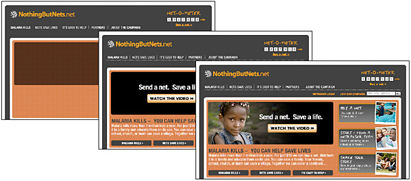
Figure 12.2 — A well-targeted animation is a powerful inducement to stay on a site and hear the message.
Text alternates
The best way to ensure that your multimedia materials are accessible is to provide alternate versions designed to accommodate different users. QuickTime reference movies provide a good illustration of the concept of alternates. When creating web video using QuickTime, it is customary to create several versions of a movie, each tuned to a different connection speed through varying levels of quality and compression, and link those versions using a reference movie. Then, when a user requests the movie via a web page, QuickTime sends the version that the user’s network connection can best accommodate. This approach supports divisions in technology resources, but alternate views also benefit those who are excluded from multimedia for other reasons. By providing alternate views of your multimedia content, your information becomes accessible to people who cannot appreciate it in its native format.Text is the most widely accessible content. For low-vision users, text can be magnified. Blind users can have text read by special software or rendered by a Braille reader. For those with technology limitations, text loads quickly and can be viewed on nongraphical browsers. Another strength of text over media content is that it can be read and indexed by search engines and translated into other languages. The best alternate for multimedia content is the written word.
For instance, if you are providing video content on your site, the simplest alternate to include is a text transcript of the audio track for hearing-impaired users. The same text transcript is useful for indexing with search engines and enabling video search. An even better approach would be to use the text as captions synchronized with the video (fig. 12.3). To address the needs of visually impaired users, you could also include a text description of the video track, either as a separate audio track or as text. Or simplify the materials by reducing the video track to a series of still images synchronized with the audio for users with reduced vision or cognitive difficulties.
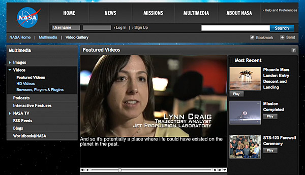
Figure 12.3 — Captions are a way to supply equivalent text for the spoken audio elements of your site.
At a minimum, you can use basic html to provide information about multimedia content. For example, you can use the alt attribute to include a short description of the animation in your applet or animated gif html code. Because almost all browsing devices can handle text, if you include this basic descriptive text, users who have their web pages read to them will at least be able to understand the function of the visual content.


