12 Multimedia
Design and Multimedia
The combination of low-bandwidth considerations and limited interface options creates interesting design challenges for incorporating multimedia elements into web sites. The key guidelines for designing for multimedia are to inform users when they are entering a high-bandwidth area and give them the tools they need to control their experience.
Inform your users
One aspect of the web is that you don’t always know where you’re going or what you’ll find there. While the element of surprise is certainly exciting, it can also be annoying, particularly when a long wait is involved. Most frustrating is when you finally receive the requested page only to find that is not what you expected or that it contains materials in a format you are not set up to view. With content that is as technologically demanding as multimedia, it is especially important to give users enough information to make an informed decision before they click, so that they know what to expect and are prepared to receive your materials.
High-demand content such as large multimedia files should not be part of your basic page design (unless, of course, your site’s reason for being is delivering high-demand multimedia files). These materials should appear on secondary pages that are described and can be accessed from the main pages of your site. Make the menu page a plain html page that loads quickly and does not require special software. Include descriptive information about the materials along with previews, such as still shots from the video. Include the running time for media clips so viewers know what to expect, and include the file size for media that downloads. In addition, fully explain any special software requirements for accessing the materials and provide a download link to any required browser plug-ins. Your users should have a clear idea of your materials before they begin to download. With a menu interface, users can confirm that their systems are properly configured and that they have enough bandwidth, time, and patience to load the materials (fig. 12.4).
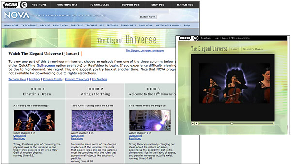
Figure 12.4 — Give users information about your multimedia content that allows them to judge whether they have the time and technology to enjoy your programming.
Provide controls
Be sure to give users status information and controls when you are presenting multimedia materials. If you don’t include controls, users will hit your page with no way to control their viewing environment. For example, if a visitor is looking at your page at a public computer or in an open office situation and you have looping birdcalls as a background sound without any control options, the visitor will experience an unsettling (and potentially embarrassing) moment when he or she cannot control interaction with your site. Many users in this situation will simply close the browser window to make the sound stop, which means that they never get to see the page content.
The QuickTime controller bar is an extremely effective interface element that provides both controls and status information. It allows users both to adjust the volume control and to play, stop, and scrub through a movie, and it provides information about the movie’s download status.
When designing a media interface, let your viewers choose when and how to listen to your media content. Always include user controls, such as a media controller bar, and make sure that users have a way to turn playback off. Avoid options like auto play or looping that take control away from the user. With auto play, for example, media files begin playing when a web page is loaded. If the page has other elements, such as descriptive text, the user who wants just the text will find the video distracting. Design your media interface so that files play only when the user explicitly elects to initiate playback.
Support keyboard interaction
Not all users can or choose to use a point-and-click device, such as a mouse, to manage interaction, and not all devices offer pointing controls. For example, non-visual users cannot see the screen to point and click, and many portable devices only provide keyboard controls. To design for universal access and usability, make sure your media controllers are operable using the keyboard.
Keyboard interaction is a two-step process of selecting and then activating a control. The tab or arrow keys move the cursor focus from element to element, and the enter key activates the element and triggers its associated function. For basic media playback, make sure users can select and activate the play and pause buttons, and select the volume control and adjust the volume using the arrow keys. For more complex interfaces, make sure all interactive elements, such as menus and buttons, can be selected and activated from the keyboard.
Offer choice
Although there are certainly favorites, there are no established standards for multimedia formats. There is no single answer to the question: “Which format should I use to ensure that everyone can access my multimedia content?” Instead, the best approach is to offer a range of choices and allow the user to select the one that best suits his or her environment and preferred access method.
For instance, audio and video can be embedded into web pages, presented as a download link, or made available as a podcast. The embedded version has the benefit of being presented within the context of the web site, which means the video can have accompanying text and images that support the video materials. In contrast, downloadable media can be viewed on different devices, including television and portable devices. Podcasts allow users to download media for offline access, with the added benefit of subscription, which results in new media files downloading automatically. Each of these scenarios has its benefits and drawbacks depending on the user context. Providing all options does not require much additional effort on the part of the designer and allows users to choose the option that suits them best (fig. 12.5).
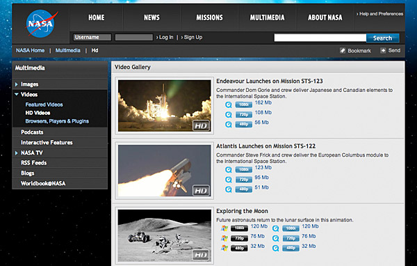
Figure 12.5 — An excellent presentation of bandwidth and format choices for video content.


