2 Universal Usability
Universal Usability in the Design Process
The World Wide Web is now more than eighteen years old-time enough for basic design conventions to have emerged. In designing web pages we often base initial designs on widely used page layout and navigation patterns, and use best practices such as consistency, modularity, and simplicity in creating our web interfaces. However, the best method for making design decisions is a combination of design best practices and familiar web layout conventions, developed in close consultation with users at each stage of the design process. Involving users in the development process helps us understand user requirements, which allows us to make informed design decisions and produce more effective designs.
Web technology collects metrics about users: what operating system and browser they use, their screen resolution, what page they visited just before their arrival at your site. And although it’s certainly useful to know these attributes, they are not that helpful in defining the audience for your web site. Web metrics will not tell you precisely why users visit your site, what they hope to find from your site, or whether they are visually impaired in some way, expert or novice, young or old.
In the end, even with the best web analytics, many things about your audience’s hopes, motivations, and expectations will remain a mystery if you rely solely on web metrics to understand your users.
In contrast, a target audience is a group of users that you have identified as critical to the success of your site. For instance, you may be designing for a certain age group, such as grade-school children, teens, or retirees. Or you may be designing for a specific technology, such as mobile devices. Bear in mind that your target audience may share common interests, but they are not likely to share access requirements. Some may be experts and others first-time users. Some may be have low or no vision, and others may have mobility or dexterity issues. The same person may access your site on a laptop, workstation, pda (personal digital assistant), and cell phone. And although you may target a certain audience, others will come. For example, an investment service for retirees will also draw visits from investors, competitors, family members, and those lucky enough to enjoy an early retirement. It would be a mistake to design such a site to meet only the needs of older users.
And there is much at stake by excluding users. Even if your web logs show that only 2 percent of your users use a specific brand of browser, don’t make the mistake of using technology that excludes those users. It’s bad business to exclude anyone from access to your information and services, and there is no way to place a value on those users who you have excluded. Who knows? Your next major donor might be one of the 2 percent you turned away at the door!
User research
The first step in any web site design process is to gather information about users-who they are, what their goals are-and identify their requirements for working with the site. The research phase is normally the most time-consuming phase of any design project, but that imbalance is due in large part to the fact that the design and evaluation phase moves more rapidly because of the time spent on research. With good user research, the decisions that drive the design are based on a solid understanding of users’ goals and requirements and therefore are far more likely to hit the mark without many cycles of iteration.
Surveys
Several techniques exist for collecting feedback directly from users about their goals and behaviors. The information gathered from these collection techniques is subjective; it represents what users say they do, which is not necessarily the same as what they actually do and care about.
Surveys are helpful for collecting a large and broad range of responses about demographics and goals. Web site surveys typically ask initial questions to help define the user: age, gender, audience type (customer, potential customer, buyer, seller). Then there might be questions related to frequency of use: first-time visitor, sometimes visitor, frequent visitor. The meat of the survey is likely to be determining which elements of the site are most used, along with some assessment of the effectiveness and enjoyment derived from using them. This question might be represented as a list of site sections, each with a sliding scale measuring the success of use. Finally, an open-ended question inviting general feedback is always a good idea. Although the information is difficult to analyze, a simple read of the responses will yield common themes that may be useful for planning.
Interviews
In-person techniques open the door to more accurate and detailed information gathering because of the opportunity for interaction and exchange. In an interview, you inquire into user goals, interests, needs, and behaviors. One effective method for understanding user behaviors is to ask users to give a verbal walkthrough that describes their typical interaction and task flow when accomplishing a goal. For example, in designing a new dating web site, you might ask users from your target audience to describe their current process when interacting with a similar web site and how they make connections without the help of the web. The key is to get the user talking and keep him or her talking. Ask clarifying questions, pursue important details, and periodically sum up the important elements of the conversation. Don’t be too quick to speak when the conversation lags; pause, and give the user the opportunity to continue the discussion thread. Also, don’t be too rigid in sticking to the script; digressions may lead to valuable insights.
Focus groups
Focus groups have a very different dynamic. Whereas the interview is all about the individual, the focus group is about the collective-a group of users who share common concerns. Focus groups have a number of benefits, not the least of which is economy; it’s an opportunity to hear many different perspectives at once. Also, the collaborative nature of focus groups helps people contribute insights that they may not have been aware of on their own. One user raises an issue that resonates with another, and the second user picks up the issue and takes it further, and the next, further.
Web analytics
With each page served, web servers collect basic information about the user and save the information in a server log file. Web analytics involves using the data in the server logs to study user behaviors. More advanced web analytics make use of additional tracking techniques that usually involve embedding something on the client-a “bug” on the page or a session cookie-that enables collection of additional information. With web analytics, it’s possible to reconstruct elements of a web site session, such as:
- Where the user was before arriving at your site
- If the user used a search engine, which keywords were used
- The sequence of pages the user visited while on your site
- Attributes of the user’s configuration, including browser, operating system, and screen dimensions and color settings
- Whether the user was a new or repeat visitor
- The last page in the session before the user left your site (fig 2.3)
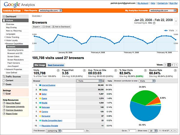
Figure 2.3 — Web analytics can help you analyze usage patterns in your site.
These and other site-specific metrics (the number of page requests helps determine which pages are most used; the number of distinct hosts helps determine how many site visitors there are) offer important insights into how users are working with your site, which is essential to any redesign process. Just bear in mind that, although web analytics appear to measure what is happening on your site, the reality is far more complicated. Many factors skew the data, such as browser caching, in which pages are stored locally on the client machine. When a user visits a cached page, that visit will not be logged in the server log file since the server was not asked for the page. Use web analytics, but don’t treat them as the last word on user behaviors. Use them to complement the other user-centered techniques described in this chapter.
Field studies
Observing users in their natural setting yields valuable insights and objective information about user behaviors and the efficacy of designs. With observational methods, we move beyond self-reported goals and behaviors to observed goals and behaviors.
In a field study, you observe users working with a system, typically in their own context. For example, in designing a library catalog system, observing library patrons navigate the library is an excellent way to understand how they work with online catalog systems and how such systems help or hinder them in achieving their goals. Field studies are particularly helpful at the beginning of a project. For a redesign, observe users working with your current system to identify points of conflict between the design and user goals. For a new web site project, observe users working with a similar web site.
Design and Evaluation
The next step in the design process is to apply what is learned in the research phase to creating designs that support the diversity of the target audience in accomplishing their goals. The design phase is an iterative one in which we conceptualize designs to create mockups, which we then evaluate and refine, often repeatedly, before arriving at a final design and finished web site.
Personas
Personas are fictional narratives describing particular representative users and serve as a stand-in for real users during the design process. Personas arise from the research phase and are informed by surveys, interviews, focus groups, and other research methods. Personas typically include a name, demographic information, level of expertise, and platform details such as connection speed, operating system, and browser software. Personas also include detailed information about user goals and motivations.
For universal usability, personas should push the boundaries of the fictional “average user” to include a range of use contexts and user motivations. Personas should represent the full range of age groups, computer expertise, and access technologies, including mobile devices, the wide but short screens of typical laptop computers, and screen reader software for nonvisual access (fig 2.4).
Figure 2.4 — Detailed personas are useful for bringing life and substance to the potential range of users of your site.
Goal analysis
Users of a system do so in response to specific goals they are trying to achieve. When we roll out of bed and into the shower in the morning, our goal is not turning on the water; our goal is to get clean and wake up. It’s the tasks we undertake to accomplish this goal that involve water, faucets, and soap. In design, it’s important to focus on goals rather than tasks in making design decisions. A focus on goals helps us think outside the box and create better designs. Instead of designing a shower from the perspective of the tasks it needs to support, we can focus on the goal of getting clean and waking up, which opens the door to new approaches.
For example, let’s say our goal when interacting with a travel web site is to get from Boston to Barbados without spending too much time or money. To accomplish our goal, our tasks are to compare flight schedules and prices. The designer who designs for our goal will understand that time spent in transit and cost are the primary factors and will design an interface that shows information in a way that permits easy comparisons. Other information related to the trip, such as meals served or type of aircraft, is secondary and available on request (fig. 2.5).
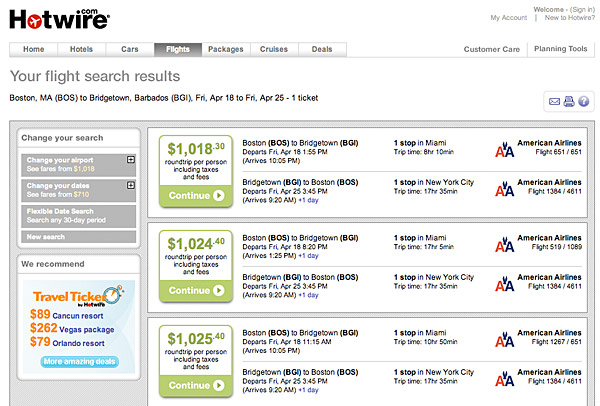
Figure 2.5 — Complex data displays can easily overwhelm the reader. Keep the display focused on the information most important to the user’s current task.
Goals come in many shapes and sizes and emerge from different perspectives. Users have both personal and practical goals: being more productive, having fun, saving time and money. Institutional goals also play a part: increase revenue, recruit more and better employees, offer more services. With any web site project, goals should be the driving factor behind design decisions and the compass to steer by throughout the design process.
Scenarios
Scenarios, or use cases, are brief narratives that tell the story of a particular user’s path in accomplishing his or her goals. To construct a scenario, we use personas representing our users and walk them through the various tasks necessary with the web site in order to accomplish their goals. In composing a scenario, we can play out different approaches to design and functionality and in the process identify possible problems with each approach.
Prototypes and wireframes
Paper prototypes are an inexpensive method for collecting user feedback on an evolving design. A paper prototype typically illustrates the location of page elements, such as site navigation, search, and content, and includes the labeling that will be used for these elements (page elements are discussed in detail in the Wireframes section of chapter 3, Information Architecture). These low-resolution mockups can be used in user testing to determine whether the organization of the page and the navigation labels are easy to use and understand. They are obviously less helpful for exploring the interactive elements of the page. For that we need functional wireframes.
Functional wireframes use the same minimalist design of paper prototypes, but on a functional web site (fig. 2.6). They take more time to develop than paper prototypes but are well worth the effort, particularly for sites that are built on complex information architectures and for web applications that contain a high level of interaction. For a functional wireframe, several layers of the web site are established to model the site’s architecture, navigation, and functionality. For interactive sites, such as web applications, the wireframe should include a basic user interface in order to play out and test the flow of the application with users.
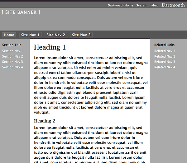
Figure 2.6 — An example of a basic template for building functional wireframes.
User testing
User testing is a controlled and directed observation of user behaviors when working with a design. User testing is used throughout the design process to evaluate different design approaches by observing how well, or how poorly, they work in helping users accomplish tasks.
A typical user testing session has a tester and a participant who represents the target audience. The user is assigned a set of tasks intended to put specific elements of a design to the test and reveal any shortcomings of the approach. During the session, the user is asked to think aloud so that the tester can understand the rationale behind his or her choices. The session normally ends with an open-ended interview in which the user is given the opportunity to discuss his or her experience with the system more broadly and provide insights and suggestions on how the system might be improved.
User testing is useful throughout the design process to help identify usability problems. The lessons learned from user testing can be used in refining the design and improving its universal usability.


