6 Page Structure
Page Structure and Site Design
Web “sites” are complete abstractions—they don’t exist, except in our heads. When we identify a site as such, what we’re really describing is a collection of individual linked pages that share a common graphic and navigational look and feel. What creates the illusion of continuity across a cohesive “site” is the design features that pages share. Individual html pages and how they are designed and linked are the atomic unit of web sites, and everything that characterizes site structure must appear in the page templates.
As the web has matured over the past decade, the structure of web pages in text-driven information sites has become more uniform and predictable. Although not all web pages share the exact layout and features described here, most web pages incorporate some or all of these basic components, in page locations that have become familiar to web users (fig. 6.1).
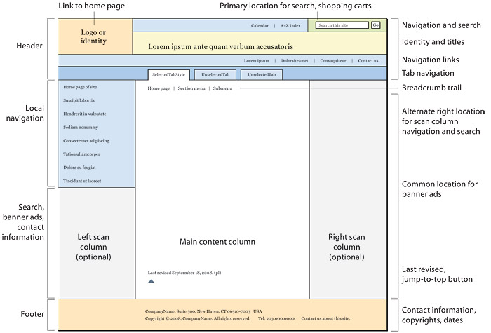
Figure 6.1 — A canonical page design and major page elements.
Page headers
Page headers are like miniature versions of the home page that sit atop each page and do many of the things that home pages do, but in a limited space. Headers provide site identity and global navigation, with search and perhaps other tools. The exact location and arrangement of the components vary from site to site, but the overall design pattern has become fairly consistent.
Headers are the most visible component of site identity. What seems real is real: a collection of pages that share headers will be perceived as a “site” even if the pages originate from very different technical sources (php/Perl, jsp, .net, blog software, portal systems, SharePoint, web applications, content management systems, and so on).
Home link
Placing your organization or site logo in the upper left corner of the page—and linking that logo to the home page—is a widely used convention and one you should adopt. If you are not using a logo or graphic in your header, at least put a “home” link near the upper left corner of the page, where 99 percent of users will expect to find it.
Global navigation
Headers are the most frequent location for global navigation links that span the site. The ideal arrangement is to use an html list of links, styled with css to spread horizontally across a section of the header. This gives you:
- Usability: global links where users most expect to see them
- Semantic logic: the collection of global links should be marked up as a list, because, well, it is a list
- Accessibility: the list format of links appears early in the code listing, where it should be
- Search visibility: a collection of your major navigation keywords, linked and at the top of the code listing, is ideal for search engine optimization
Tabs are another widely used, easily understood convention for global navigation. The best way to implement tabs is to style an ordinary html list with a more elaborate css treatment to form the “tab” graphic around each link. Be sure you get the graphic details right: the selected tab should be graphically unambiguous, and the remaining tabs should clearly be behind the selected tab. This type of “you are here” marker is essential in orienting users within the site. Tabs can also be used to implement a two-tiered navigation scheme, in which a secondary horizontal list of links appears under the selected tab, again as a simple html list with css styling, to keep things semantic, accessible, and search visible (fig. 6.2).
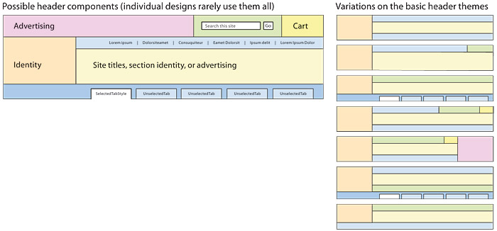
Figure 6.2 — The canonical form of page headers is dominated by horizontal bands of links and tools, one or several identity graphics, and, in many sites, advertising. The cast of characters is fairly consistent, but the exact form of headers can vary quite a bit.
Breadcrumb navigation
Breadcrumb navigation is a widely used, easily understood navigation device that is particularly useful in large sites with deep levels of content organization (see chapter 4, Interface Design Conventions). Breadcrumbs integrated into the header are best at the top of the header, as in the Google and useit.com sites (fig. 6.3). Another popular location for breadcrumb navigation is just above the main page content.

Figure 6.3 — Locations for breadcrumb trails.
Search
All sites with more than few dozen pages should offer local site search. The upper right area of the header is a popular location for search boxes, but a header search box must necessarily be simple to fit in this relatively small area (fig. 6.4). If you need more screen area to offer more controls and choices to the search user, consider locating your site search in the left or right scan columns of the page (see Scan columns, below).

Figure 6.4 — A header-based search box.
“Checkout baskets,” online shopping “carts”
Long ago, Amazon put its “cart” link in the upper right of the header, and that’s where virtually all other shopping sites put it now, too. Don’t buck the trend; it’s one of the most firmly rooted interface conventions on the web (fig. 6.5).

Figure 6.5 — Put the shopping cart where Amazon puts it, because that’s where most people will look for it.
Ad-supported sites often reserve a large area above other header components for banner advertising, and research shows that users commonly expect to see banner ads in this area of the page. This layout convention has important implications, even if your site does not use banner ads, because of the widely observed phenomenon of “banner blindness.” Readers commonly ignore areas of the screen that usually contain advertising, especially if the graphic content looks like a banner ad. Be sure your headers and other page graphics don’t use the heavily boxed and graphically loud visual vocabulary of most banner ads, or your readers may ignore important elements of your user interface.
Scan columns
Subdividing the page field into functional regions is a fundamental characteristic of modern graphic design. Early in the web’s history, designers began using narrow “scan” columns at the edge of the page to organize navigation links and other peripheral page elements, much as scan columns have been used in print publications for a century or more. Research on web user expectations now supports the common practice of locating navigational links—particularly section navigation—in the left column.
Scan columns are also useful as locations for web search boxes, mailing address and contact information, and other more minor but necessary page elements. Research shows that the left scan column under the local navigation links is the second place most users will look for search features, after they look in the right header area (fig. 6.6).
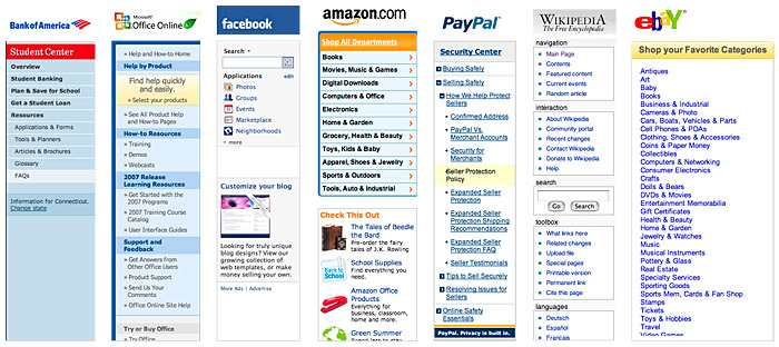
Figure 6.6 — Beyond the superficial visual style variations, scan column designs have become remarkably consistent in major content and sales web sites.
Left or right scan columns for navigation?
Extensive eye-tracking and user research says that it doesn’t really matter whether you use left or right navigation columns. Users seem to do just fine either way, as long as you are consistent about where you put things. We favor the left column for navigation simply because that is the most common practice.
Mailing address and contact information
Basic “real world” information about who the company responsible for the site is, where the company is, and how to contact the company is often hard to find on otherwise well-designed sites. If you sell a product or service, don’t hide from your customers. Display your contact information in a prominent location, such as the scan column, on every page.
Advertising and the scan columns
Our advice about ads in the scan column is the same as with header ads (above): beware! Users often ignore content that looks like advertising when they see it in a scan column. Use formats that don’t scream “advertising!” Never make your scan column content or navigation look anything like a typical banner ad, or users may never notice it.
The content area
Web content is so multifaceted that few general rules apply, but the following common practices make content areas easier to use:
- Page titles. Don’t bury the lead. Every page needs a visible name near the top. For all kinds of logical, editorial, accessibility, search visibility, and common-sense reasons, use an
<h1>heading at the top of the page to let users know what the page is about. - Breadcrumb navigation. The top of the content area is the most common location for breadcrumb navigation.
- Jump-to-top links. Jump links are a nice refinement for long pages. These links don’t need to be elaborate—just a top of page link will do, but a small up-arrow icon offers good reinforcement.
- Rules. These elements can easily be overused and lead to a cluttered design. Use css to keep page rules as unobtrusive as possible. When in doubt, skip rules and use a little white space to create visual content groupings or separations.
- Paging navigation. In multipage sequences it is convenient to have simple text links at the top and bottom of the page to move the reader to the previous or next pages in the sequence. In longer sequences it is helpful to provide information describing where they are in the series.
- Dates. Publication and update dates are useful for assessing the currency and relevance of content. In news and magazine sites the publication date should appear at the top of the page. Other sites should display a last-updated date at the bottom of the content area (fig. 6.7).
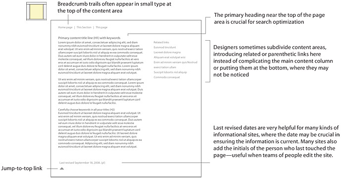
Figure 6.7 — Typical content-area components.
Page footers
Page footers are mostly about housekeeping and legal matters. These elements need to be on the page, but place them somewhere out of the way:
- Page author or, in large enterprise sites, responsible party
- Copyright statement
- Contact details, especially email
- Links to related sites or to the larger enterprise
- Redundant navigation links, for long pages


