Front Matter
Foreword
My favorite high school English teacher had this little ritual: in the early days of autumn, at the start of each of his classes, he’d lean against the chalkboard at the front of the room, his chalk-covered hands stuffed in his pockets. And as he stood there, he’d start telling a story about the syllabus before us—the authors whose works we’d be reading throughout the year, the themes we’d explore, the discussions we’d have.
Toward the end of the introduction, he’d remind us that while we’d be spending an entire year together, one class wasn’t quite enough time to explore a topic fully. Instead, he’d say, “this course is like a tour through a foreign country. We’ll spend the next few months exploring this new territory, and discussing some wonderful books together. Like all tours, however, we’ll only have a little time together…but if I’ve done my job right, I’ll have shown you just enough sights so that when you’re ready, you’ll come back. And you’ll have seen enough landmarks so that you can find your own way, and perhaps explore a bit further.”
Now I’ll tell you a little secret: this isn’t a book you’re reading. It’s a map.
The web is a sprawling, strange place, filled with disciplines and languages aplenty. And truthfully, it can be a daunting place to explore. But thankfully, you hold a copy of Web Style Guide. Drawn up by Patrick Lynch and Sarah Horton—two talented educators and writers, yes, but also cartographers—this is a chart of the web’s borders. Patrick and Sarah understand the intricacies of page layout, how to scope a design project, the fundamentals of web typography, and so much more.
Whether you’re a new traveler or a well-seasoned one, Web Style Guide will provide you with a path through your next project, and introduce you to ideas, concepts, and landmarks you’ll want to revisit.
So let’s start exploring.
—Ethan Marcotte
Preface
User experience is an overarching consideration that involves a wide range of activities by anyone who makes decisions and takes actions that affect how people experience a web site. Every person on the web development team has a role to play. On many sites, users are active contributors, which means that they also influence whether a web site offers an enjoyable and accessible user experience. And providing a good user experience is a critical factor in the success of any enterprise. Nothing is better for building a loyal following than providing a good experience, where people are successful in accessing and using content and features that they value.
When we posted the first version of Web Style Guide on the web in 1993, “user experience” wasn’t a thing. The web offered only rudimentary design options and basic interaction through hyperlinks. Our guidance focused on basic best practices within the constrained available options: how to title a page to support scanning in a list of bookmarks, how to structure text to accommodate the reading habits of online readers. Over time and with subsequent editions, we were able to offer guidance on more attributes, such as page design and graphic design, as web technologies became more powerful and robust. Our early editions focused on the craft of web design, teaching how to use the available tools and materials to best effect. These editions had lots of code examples and coverage of technical concerns, like image and video compression algorithms, because building a web site meant knowing how to trick a rudimentary hypertext markup language into performing feats of graphic design, and how to deliver data-intensive images and media to people on slow modems. There was much more science than art in the early web.
Things have changed, and so has Web Style Guide. Now, more than twenty years later, the technology platform is more mature. Users are more demanding—less willing to compromise—and they expect to encounter accessible and usable sites. Organizations are realizing the importance of design and are adopting a more strategic approach to designing and delivering quality experiences.
This fourth edition of Web Style Guide reflects a more serious and mature environment—one focused on users, not technology. It has fewer code samples. Knowledge of HTML and CSS is no longer required to be an effective web professional (although knowing what’s happening under the hood remains a distinct advantage). A new strategy chapter acknowledges that good user experience and effective design require vision and understanding. The next chapter, on research, demonstrates that understanding cannot happen in a team meeting room, on a whiteboard, but requires engagement with people—in all their diversity—who will use the site. And throughout the book there is a strong emphasis on quality content and interaction for meeting users’ needs and preferences. Previous editions bore the subtitle Basic Design Principles for Creating Web Sites. The fourth edition subtitle is Foundations of User Experience Design.
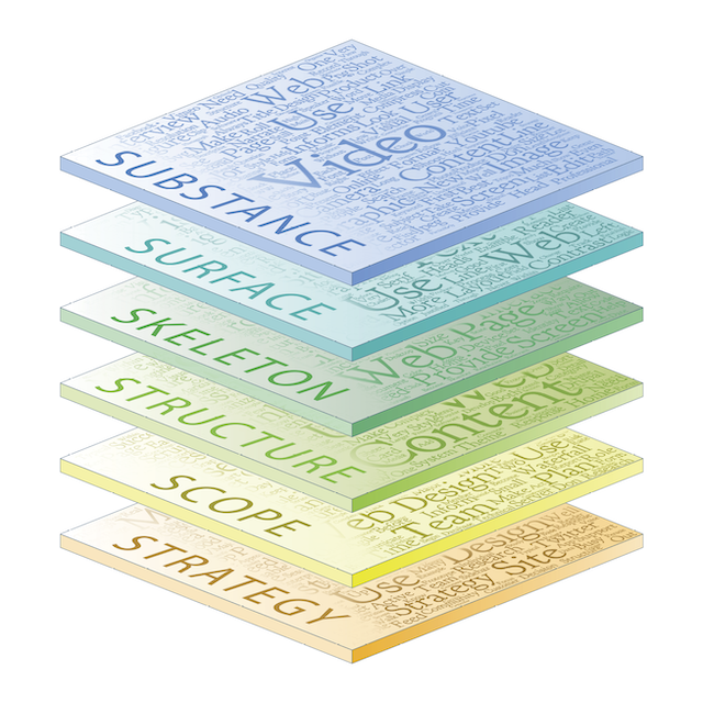
With a shift in focus to user experience design, we mapped our chapters to the five planes of user experience described by Jesse James Garret in his book The Elements of User Experience. His classic diagram (which you can find at wsg4.link/jjg-elements) is both an exposition of the dimensions of user experience design and a road map for user experience in the design and development process.
The process of mapping the long-standing and new chapters of Web Style Guide was revealing. We have over time given more attention to providing guidance for activities at the base of the framework—the strategy and scope planes. Good user experiences require clear purpose and a close understanding of user needs and preferences, and successful projects require planning. And we have added a new and critically important plane, which we call Substance. The Substance plane is at the top of the framework, and includes text, images, and video. The past years have seen a growing understanding that “content is king,” and no amount of eye candy or fancy widgets can have more impact than content that appeals to users.

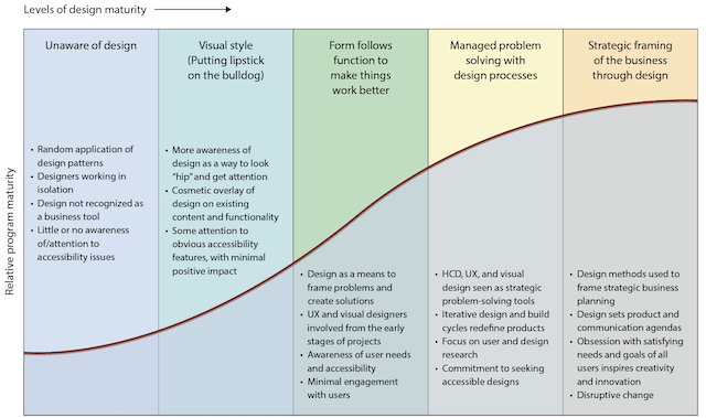
Another refreshing change we’ve seen since we began the Web Style Guide project twenty-three years ago is the broad, deep recognition of the value of design of all kinds: user experience design, interface design, content design, and visual communications design. Today business thought leaders like Apple, Google, Amazon, Facebook, and Adobe are not just technology leaders—in each instance what people admire most in these companies is superb design. In function, in the user experiences they create, and in the look and feel of their products and services, design is a critical strategic process integrated into every level of the business. We’ve seen the best enterprises steadily climb the design maturity curve, and derive tremendous business value as a result. Designing for people, in all their diversity, has become recognized as a distinct advantage. A company that holds accessible user experience design as a core value, supported by a user-centered practice of design, reaps the benefits of successful, satisfied, and loyal customers.

Acknowledgments
In addition to all those who contributed to the first three editions of Web Style Guide and whom we acknowledge in our earlier prefaces, we thank Jean Thomson Black, Samantha Ostrowski, and Dan Heaton at Yale University Press for their hard work and guidance in producing this fourth edition. We are particularly grateful to Ethan Marcotte for his foreword to this edition, and to Peter Morville and Louis Rosenfeld for their forewords to earlier editions of the guide.
I extend heartfelt thanks to my friends and my colleagues at Yale University for their counsel over the years, particularly my Yale colleague and world-class web front-end engineer and designer Victor Velt, for his wise advice, and for many great conversations about the future of the web and web content.
In particular, I thank Carl Jaffe for almost thirty years of generous friendship and wise counsel since our work together at Yale Center for Advanced Instructional Media. Much of Carl’s wisdom and insight appears on these pages. I also thank my coauthor and dear friend Sarah Horton for her enduring commitment to this enterprise, and for her efforts in making the web more accessible to everyone.
Without family, none of this would have meaning. For her unfailing love, support, and generosity of spirit, I thank the wisest woman I know, Susan Grajek. For their love, support, and no small amount of advice now that they know much of coding and the Interwebs better than I do: Devorah Lynch, Alex Wack, and Tyler Wack.
—Patrick J. Lynch
With this fourth edition of Web Style Guide I have a lot to celebrate and be grateful for.
I celebrate more than twenty years of partnership with my dear friend and coauthor, Pat Lynch. Our collaboration and friendship began in 1991, when he took me under his wing and taught me so much, about Photoshop and design, scripting and interaction, friendship and collaboration, music and life. Pat is the most talented and multidimensional person I know, and he has a huge heart. Fate looked kindly on me when she put me in Pat’s way.
I also celebrate more than twenty years working in higher education, at Yale, Dartmouth, and Harvard. There is no better place to learn and grow, and I am grateful to my mentors and friends who have guided me along the way. Since the previous edition I spent time at Harvard as web strategy project lead, and in that position I learned a great deal about how to advance a user experience strategy in a decentralized and largely autonomous organization. I am grateful to Perry Hewitt and everyone at HPAC, HUIT, and HWP (Harvard-speak for Harvard Public Affairs and Communications, Harvard University Information Technology, and Harvard Web Publishing) for support, encouragement, and opportunities to grow.
In 2014 I left higher ed to join The Paciello Group, helping to build a user experience practice focused on accessibility. I am immeasurably grateful to my UX colleagues, David Sloan and Henny Swan, who are right beside me, cutting a path toward accessible user experience. Their insights are woven into mine so completely that their words are echoed throughout these pages, along with those of the team of accessibility experts who fill my head each day with new knowledge: Mat Atkinson, Ashley Bischoff, Graeme Coleman, Steve Faulkner, Bill Gregory, Karl Groves, Hans Hillen, Patrick Lauke, Gez Lemon, Mark Novak, Ian Pouncey, Cédric Trévisan, and Léonie Watson. I am grateful to TPG leadership, Mike Paciello, Charlie Pike, and Deb Rapsis, for having the vision to pursue user experience as a path toward ensuring that everyone can participate online.
I am grateful to Malcolm Brown for his support, wise counsel, and creative problem solving.
I am grateful to my mother and father, and my large and wondrous family, who wait patiently while I chase deadlines.
Nico is, as ever, my son (sun), and I follow him like a flower. He grew up alongside Web Style Guide and is its biggest fan. I am grateful for his commitment to this enterprise and his support and patience all these years, even when writing kept me from playing.
The writing’s done. Let’s play!
—Sarah Horton
With credit and gratitude to Jonee Meiser for her work translating complex diagrams into words for the Web Style Guide website.