1 Process
General Advice About Running Web Projects
Ready, fire, aim
The prospect of creating a new or revised web site is exciting, and many teams will find it irresistible to jump in and start “sketching” or prototyping site designs long before anyone on the team knows:
- What your goals and strategies are
- Who exactly you’re designing the site for and what those users want
- What essential content structures, navigation, and interactive features are needed
Don’t let the process get hijacked by eager beavers who “just want to make some pages.” Decide the big strategic things first, and make pages only when you have all the important answers in place to guide the rest of the design process intelligently.
Stay away from visual design until everything else is planned
The fastest way to run a web project off the rails is to start your planning process by discussing the home page visuals or what the overall graphic design of the site should look like. Pour the foundation and build the walls before you let anyone fuss about the color of the drapes. The visual form of your site should flow from careful and informed decisions about site structure, navigation, content and interactivity requirements, and overall business goals. Detailed visual design should always come last in site planning: premature graphic design decisions will confound you at every turn.
Small is good
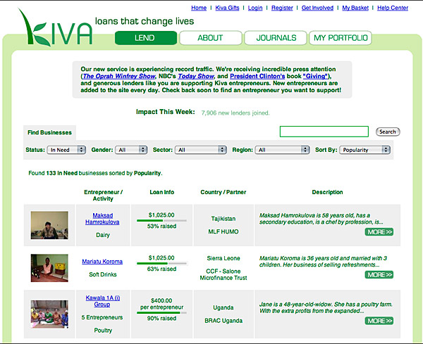
Often the easiest way to “manage” a site project is by adding content or features to avoid contention on the team, particularly if you look only at the initial programming or design costs. Large web sites are expensive to maintain, and it’s easy to bite off more than you can chew. Every new page, link, or application feature requires a long-term maintenance commitment. Stay small if you can, and stay focused. A small, high-quality site is infinitely better than a giant contraption with old content and broken links. The Kiva site is a model of simple, straightforward design and functionality—staying small while accomplishing enormous good (fig. 1.12).

Figure 1.12 Elegant sites are never more complex than they need to be. www.kiva.org
Plan the work, then work the plan
The oldest joke in project management is, “Good, fast, or cheap? Pick any two.” If you are developing anything more than a small web site, make sure you have an experienced web project manager.


