4 Interface Design
The Enterprise Interface
The web can provide a powerful framework for promoting group cohesion and identification with the large missions and goals of an enterprise, but only if the user interface, information architecture, and graphic design of the enterprise’s web sites consistently promote a common purpose and shared identity across all the major elements of the public-facing web sites and the organization’s internal sites and intranet. Most large corporations have well-established corporate identity programs that now include comprehensive web design and interface standards.
The organizational context of interfaces
Many smaller companies, federal, state, and local government sites, college and university sites, and nonprofit institutions produce chaotic, poorly organized web sites because the institutions lack consistent, widely implemented web publishing standards. Nobody sets out to produce a chaotic enterprise web presence, but an insistence on trying to optimize each little site within the larger organization is a guarantee of disorder and confusion for users. You can’t optimize a library by writing a great book, and no single web site—no matter how well designed—will ever improve an enterprise’s overall web presence.
The only long-term approach to improving an organization’s web presence is a consistent approach to web interface design, one that explicitly recognizes the larger context of the enterprise and the web in general. Ideally this set of consistent standards becomes the “enterprise interface” across all forms of web information publishing and web-based access to applications. In today’s large organizations web content can flow from dozens of major information sources. A consistent, comprehensive approach to the enterprise interface is the best way to maximize the return for the enormous investments that companies make in web publishing and web applications.
A chaotic web presence sends one consistent message about an organization: contempt for the user. Users spend 99.99 percent of their time on web sites other than yours, and potential readers could care less that you want to look unique. If your organization has web standards, always incorporate them into your site design and user interface. If you don’t have standards, lead an effort to create them. Research on the most effective corporate intranets and portals shows that users are most productive, efficient, and overwhelmingly more satisfied with sites that employ a consistent, comprehensive interface and design standard throughout the organization’s web presence.
Enterprise interface programs have three primary aims: coherence, symbolism, and positioning.
Coherence
A coherent interface presents the enterprise clearly and comprehensively, conveying an understandable picture of the organization’s structure and functioning, products and services to clients, internal communications and management policy, and overall mission and goals. Building a legible, easily navigable corporate web structure is more than just a graphic user interface issue. A well-structured site rich with useful content directly represents the depth and breadth of an enterprise more comprehensively than any previous medium.
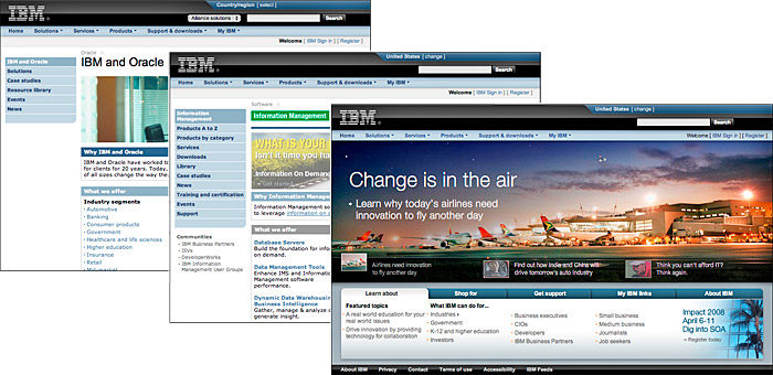
ibm’s overall web presence is a masterpiece of comprehensive visual and interface design across a massive organizational web presence (fig. 4.21).
Symbolism
As networked work environments become the norm and various forms of telecommuting and remote access become routine, web-based work environments will become the dominant force in creating and maintaining the corporate ethos, attitudes, and values. For most employees the organizational web presence has become the most visible and functional evidence of social cohesion and common purpose across the enterprise.
Positioning
A clear and recognizable identity program helps distinguish an enterprise from peers and competitors. This is especially critical on the Internet, where everyone has a web site and all web sites appear in the same limited venue (a browser window on the user’s screen). A user may visit a dozen organizational sites in a browsing session and be exposed to many graphic themes. Web users’ expectations of the Internet as a communications medium are determined mainly by what they have seen in other sites, and what they’ve seen is mostly like confetti: weightless, colorful, and chaotic. Will users remember your pages if your site looks like nothing else they’ve seen in your larger enterprise?

Figure 4.21 — A comprehensive design system across the massive IBM web presence.
Cohesive, comprehensive design transcends immediate commercial objectives. Enterprises need to differentiate themselves not only in the products and services they offer but also as social entities. In too many corporate, university, and government sites, the lack of a comprehensive group identity and shared sense of mission are made painfully obvious by the chaotic condition of their web sites. An effective web presence can be a powerful tool for enhancing the status and competitive positioning of an enterprise, but only if the web site effectively projects a feeling of trust in the knowledge and competence of the organization that produced it.


