by Patrick J. Lynch
and Sarah Horton

7 Page Design
Sidebar: Visual Design Principles
The Gestalt psychologists of the early twentieth century were fascinated with the mind’s ability to see unified “wholes” from the sum of complex visual parts (“Gestalt” is German for “shape” or “whole shape”). Their research into the perception of visual patterns yielded a number of consistent principles that dominate human visual reasoning and pattern recognition, and these principles form the theoretical basis for much of modern graphic design. The following principles are those most relevant to web page design:
Proximity
Elements that are close to each other are perceived as more related than elements that lie farther apart (a, below).Similarity
Viewers will associate and treat as a group elements that share consistent visual characteristics (b, below).Continuity
We prefer continuous, unbroken contours and paths, and the vast majority of viewers will interpret c, below, as two crossed lines, not four lines meeting at a common point.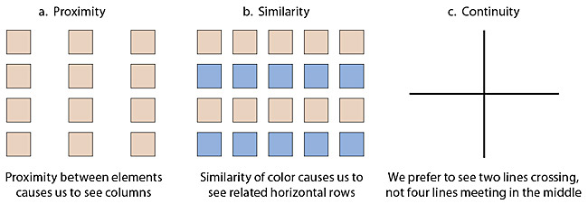
Closure
We have a powerful bias to see completed figures, even when the contours of the figure are broken or ambiguous. We see a white rectangle overlying four circles (a, opposite), not four circles that each have a section missing.Figure-ground relationships
In figure-ground reversal the viewer’s perception alternates between two possible interpretations of the same visual field: you see either a goblet or two faces, but you cannot see both at once (b, below). Proximity has a strong effect on figure-ground relationships: it’s easier for most people to see the goblet when it’s wider and the “faces” are farther apart (c, below). Also, visual elements that are relatively small will be seen as discrete elements against a larger field. The small element will be seen as the “figure” and the larger field as the “ground” around the figure.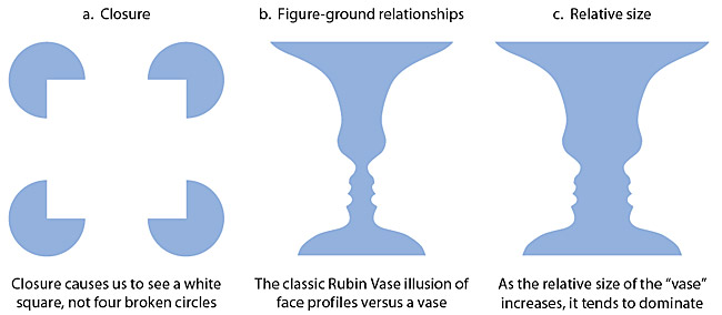
Uniform connectedness
Uniform connectedness refers to relations of elements that are defined by enclosing elements within other elements, regions, or discrete areas of the page.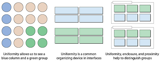
1 + 1 = 3 effects
The “white space” between two visual elements forms a third visual element and becomes visually active as the elements come closer together. The well-known visual illusion below of gray “spots” appearing in the spaces between the dark squares shows the worst-case scenario for 1 + 1 = 3 effects, but this principle applies to all closely spaced elements in which the ground forms an active part of the overall design.

