7 Page Design
Page Frameworks
Web pages are plastic in both horizontal and vertical dimensions in a way that paper pages are not. Therefore, even before you decide on a page grid, you need to decide on the fundamental page framework that suits your site best: a fixed-width page or a flexible-width page.
Deciding on page length is easier. Here the best practice is a common-sense approach that works well for your content. The old saw that “web readers don’t scroll” may have been true of new users a decade or more ago, but it certainly isn’t true now. As readers have grown used to the web as a reading medium, the design constraints on page length have lessened, and usability studies have shown that web readers certainly do scroll through web content that interests them.
Fixed page widths
Fixed-width page designs are widely used, particularly for complex page layouts with many functional subregions of the page, such as in newspaper sites. Putting content into a fixed-width column means that your page layout will be stable whatever the size of the user’s screen or browser window. Designing in a stable environment means that you can fix the position of elements on the page and control such typographic features as line length and spacing. Stable layouts also preserve the Gestalt visual and spatial logic of how various components in the page layout relate to one another.
Fixed-width layouts have several downsides. On large display screens a major portion of screen real estate goes unused, and in a narrow browser window users may need to scroll horizontally to see the full width of the page. Also, fixed-width layouts do not always respond gracefully to enlarged text (fig. 7.15).

Figure 7.15 — Fixed-width designs may fall apart visually if the reader chooses to enlarge the text size.
One common hybrid alternative is to combine one or more fixed-width columns with a flexible-width center column that has relatively simple content structure and stretches to fill the full width of the browser window (fig. 7.16).
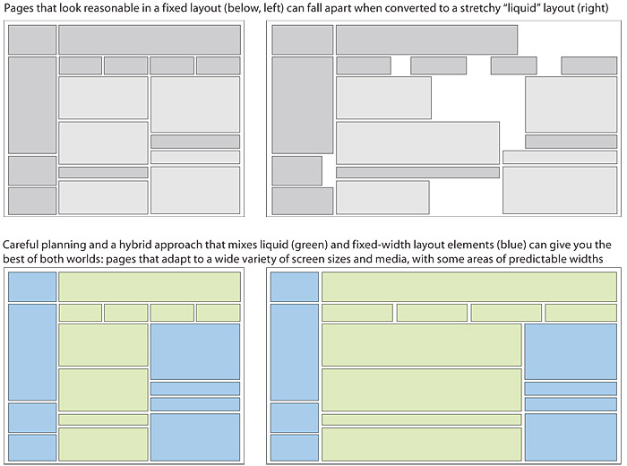
Figure 7.16 — Careful HTML and CSS design can create “hybrid” page designs that contain both fixed and “liquid” design elements.
The “safe” page width is a constantly moving target, because the average size of computer screens increases all the time. The best way to decide on an optimal page width is using web analytics to determine the average screen size of your site visitors.
Summary
Fixed layouts are optimized for the most common web viewing conditions—the desktop or laptop screen—and can be adapted to handheld devices and other forms of mobile computing with mobile style sheets. But fixed layouts will always be more brittle and prone to universal usability problems than flexible layouts. We thus strongly recommend that you consider flexible page layouts as a design solution.
Flexible page widths
With the variety of sizes in display screens ranging from small cell phones to wide cinema displays, the entire notion of designing to a standard “safe” size is often impractical. The web is a flexible medium designed to accommodate different users and a variety of display devices.
Unlike a printed document fixed on paper, the look of a web page depends on such elements as the display size, resolution, and color settings, the height and width of the browser window, software preferences such as link and background color settings, and available fonts. Indeed, there is no way to have complete control over the design of a web page. Often the best approach is to embrace the flexibility of the medium and design pages that are legible, adaptable to many display devices, and accessible to all users.
Flexible or “fluid” page design is in many ways more challenging than fixed design because it requires a deep understanding of html and its implementation across platforms and browsers. It also requires that you think outside the box of your configuration and come up with graphics and layouts that will still work under varying conditions. There are several methods for defining flexible page widths. The most common approach is to use percentages to define the width of the different elements on the page.
For example, for a two-column layout, the content may occupy 75 percent of the page width and the section navigation the remaining 25 percent. The same page printed would hide the display of the navigation column since it’s of little use on paper and set the page width to a measure that is comfortable for reading. And on a mobile device, where navigation is essential but the narrow screen width does not support multiple columns, we would collapse the two columns into one and maximize the space available on screen (fig. 7.17).
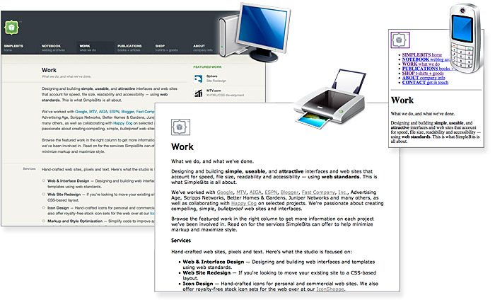
Figure 7.17 — Strategic use of CSS and flexible HTML page coding can liberate your content to work well across many display media.
Summary
Flexible page designs have enormous advantages in adaptability across various display devices (desktop, laptop, cell phone, iPod, and so on). Flexible designs are also more universally usable because they can be easily adapted to increase text size, display color and contrast, and other viewing or reading parameters. Flexible pages may not be the best approach for complex page layouts that depend on relatively fixed visual relations among page size, typography, and graphics.


