9 Editorial Style
Structuring Your Prose
Documents written to be read online should be concise and structured for scanning. Most online readers are at some point “scanners” who skim web pages rather than read them word by word. Even methodical readers will appreciate your efforts to accommodate online reading patterns rather than forcing readers to slow down and pick their way through your pages in order to glean information. That said, keep in mind that much content is not well suited to the telegraphic style that works well for online documents. Web authors often cut so much out of their presentations that what remains would barely fill a printed pamphlet. Concise writing is always better, but don’t dumb down what you have to say. Simply make printing easy for those who prefer to read offline, and you can use the web to deliver content without cutting the heart out of what you have to say.
Site structure
The first accommodation for online reading is in how you structure your site. Rather than provide a single page with all the information on a topic, break up a body of information into logical “chunks,” each on its own page, and connect the pages using links. This approach accommodates online reading by providing direct access to subcategories of specific information rather than combining all information about a topic on a single page.
Only use chunking where it makes sense (see chapter 3, Chunking information). Don’t break up a long document arbitrarily; users will have to download each page and will have difficulty printing or saving the entire piece. The key to good chunking is to divide your information into comprehensive segments. That way users will have direct and complete access to the topics they are interested in without having to wade through irrelevant material or follow a series of links to get the whole picture.
As you review content for your new or revised site, always look for opportunities to develop and use modular, consistent means of approaching content topics. A consistent, repeatable, well-specified content structure makes it much easier for writers and editors to understand what is expected of them. Modular structure is also easier on users, since they can quickly predict how to scan chunks of content that share the same structure (fig. 9.1).
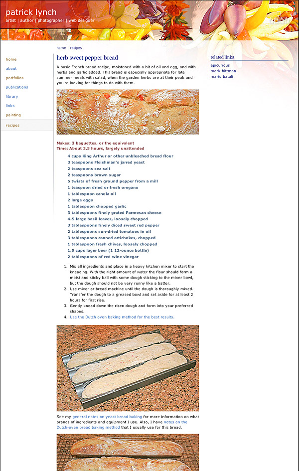
Figure 9.1 — Recipes allow for the modular organization of content into logical “chunks”—description, ingredients, and preparation.
Page structure
The page level is where web writing really differs from other genres. Web readers often approach a web page with a quick skim in order to form an overview of the page and determine whether the information they are seeking is likely to be found there. Some users then read through the page, while others print the page for offline reading. The following guidelines support both the skimming and reading behaviors of online readers.
Segment the text for easy scanning
Browsing a page is easier when the text is broken into segments topped by headings that describe the subject of each segment. This often means breaking up long paragraphs, and using more subheadings than you would for print publication. Remember that in the restricted world of the computer screen, a long paragraph may fill the screen with a visually monotonous block of text.
Use descriptive headings
Avoid catchy but meaningless headings. Don’t force readers to read a text segment to determine its topic. Highlighting or linking meaningless or ambiguous phrases will not help you with optimizing your content for search engines and may even harm the overall search visibility of your page by adding confusing keywords into the mix.
Highlight important words and sections
Within sections, use lists and typographical emphasis for words or sections you wish to highlight; these and headings are the elements that will grab the user’s attention during a scan.
Use the inverted pyramid
The inverted pyramid style used in journalism works well on web pages, with the conclusion appearing at the beginning of a text. Place the important facts near the top of the first paragraph where users can find them quickly (fig. 9.2).
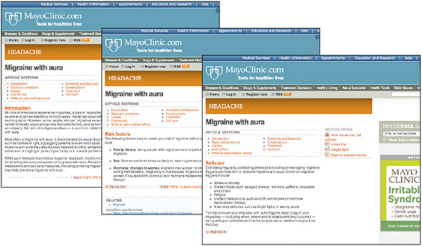
Figure 9.2 — Put the important words and phrases at the top of the page, where the reader (or search engine) will scan them first.
Structural markup
html is a markup language that adds a layer of structural meaning to documents. It works by wrapping elements, such as titles, headings, paragraphs, lists, tables, addresses, and citations, in defining tags. The result is a machine-friendly document that can be read and interpreted by software. Tags tell software, for example, that the text from here to here is a heading, and the following text block is a paragraph, and so on. For example, when a web author defines a block of text as the page title, web browser software can display the page title in the browser title bar, in the browser history, and as a bookmark.
On the surface, a structured document looks no different from one that uses font size and other visual formatting to distinguish elements such as headings. When it comes to functionality, however, structure gives power and utility to the web. Take, for example, the heading of this section. <b>Structural markup</b> is visually identifiable as a heading because it is bold and sits directly above plain text. But software cannot infer that it is the primary subheading of this section because <b> means nothing more than bold. If the chapter title is marked as <h1>Structural markup</h1>, software knows that the page is about structural markup, and that in turn facilitates all kinds of functions, such as returning the page on searches for structural markup or adding the page to compilations about structural markup.
When marking up text, think about what each text element is and not what it should look like. Tag each element with the appropriate html structural tag, and then use css to manage its visual properties (see chapter 8, Semantic emphasis).


