 | |
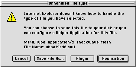
Applications for multimediaWeb designers must always be considerate of the consumer. A happy customer will come back, but one who has been made to wait and is then offered goods that are irrelevant is likely to shop elsewhere. Because multimedia comes with a high price tag, it should be used sparingly and judiciously. All too often Web authors include visual or moving elements on the page for the purpose of holding the user's attention. This approach is based on the assumption that Web users have short attention spans, which in many cases may be true. However, the solution is not to add gratuitous "eye candy" to your Web presentation, which may, in fact, command too much of the user's attention and detract attention from the main content of your page. When thinking about adding media to your Web pages, consider first and foremost the nature of your materials. Use images, animations, video, or sound only when relevant to your message.  Bear in mind, too, that there are technical limitations to the delivery of audiovisual content via the Web. For example, long-duration video and video requiring smooth motion or clear details require large amounts of bandwidth to deliver and may tax the playback capacity of the user's machine. A significant amount of downsampling and compression is required to create a file that is small enough to be delivered via the Web. In some cases, these compromises may be too significant to warrant the effort. When you are considering adding multimedia to your pages, make sure the technology can meet the demands of your content. You don't want users to spend extra time and energy retrieving files that cannot be illustrative owing to limitations of the technology. Also be wary of fledgling technologies. Plug-ins that allow users to see new and exciting things using their favorite browser software are constantly being introduced. This is especially true of multimedia; the options for encoding and delivering audio, animations, and video are dizzying. Although designers may be tempted to create files that employ the functionality offered by custom plug-ins, they should bear two things in mind. First, the bother and potential confusion of downloading and installing plug-ins will deter many users. Second, it is not prudent to create content in a custom file format that could quickly become obsolete. It is best to create your multimedia content in the standard formats for operating systems and browser software. 
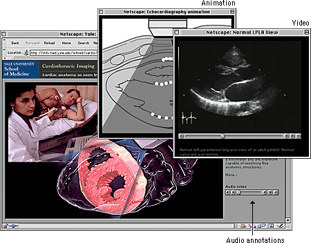
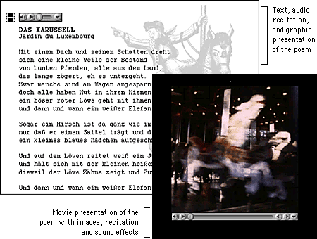
This somewhat conservative discussion of multimedia considerations needs one important qualification. If you are creating a site for a specific audience and not for global interests you will probably have more flexibility and can ask more from your users. You can require them to use specific browser software and plug-ins, and you can include data-intensive multimedia elements in your presentation. Say, for example, that your site is academic and your audience is a group of students or faculty with specialized interests. You are charged with the task of creating a custom site that fully addresses these interests, so function should define form. A foreign-language teaching site, for example, could contain bandwidth-intensive audio and video elements because the students who visit the site will use these multimedia elements to improve their abilities with the language. These students are not casual visitors; they are invested in the content, so they will tolerate lengthy download times and more demanding site interaction. And because your audience is defined and finite, you can take steps to ensure that they know what to expect and are prepared when they visit your site.  |
|
|