 | |
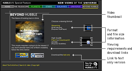
Design and multimediaThe combination of low-bandwidth considerations and primitive interface options creates interesting design challenges for Web developers who wish to incorporate multimedia elements into their sites. Designers need to inform users when they are entering a high-bandwidth area and give them the tools they need to control their experience once in the area. Inform your usersOne aspect of the Web is that you don't always know where you're going or what you'll find there. For some this uncertainty is exciting. For many, it is annoying, particularly when a long wait is involved. Most frustrating, perhaps, is when you finally receive the requested page only to find that is not what you expected or that it contains materials in a format you are not set up to view. With content that is as technologically demanding as multi-media, it is especially important to give users enough information to make an informed decision before they click, so that they know what to expect and are prepared to receive your materials.  High-demand content such as large multimedia files should not be part of your basic page design. These materials should appear on secondary pages that are described and can be accessed from the main pages of your site. Make the menu page a plain HTML page that loads quickly and does not require special software. Include descriptive information about the materials along with previews such as still shots from the video. Include the run time for time-based media, and include the file size for materials that download. In addition, fully explain any special software requirements for accessing the materials and provide a download link. Your users should have a clear idea of what your materials are before they begin to download. With a menu interface, users can confirm that their systems are properly configured and that they have enough bandwidth, time, and patience to load the materials. Provide controlsBe sure to give users status information and controls when you are presenting multimedia materials. The QuickTime controller bar is an extremely effective interface element that provides both controls and status information. It allows users both to adjust the volume control and to play, stop, and scrub through a movie, and it provides information about the movie's download status. 
If you don't include controls, users will hit your page with no way to control their viewing environment. For example, if a visitor is looking at your page at a public workstation and you have looping bird calls as a background sound without any control options, the visitor will experience an unsettling (and potentially embarrassing) moment when he or she cannot control interaction with your site. Many users in this situation will simply close the browser window to make the sound stop, which means that they never get to see the page content. When designing a media interface, let interaction with your media be entirely user-driven. Always include user controls, such as a media controller bar, and make sure that users have a way to turn it off. Avoid prescribed playback options like auto play or looping that take control from the user. With auto play, for example, media files begin playing when a Web page is loaded. If the page has other elements, such as descriptive text, the user who wants just the text will find the video distracting. Design your media interface so that files play only when the user explicitly elects to initiate playback. |
|
|