 | |
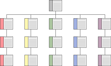
ConsistencyEstablish a layout grid and a style for handling your text and graphics, then apply it consistently to build rhythm and unity across the pages of your site. Repetition is not boring; it gives your site a consistent graphic identity that creates and then reinforces a distinct sense of "place" and makes your site memorable. A consistent approach to layout and navigation allows readers to adapt quickly to your design and to confidently predict the location of information and navigation controls across the pages of your site. 
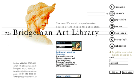
If you choose a graphic theme, use it throughout your Web site. The Bridgeman Art Library home page banner, below, sets the graphic theme for the site and introduces distinctive typography and a set of navigation buttons:  Below is a banner at the top of an interior page in the Bridgeman Art Library site. Note how the typography and the navigation theme are carried over to the interior banners. There is no confusion about whose site you are navigating through: |
|
|