 | |
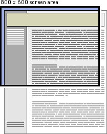
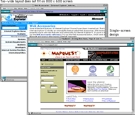
Page dimensionsAlthough Web pages and conventional print documents share many graphic, functional, and editorial similarities, the computer screen, not the printed page, is the primary delivery site for Web-based information, and the computer screen is very different from the printed page. Computer screens are typically smaller than most opened books or magazines. A common mistake in Web design is spreading the width of page graphics beyond the area most viewers can see on their seventeen- or nineteen-inch display screens: 
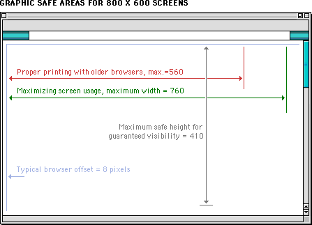
Graphic safe areasThe "safe area" for Web page graphics is determined by two factors: the minimum screen size in common use and the width of paper used to print Web pages. Most display screens used in academia and business are seventeen to nineteen inches (forty-three to forty-eight centimeters) in size, and most are set to display an 800 x 600-pixel screen. Web page graphics that exceed the width dimension of the most common display screens look amateurish and will inconvenience many readers by forcing them to scroll both horizontally and vertically to see the full page layout. It's bad enough to have to scroll in one (vertical) direction; having to scroll in two directions is intolerable.  Even on small computer screens it is possible to display graphics that are too wide to print well on common letter-size, legal-size, or A4 paper widths. Current browser versions attempt to resolve printing problems by providing the option to scale the page contents to fit the standard paper width. However, many users are unaware of the "fit to page" option. Another problem is that wide pages that are scaled to fit are often illegible because the type has been scaled excessively. In many Web pages, however, printing is a secondary concern. Just be aware that your readers will either lose the right margin of your layout or produce a scaled document if they print wide pages in standard vertical print layout. Pages with lots of text should always be designed to print properly because most readers will print those pages to read them more comfortably. If the page layout is too wide readers will lose several words from each line of text down the right margin or have to contend with small type. The graphic safe area dimensions for printing layouts and for page layouts designed to use the maximum width of 800 x 600 screens are shown below: Graphic "safe area" dimensions for layouts designed to print well: Graphic "safe area" dimensions for layouts designed for 800 x 600 screens: 
|
|
|