 | |
Fixed versus flexibleThe behavior of an HTML table depends largely on how its cells are defined. One "feature" of tables is that they try to be accommodating; they expand and collapse to accommodate their contents and to fit the dimensions of the viewer's browser window. In their most basic form, tables are not much more precise than plain text. 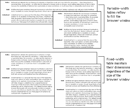
It is possible to create flexible layout tables that resize gracefully without sacrificing the integrity of your design, but if you are turning to layout tables for precision you will need to use fixed-width layout tables. Use fixed-width tables for precise layoutsPutting content into a fixed-width table means that your page layout will be stable whatever the size of the user's screen or browser window. Designing in a stable environment means that you can fix the position of elements on the page and control typographic features such as line length and spacing. A downside of a controlled layout is that on large display screens a major portion of screen real estate goes unused. You can avoid the "wasteland" effect of a fixed layout by centering the table in the browser window or by designing a background graphic to fill the empty areas of the screen. 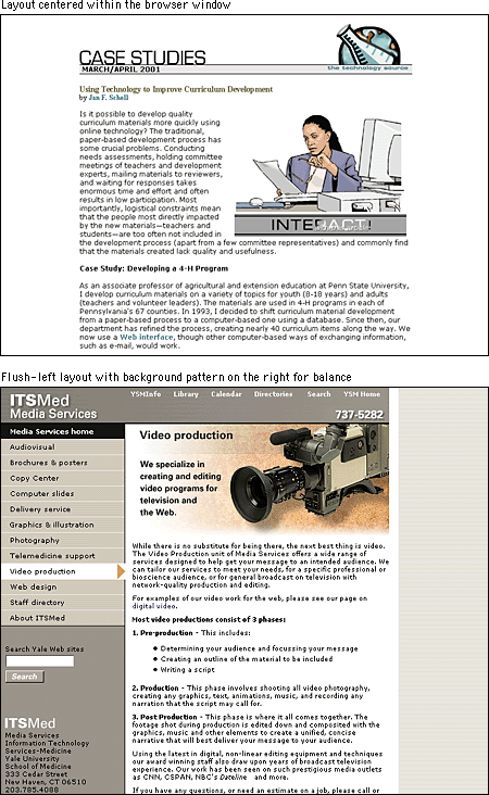 In a fixed-width table you must define cell widths with absolute values. This will keep the tables from expanding to fill the window. Then, to keep tables from collapsing when the browser window is too small to accommodate their dimensions, include an invisible image equal to the width of the cell in each table cell. These two techniques will force table cells to maintain their dimensions regardless of the size of the browser window. 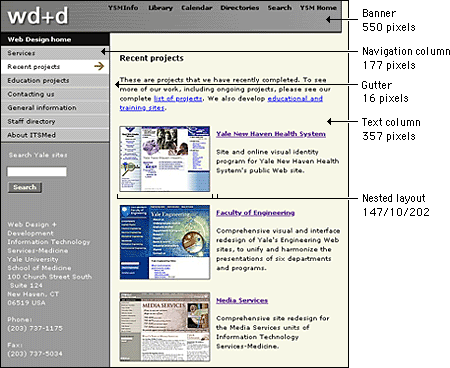 Use flexible tables for layouts that adaptA popular viewpoint is that designers should embrace the nature of Web documents and create flexible layouts that adapt to different viewing conditions. To do this, you need to be willing to abandon control of aspects of your page design, notably line length. Flexible design is in many ways more challenging than fixed design because it requires a deep understanding of HTML and its implementation across platforms and browsers. It also requires that you think "outside the box" of your own configuration and come up with graphics and layouts that will still "work" under varying viewing conditions.  Tables are inherently flexible, so one approach to flexible design is to let table cells size themselves according to their contents and the size of the browser window. Another approach is to specify cell widths using percentage values; for example, set the left scan column width to 40 percent and the main text column width to 60 percent. That way the columns will resize when the window size is changed, but they will always maintain their relative proportions regardless of the size of the browser window. You can also use a combination of fixed and unspecified table cell widths to create a flexible layout. Using this technique you specify in pixels the width of the columns that require absolute positioning — for example, a navigation column or gutter — and leave the remaining column, such as the text column, unspecified so that it adapts to fill the screen. 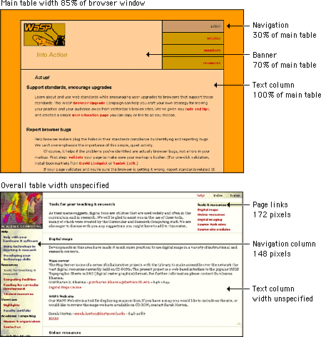 |
|
|