 | |
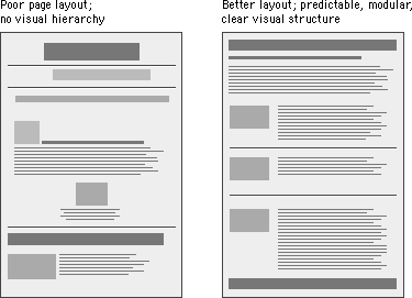
Design grids for Web pagesConsistency and predictability are essential attributes of any well-designed information system. The design grids that underlie most well-designed paper publications are equally necessary in designing electronic documents and online publications, where the spatial relations among on-screen elements are constantly shifting in response to the user's input and system activity. Grids bring order to the pageCurrent implementations of HyperText Markup Language do not allow the easy flexibility or control that graphic designers routinely expect from page layout software or multimedia authoring tools. Yet HTML can be used to create complex and highly functional information systems if it is used thoughtfully. When used inappropriately or inconsistently, the typographic controls and inlined graphics of Web pages can create a confusing visual jumble, without apparent hierarchy of importance. Haphazardly mixed graphics and text decrease usability and legibility, just as they do in paper pages. A balanced and consistently implemented design scheme will increase readers' confidence in your site. 
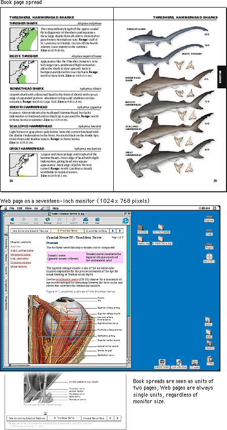
No one design grid system is appropriate for all Web pages. Your first step is to establish a basic layout grid. With this graphic "backbone" you can determine how the major blocks of type and illustrations will regularly occur in your pages and set the placement and style guidelines for major screen titles, subtitles, and navigation links or buttons. To start, gather representative examples of your text, along with some graphics, scans, or other illustrative material, and experiment with various arrangements of the elements on the page. In larger projects it isn't possible to exactly predict how every combination of text and graphics will interact on the screen, but examine your Web layout "sketches" against both your most complex and your least complex pages. Your goal is to establish a consistent, logical screen layout, one that allows you to "plug in" text and graphics without having to stop and rethink your basic design approach on each new page. Without a firm underlying design grid, your project's page layout will be driven by the problems of the moment, and the overall design of your Web site will seem patchy and confusing. Vertical stratification in Web pagesA Web page can be almost any length, but you've only got about forty-five square inches "above the fold" — at the top of your page — to capture the average reader, because that is all he or she will see as the page loads. One crucial difference between Web page design and print page design is that when readers turn a book or magazine page they see not only the whole next page but the whole two-page spread, all at the same time. In print design, therefore, the two-page spread is the fundamental graphic design unit. Print design can achieve a design unity and density of information that Web page design cannot emulate. Regardless of how large the display screen is, the reader still sees one page at a time, and even a twenty-one-inch screen will display only as much information as is found in a small magazine spread: 
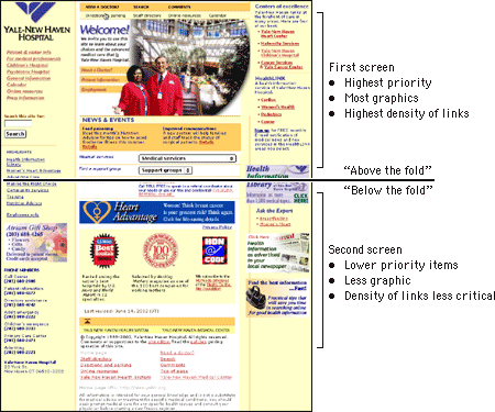
Design for screens of informationMost Web page designs can be divided vertically into zones with different functions and varying levels of graphics and text complexity. As vertical scrolling progressively reveals the page, new content appears and the upper content disappears. A new graphic context is established each time the reader scrolls down the page. Web page layouts should thus be judged not by viewing the whole page as a unit but by dividing the page into visual and functional zones and judging the suitability of each screen of information. Notice the vertical structure of the home page reproduced below. The top screen of information is much denser with links because it is the only area that is sure to be visible to all users:  |
|
|