 | |
AlignmentMargins define the reading area of your page by separating the main text from the surrounding environment. Margins provide important visual relief in any document, but careful design of margins and other "white space" is particularly important in Web page design because Web content must coexist on the computer screen with the interface elements of the browser itself and with other windows, menus, and icons of the user interface.  Margins and space can be used to delineate the main text from the other page elements. And when used consistently, margins provide unity throughout a site by creating a consistent structure and look to the site pages. They also add visual interest by contrasting the positive space of the screen (text, graphics) from the negative (white) space. Text blocks have different ways of sitting within margins. Left-justified, centered, right-justified, and justified text are the alignment options available on the Web. Justified textJustified text is set flush with the left and right margins. Justified blocks of text create solid rectangles, and block headings are normally centered for a symmetrical, formal-looking document. In print, justification is achieved by adjusting the space between words and by using word hyphenation. Page layout programs use a hyphenation dictionary to check for and apply hyphenation at each line's end and then adjust word spacing throughout the line. But even with sophisticated page layout software, justified text blocks often suffer from poor spacing and excessive hyphenation and require manual refinement. This level of control is not even a remote possibility on Web pages. The most recent browser versions (and CSS) support justified text, but it is achieved by crude adjustments to word spacing. Fine adjustments are not possible on low-resolution computer displays and are impractical to implement in today's Web browsers. Also, Web browsers are unlikely to offer automatic hyphenation any time soon, another "must" for properly justified text. For the foreseeable future, the legibility of your Web documents will suffer if you set your text in justified format. 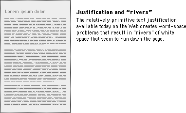
Centered and right-justified text blocksCentered and right-justified text blocks are difficult to read. We read from left to right, anchoring our tracking across the page at the vertical line of the left margin. The ragged left margins produced by centering or right-justifying text make that scanning much harder, because your eye needs to search for the beginning of each new line. Left-justified textLeft-justified text is the most legible option for Web pages because the left margin is even and predictable and the right margin is irregular. Unlike justified text, left justification requires no adjustment to word spacing; the inequities in spacing fall at the end of the lines. The resulting "ragged" right margin adds variety and interest to the page without interfering with legibility. 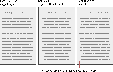
Justification of headlinesTitles and headings over left-justified body text should also be flush left. Centered headings pair well with justified text, but justified text should not be used on Web pages. Centered display type contrasts with the asymmetry of the ragged right margin of left-justified body text and produces an unbalanced page. 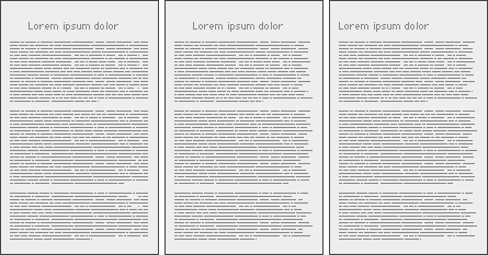
Until typographic options for Web pages become more sophisticated, we recommend that you use left-justified text blocks and headlines as the best solution for most layout situations. |
|
|