 | |
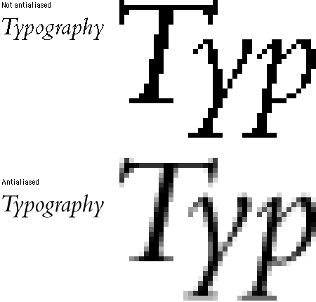
Type graphicsTypography cannot always be neatly separated from the graphics of your Web site. Graphic text can be tightly integrated with images in ways that are impossible in HTML text:  For aesthetic reasons you may choose to use graphical representations of type rather than manipulate HTML type. In either case you'll need to understand how to best render type within GIF (Graphics Interchange Format) and JPEG (Joint Photographic Experts Group) graphics. Anti-aliased typeAntialiasing is a technique widely used in computer graphics to optimize the look of graphics and typography on the display screen. Antialiasing visually "smoothes" the shapes in graphics and type by inserting pixels of intermediate colors along boundary edges between colors. In typography, antialiasing removes the jagged edges of larger type characters. At normal viewing distances antialiasing gives the impression that the type is rendered at a higher resolution: 
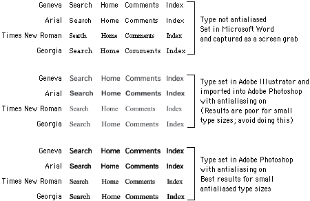
Creating antialiased typeSophisticated image editing programs such as Adobe Photoshop will create antialiased type automatically, and these "paint" image editors are where most Web designers create their graphic typography. If, however, you have a complex arrangement of typography and graphics (say, for a home page banner), you may wish to work first in a drawing program such as Adobe Illustrator or Macromedia FreeHand. Drawing programs are better at laying out text and will let you edit the text up to the final rendering into a paint (GIF or JPEG) graphic to use on the Web page. Final rendering is usually done by importing the graphic into Photoshop, where all text will automatically become antialiased:  We often use graphic type within banner or navigational graphics, but we rarely use graphic type simply as a stylistic substitute for headlines or subheads within a Web page. Purely graphic typography cannot be searched and indexed along with the HTML-based text on a Web page. Your best option is to repeat the textual content of the graphic inside an When not to use antialiasingAntialiasing is great for large display type, but it is not suitable for small type sizes, especially type smaller than 10 points. The antialiasing reduces the legibility of small type, particularly when you import it into Photoshop from a drawing program like Adobe Illustrator. If you need to antialias small type sizes, do it in Photoshop: 
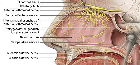
For the anatomic illustration below we used non-antialiased 9-point Geneva (a Macintosh screen font) for the illustration labels: 
|
|
|